An online store website that looks like the things you sell
When a designed storefront beats a big commerce theme, what every product page needs, how checkout works for digital and physical goods, and how Laarpi builds a store for a small catalogue.
Most small online stores look like the same store with a different logo. That's not because the owners lack taste. It's because the big commerce platforms are built for catalogues, and their themes optimise for the store with five hundred products. If you sell twelve things, or one, the theme gives you a grid, a carousel, a newsletter pop-up and a footer of payment icons, and your products end up looking like everyone else's.
A small catalogue deserves an online store website designed around the products. This page covers when that's the right choice, what every product page needs, how checkout works for digital and physical goods with Laarpi, and how it builds a store.
When a designed storefront beats a commerce theme
Be honest about which kind of store you are.
| You sell | Best fit |
|---|---|
| One product, or a launch | A designed product page; see below |
| A small collection, 5–50 pieces | A designed storefront, like the examples below |
| Drops and one-of-ones | A designed storefront, updated per drop |
| Digital goods: templates, fonts, presets, audio, software | A designed storefront with built-in checkout |
| Hundreds of SKUs, variants, inventory, fulfilment | A commerce platform. Laarpi can build the brand site around it |
The rest of this page is about the middle rows.
Products at their true scale
The best small stores make you understand the object before you buy it.
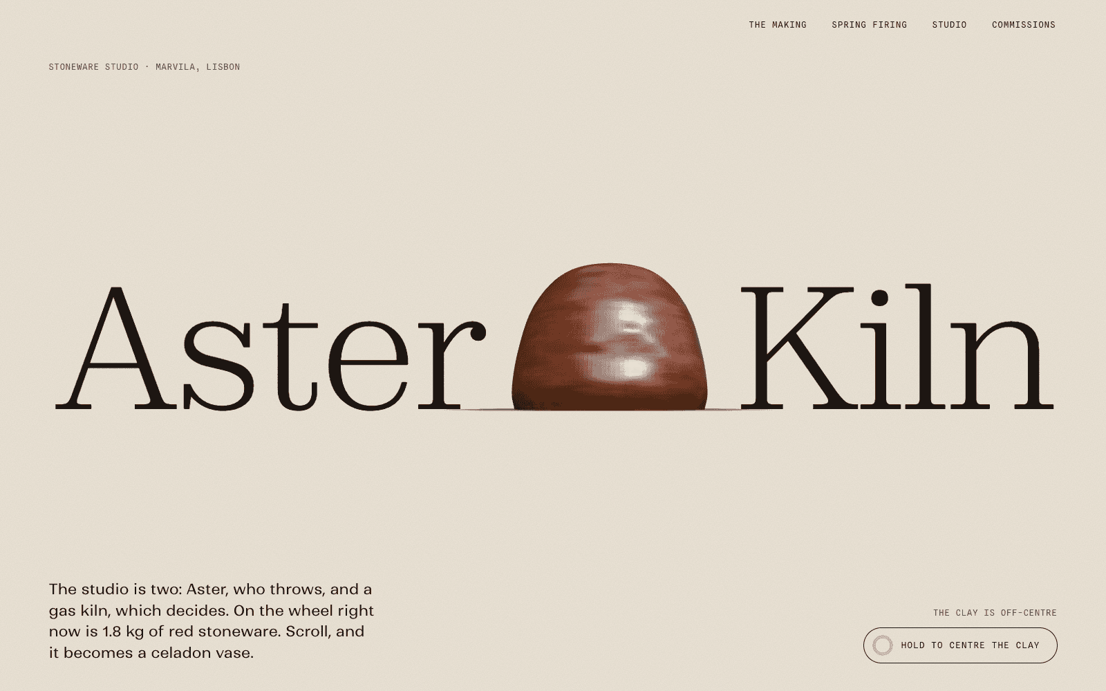
Aster & Kiln is a showcase site made by the Laarpi team with Laarpi's library and process for an imagined one-person stoneware studio in Lisbon. You watch one vase thrown, glazed and fired as you scroll. Then the spring firing appears: six pieces on one shelf line, at their true relative sizes, each with a catalogue number, dimensions and a buy button, plus a refundable deposit for commissions. A buyer understands what a hand-thrown pot is worth before they see a price.

PATCH-01 is a showcase launch page for an imagined synthesizer module. The final section is a configurator in its simplest form: choose a Raw or Carbon finish and the 3D panel re-anodises in front of you, then pre-order. Choices shown, not listed.
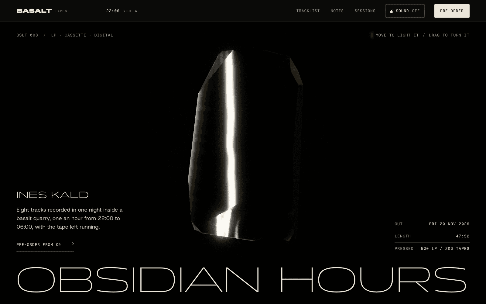
BASALT Tapes: Obsidian Hours sells an imagined record in three formats (vinyl, cassette, download) as three plain rows after a long, atmospheric page. Atmosphere sells the record; plain rows sell the format.
You can open all three in the community and remix any of them as the starting point for your own store.
What every product page needs
Whatever the design, a product page has to answer the buyer's questions without making them hunt:
- What it is, in a plain sentence, then the details: materials, dimensions, contents, compatibility.
- Photographs that show scale, texture and use, at proper size, with alt text.
- The price, including whether tax is included, and shipping costs before checkout.
- Availability: in stock, made to order, ships on a date. Only true scarcity; no invented countdowns.
- Returns and care, in plain language.
- One clear buy button, placed where a thumb finds it on a phone.
What to leave out: fake "only 2 left" banners, invented reviews, pop-ups that interrupt before anyone has seen a product. Laarpi never invents reviews or numbers, and real ones can be added once you have them.
How checkout works
This is the part to get right, so here it is plainly.
Digital goods: built-in checkout. Laarpi connects your own Polar account, creates your products there and wires checkout links (or an overlay checkout) to your buy buttons. Polar is built for digital goods: software, templates, fonts, presets, design assets, photos, audio, video and premium content. It acts as merchant of record, handling sales tax, and the revenue goes to your account. After purchase, buyers return to your site to a quiet confirmation. Some categories, such as ebooks, pre-orders and ticket sales, are reviewed by Polar case by case. More on website payments.
Physical goods: your store's checkout. Polar doesn't sell physical products. If you sell physical things, keep using the commerce or payments platform you already have for checkout, stock and shipping, and Laarpi links each buy button to that product's checkout or payment link. The storefront is designed by Laarpi; the transaction happens where your inventory lives.
Either way: the customers and the money are yours. Nothing passes through Laarpi.
Choosing a look for a store
Some directions that suit different kinds of products, as starting points:
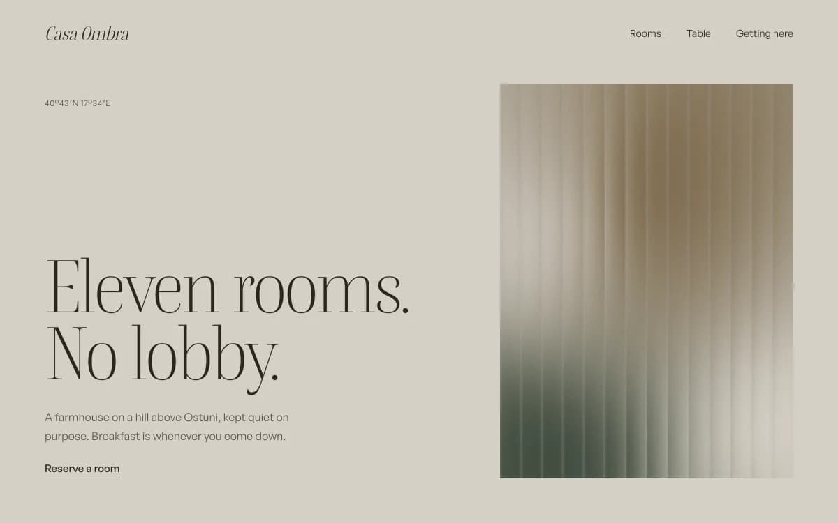
Quiet Luxury is stone, camel and a sharp serif. Right for homeware, fashion and objects that should feel expensive without saying so.
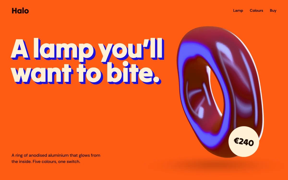
Dimensional Pop is faux-3D type and glossy objects on hot grounds. Right for playful products, lighting and gifts. The specimen above was composed for a single lamp.
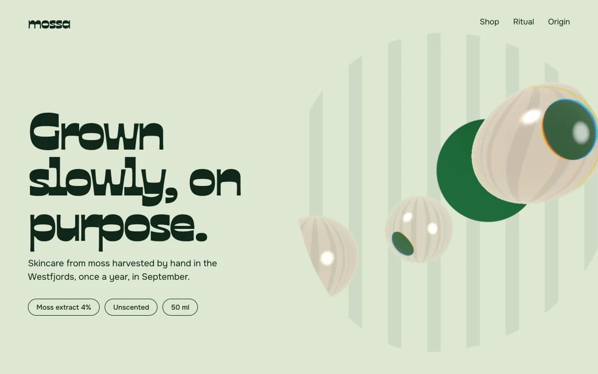
Organic Biomorph is soft, living forms on leaf and moss grounds. Right for skincare, food and anything grown.
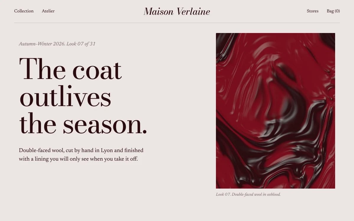
Editorial Luxe is the magazine spread. Right for fashion and lookbook-led collections.
Showing products in 3D
Real-time 3D earns its place in a store when it shows something photographs can't: how an object turns, what's inside it, how a finish changes. If you have a model of the product (exported as GLB or glTF from your CAD or 3D tool), Laarpi lights it with open-licensed studio HDRIs and builds the page around it. If you don't, it uses your photographs well. It never models a real product out of crude primitive shapes, because a bad model is worse than none. See the 3D website builder.
How Laarpi builds an online store
Describe what you sell, who buys it and what makes it different. Attach product photographs. Press Start building.
It asks only what changes the store. For example: "Is this a permanent collection or a drop that sells out?" or "Do buyers need to see the making, or just the finished piece?" Questions come as cards with palettes and type you can see.
It writes a plan you can edit: the idea, the sections, the products and their checkout, the type and palette with reasons. Products are listed in the plan, so you can correct a price before anything is built.
It builds real code and reviews it. Screenshots, layout checks at six widths, and a separate art director scoring eight criteria. On a Finish, at least two rounds of revision. On a store it pays particular attention to the buy buttons on a phone and the product text staying readable over imagery.
You direct it. Point at a product and say "sold out", or at the hero and say "lead with the bowl". Only that part changes, and every version is kept.
It ships. On a laarpi.site address, or your own domain on a paid plan.
Online store website checklist
- A first screen that shows the product and says what it is
- Product pages with materials, sizes, price, tax, shipping and returns stated plainly
- Photographs that show scale and texture, with alt text
- Only true scarcity and only real reviews
- The right checkout for what you sell: built-in for digital goods, your store's checkout for physical ones
- A buy button a thumb can reach on a phone
- Your own domain before you start advertising
When you need a full commerce platform
A Laarpi store is a designed storefront in real code for a small catalogue, with digital checkout built in and physical checkout linked out. It isn't an inventory system, an order manager or a shipping tool. If those are what you need most, use a commerce platform and let Laarpi build the brand site around it. If you need your twelve products to look like nobody else's, start here. For single products see product launch pages, and for records and merch, musician websites.