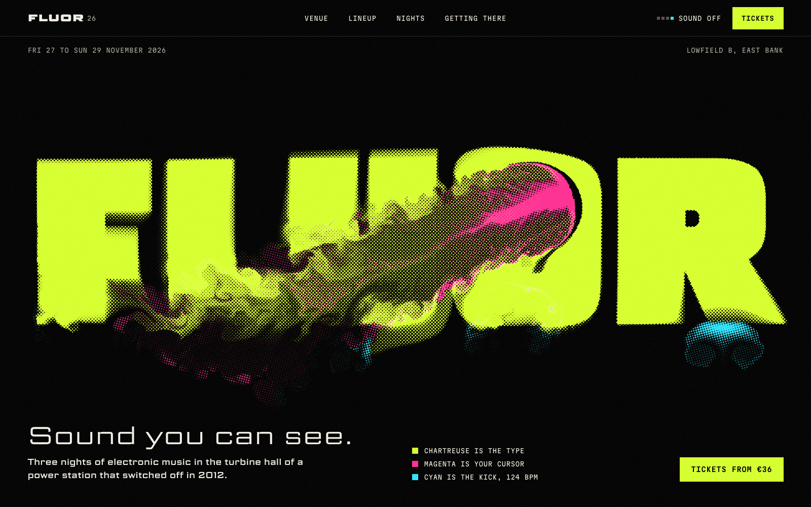
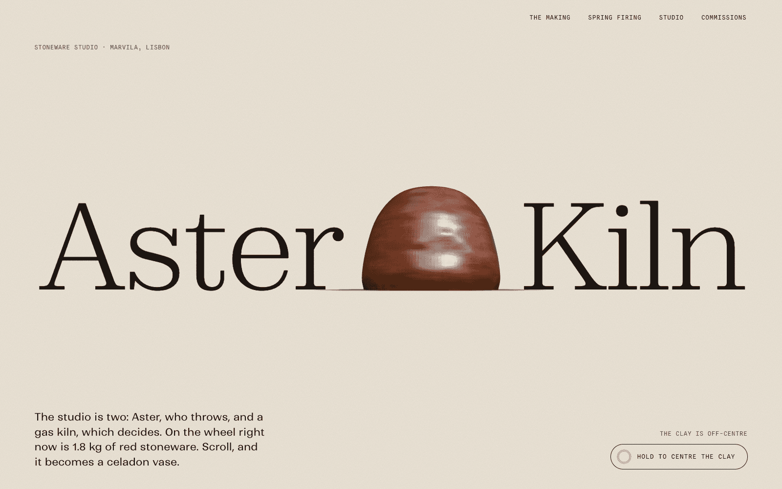
Kinetic Type: when the letters are the moving image
A style for festivals, labels and studios with a strong name and few images, where the type does the work photography usually does. How it moves, what it is built from, and how to keep it readable.
Palette and type
Palette
- Ground#C8F31D
- Surface#B8E00F
- Ink#1A0533
- Muted#60642A
- Accent#2B00FF
- Accent 2#FF2E88
- Line#A5C321
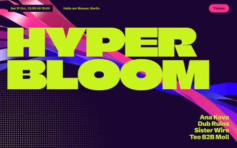
Acid rave
Lime as the ground, not the accent: the page itself is the flyer. Deep violet ink keeps text crisp; electric blue and pink fight for attention on purpose.
- Ground#FF5B14
- Surface#FF7433
- Ink#1A0A00
- Muted#461904
- Accent#1B12E0
- Accent 2#FFF0D6
- Line#D14B10
Solar flare
The whole page is the accent: blazing orange ground, near-black ink, a cobalt that vibrates against it, and cream for the rare highlight.
- Ground#1D3EBF
- Surface#2A4BD0
- Ink#F3F0E6
- Muted#BBC2DC
- Accent#FFC93C
- Accent 2#FF7AA2
- Line#5069C8
Cobalt tile
Painted-tile cobalt as the ground, whitewash ink, and the yellow and pink of a market stall.
Type
Kinetic Type
Unbounded
Letters are the moving image. Wide, loud display type that scatters, scrolls and reacts; colour fields do the rest.
Familjen Grotesk
Unbounded / Familjen Grotesk / 0123456789
Space Mono
- Layout
- Type-first compositions: wordmark heroes, full-bleed marquees, giant figures; few images, strong section colour changes via data-theme.
- Motion
- Particle wordmark, char reveals, velocity-aware marquees, split-hover on every link, magnetic round buttons; theme flow between sections.
Try it with a prompt
“A type and poster festival in an old tram depot. The name in particles, the programme as a marquee.”
Start building in Kinetic TypeIn most websites, type labels the pictures. In Kinetic Type, the type is the picture. Wordmarks built from thousands of particles. Names that scatter when the cursor passes and re-form when it leaves. Marquees that speed up when you scroll faster. Whole sections that switch colour as you arrive.
It is the loudest style in the catalogue, and the one that needs the most discipline.
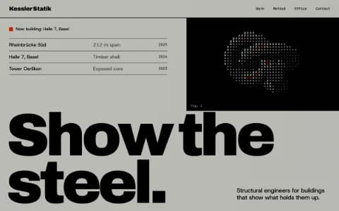
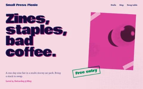
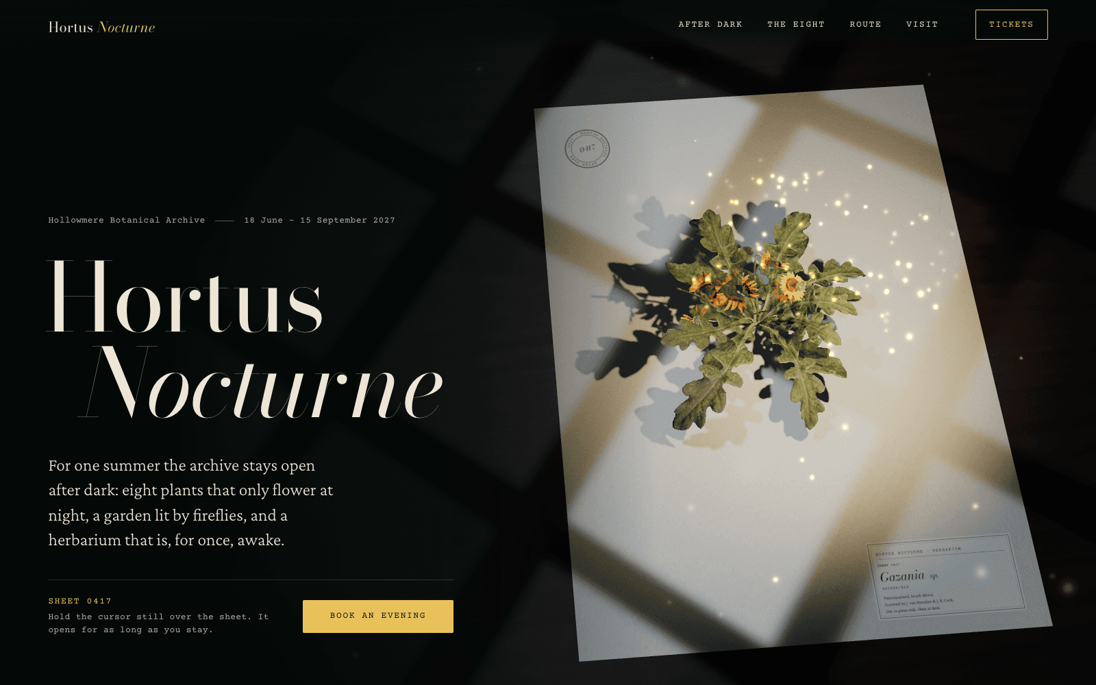
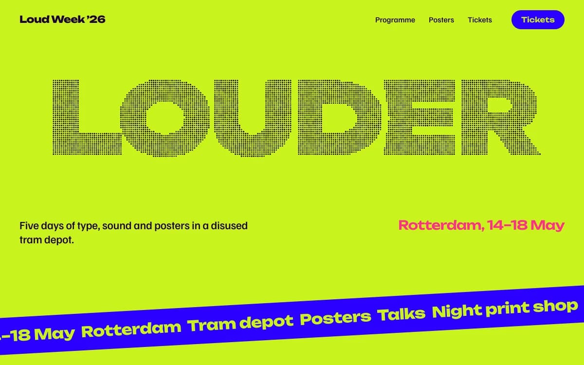
The specimen, for a fictional week of type and posters in a disused tram depot, shows the core moves: a single word in halftone filling the width, two plain lines of practical information, and a tilted marquee band running the programme across the page.
Where it comes from
Kinetic typography was born in film titles. In the late 1950s Saul Bass made the opening credits of Vertigo, North by Northwest and Psycho into short films where letters moved, split and slid with the music. Television idents and music videos took it further.
On the web it became possible at scale once browsers could animate type smoothly and variable fonts let a single letter change width and weight on the fly. Kinetic Type brings that cinema to the page, driven by the visitor instead of a timeline.
What defines it
| Element | The Kinetic Type choice | Why |
|---|---|---|
| Hero | A wordmark or one word, filling the screen | The name is the brand's strongest image |
| Type | Wide, loud display faces; one grotesk with character for text | Shapes must hold up when they move |
| Motion | Particle wordmarks, character reveals, velocity marquees, split hovers | Every interaction answers the visitor |
| Colour | Big flat fields that change between sections | Colour does what imagery usually does |
| Images | Few, or none | Type carries the page |
| Buttons | Round, magnetic, few | One clear action per screen |
Palettes
| Palette | Ground | Ink | Accent | Character |
|---|---|---|---|---|
| Acid rave | #C8F31D | #1A0533 | #2B00FF | Lime as the ground: the page is the flyer |
| Solar flare | #FF5B14 | #1A0A00 | #1B12E0 | The whole page is the accent; cobalt vibrates against it |
| Cobalt tile | #1D3EBF | #F3F0E6 | #FFC93C | Painted-tile blue with whitewash ink and market-stall yellow |
These are hot palettes. Each still keeps a dark or pale ink that passes contrast checks on its ground, so information stays readable when everything else is loud.
Type
- Display: Unbounded. An extended, rounded-square face. Loud, digital and confident, and its wide shapes survive being broken into particles.
- Text: Familjen Grotesk. A grotesk with odd, lovable details that works for both headings and paragraphs.
- Mono: Space Mono. A geometric mono with a 1970s science-fiction flavour, for dates, labels and specs.
Motion and depth
This is where Kinetic Type lives. The building blocks:
- Particle type: letters rebuilt from thousands of particles that swarm in and settle, then part around the cursor.
- Character reveals: headlines that arrive letter by letter, timed to scroll.
- Velocity marquees: bands of names that speed up and slow down with the scroll.
- Split hovers: links whose letters slide apart on hover.
- Ink trails: the cursor leaves a trail of pigment that bleeds and fades.
- Theme flow: the page colour changes as each section arrives.
The rule that makes it work: one moving idea per screen. The guide to accessible motion explains how to keep it comfortable for everyone.
A typical page, section by section
Every site is designed for its own idea, so treat this as a sketch, not a template. A page in this style often runs like this:
- The wordmark hero. The name built from particles or set huge, and nothing else competing.
- A marquee band of the programme, the roster or the products, running with the scroll.
- The index. Work or acts as a list of names in big type; each name splits or moves on hover.
- Figures at scale: dates, days, counts that matter, counted up as they arrive.
- The call to action on its own colour field, with one round magnetic button.
- A footer that sets the name again, at the other extreme of the type's width or weight.
Who it suits
| A strong fit | A poor fit |
|---|---|
| Festivals, club nights and events | Professional services that need to feel calm |
| Record labels and musicians | Sites where most visitors come to read |
| Design studios and agencies | Products sold on photography |
| Brands with a strong name and few images | Healthcare and finance |
More on these in the use cases for event websites and agency websites.
How it goes wrong
- Everything moves. If body copy animates too, nothing reads. Kinetic sites keep paragraphs still.
- Motion without a trigger. Type that loops forever on its own becomes wallpaper. The best kinetic moments answer the cursor or the scroll.
- Too many effects. Particles, scrambles, marquees and trails all at once is a demo reel, not a site. Pick a grammar.
- Flashing. Rapid colour changes can harm people with photosensitive conditions. Nothing on a Laarpi site flashes more than three times a second.
- Broken wordmarks on phones. A wide display face at screen width is the first thing to overflow. Laarpi fits single-word headlines to the width and checks them at six screen sizes.
Making it yours
- "A type and poster festival in an old tram depot. The name in particles, the programme as a marquee."
- "A record label with three artists. Each artist's name moves at their tempo."
- "A design studio called LOUD. The site should be exactly that, and still easy to contact."
For the same energy on a club flyer, see Acid Rave. For type in print form, Riso Zine. For type that stands still and still hits hard, Swiss Brutal. How the motion is planned and checked is covered on animated websites.