How to build a portfolio that gets you hired
How portfolio reviewers actually read, what to show for each creative discipline, how to write case studies that prove your judgement, and how to make the site itself part of the argument.
A portfolio isn't an archive of everything you've made. It's an argument for one thing: that you're the person to hire for a particular kind of work. Every project you include, every word you write and the site itself either supports that argument or weakens it.
This guide is about building a portfolio that gets you hired: how reviewers actually read portfolios, what to show in different disciplines, how to write case studies that prove your judgement, and how to make the site part of the argument without getting in the way of it.
How reviewers actually read a portfolio
Hiring managers, creative directors and recruiters review portfolios between other work. The pattern is consistent across disciplines, and it shapes everything else in this guide:
- The skim. They open your site, read your one-line description, and look at the first screen of work. They're deciding whether to look further.
- The open. They click one project, usually the first, or the one that looks most like the job.
- The read. If that project holds up, they read it properly, and then perhaps another.
- The shortlist. They remember one or two things about you. Make sure those are the right things.
What follows: your first screen and your first project carry most of the weight. A brilliant fifth project rarely rescues a weak first one.
Choose the projects for the job you want
Start from the role, not from your archive. Read the job description, or think about the clients you want, and pick the projects that prove you can do that work.
- Three to six projects, in depth. Fewer and deeper beats more and shallower.
- Strongest first. Or most relevant to this role. Ideally both.
- Range only where it's relevant. A brand designer applying to a packaging studio should lead with packaging, not with an app.
- Cut ruthlessly. If you hesitate about a project, it goes in the index or out entirely.
What reviewers look for, by discipline
Different disciplines hire on different evidence. Here is what tends to matter most for each:
| Discipline | What to show | What reviewers want to see |
|---|---|---|
| Brand and graphic design | Identity systems in use, not just logos | Range of applications, typography, the idea behind the system |
| Product and UX design | Problems, decisions, trade-offs, results | How you think: research, constraints, iteration, what shipped |
| Motion design | Short, well-edited pieces that start fast | Timing, restraint, how motion carries meaning |
| Illustration | A consistent voice, then range within it | Personal style, commercial application, finished pieces |
| Architecture | Drawings, models, built work, process | Spatial thinking, technical understanding, your role |
| Creative development | Live work, source where possible | Craft, performance, how you solved the hard part |
| Photography | Edited series, not single frames | A way of seeing, consistency, sequence |
For the specifics of architecture and photography sites, see architecture portfolios and photography portfolios.
Write case studies that prove judgement
Most portfolio case studies are image dumps with a paragraph of context. The ones that get people hired show how the designer thinks. A structure that works:
- One line of context. Client or company, year, your role, the team.
- The problem. What needed to change, and why it was hard. Two or three sentences.
- The constraints. Budget, time, technology, brand, regulation. Constraints are where judgement shows.
- The key decisions, each with the image that shows it. "We dropped the onboarding tour and put the first task on the empty state instead, because…" One decision per image, captioned.
- What you tried that didn't work. Briefly. It shows you iterate.
- The result. Real outcomes only, approved for sharing. If you don't have numbers, describe what changed: "Support tickets about checkout stopped being the top category."
- Credits. Name the team.
Writing tips
- Write for skimmers. Short paragraphs, clear headings, captions that make sense on their own.
- Use "I" for what you did and "we" for what the team did, and be precise about which is which.
- Cut adjectives. "A bold, innovative rebrand" tells a reviewer nothing. Show the before and after.
- Never invent results, quotes or clients. Reviewers check, and the industry is small.
Make the site part of the argument
Your portfolio site is the first piece of your work a reviewer sees, before any project. For design and creative roles especially, a template that looks like everyone else's is a missed chance.
That doesn't mean making it complicated. It means making choices:
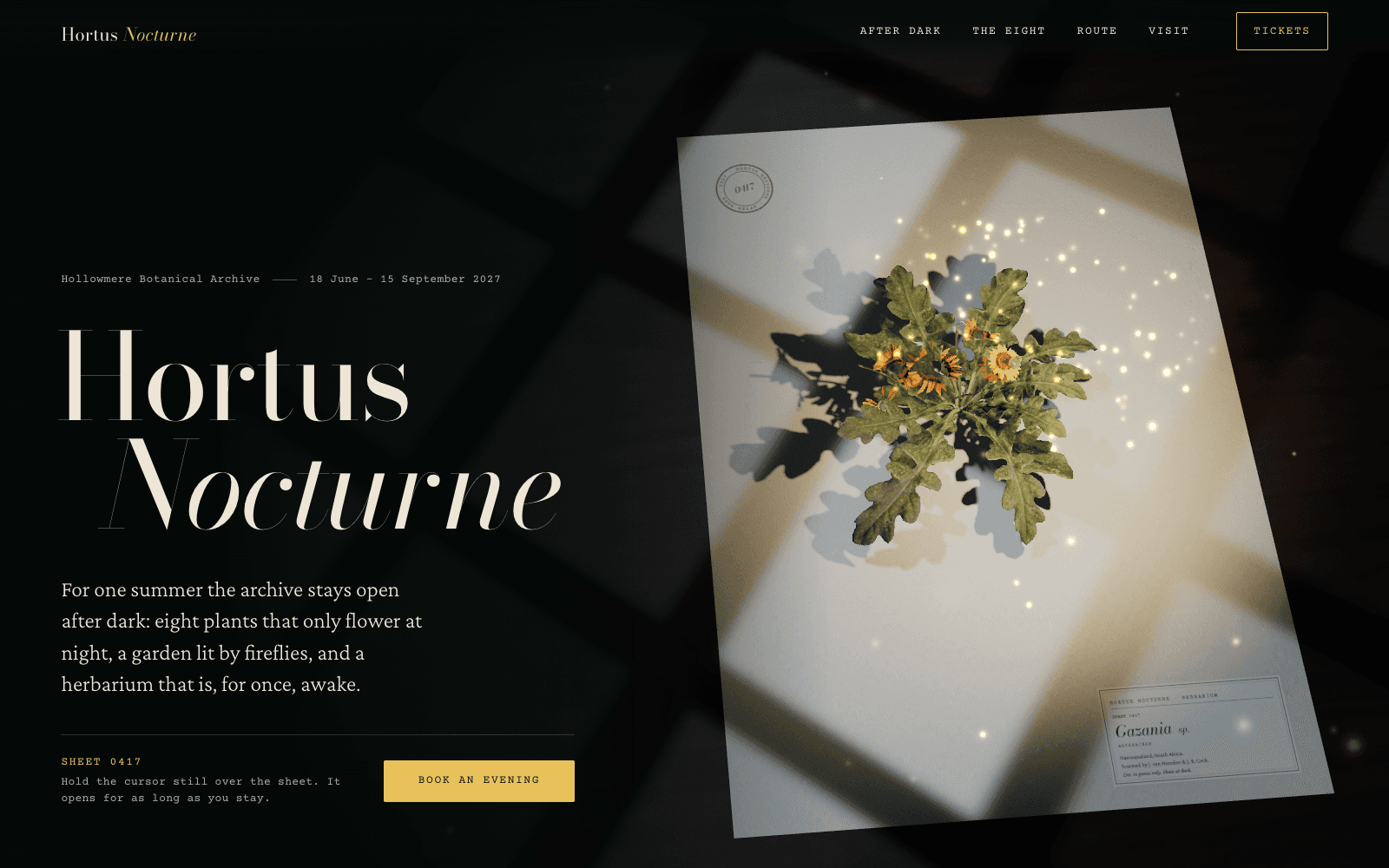
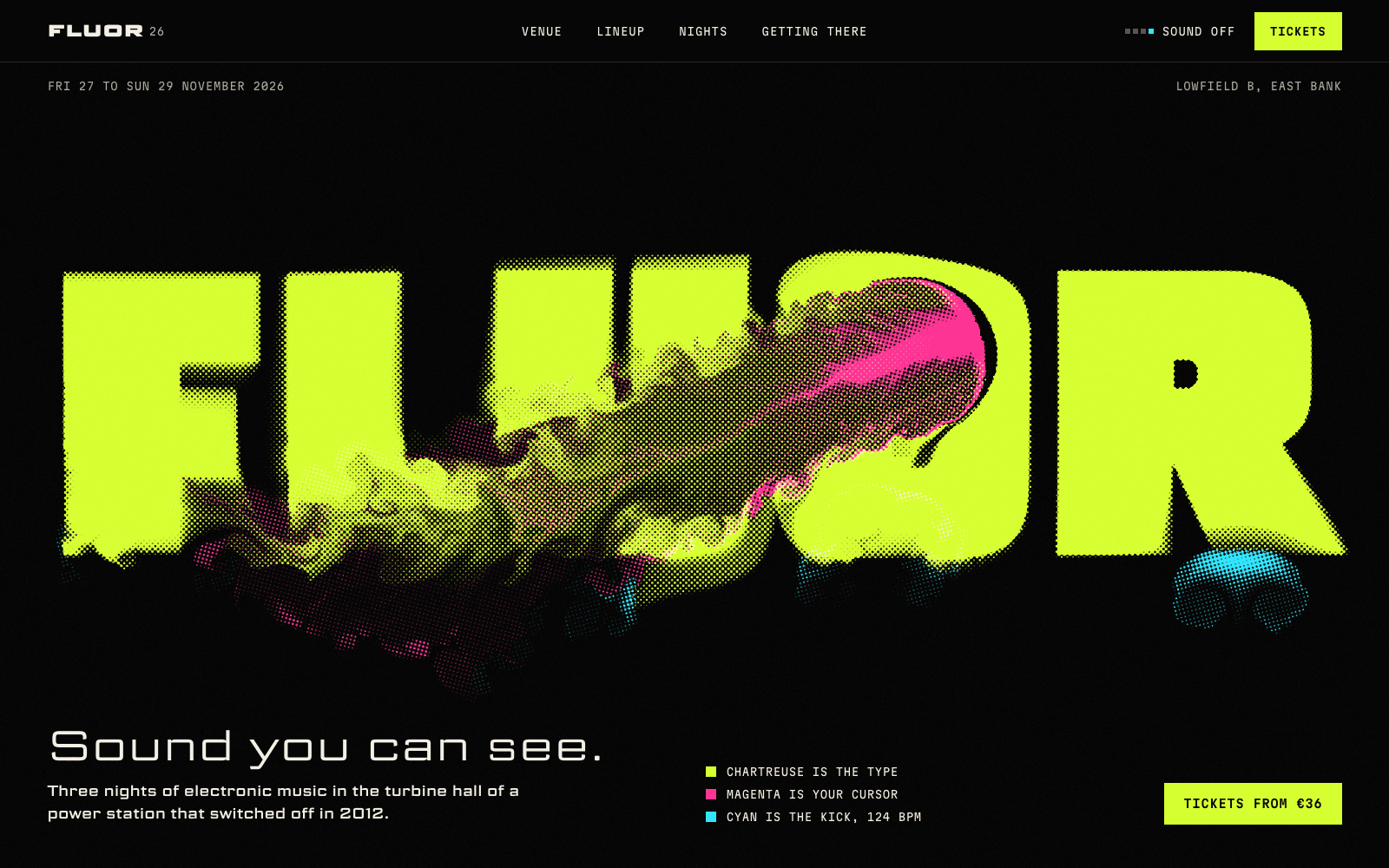
- Type with a voice. The single fastest way to look different from every template is to stop using the same two or three typefaces as everyone else. Our guide to choosing fonts that aren't Inter has pairings and reasons.
- A layout with a point of view. A real grid, considered scale, white space that does work.
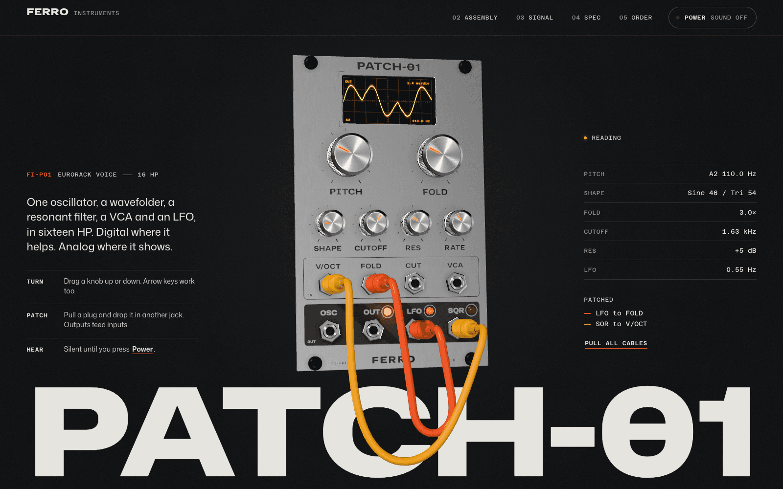
- One signature detail that rewards a second look, tied to what you do.
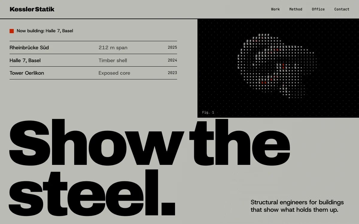
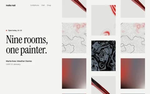
A strict, information-first look such as Swiss Brutal suits designers whose work is systematic: the site itself demonstrates the grid discipline the reviewer is hiring for.
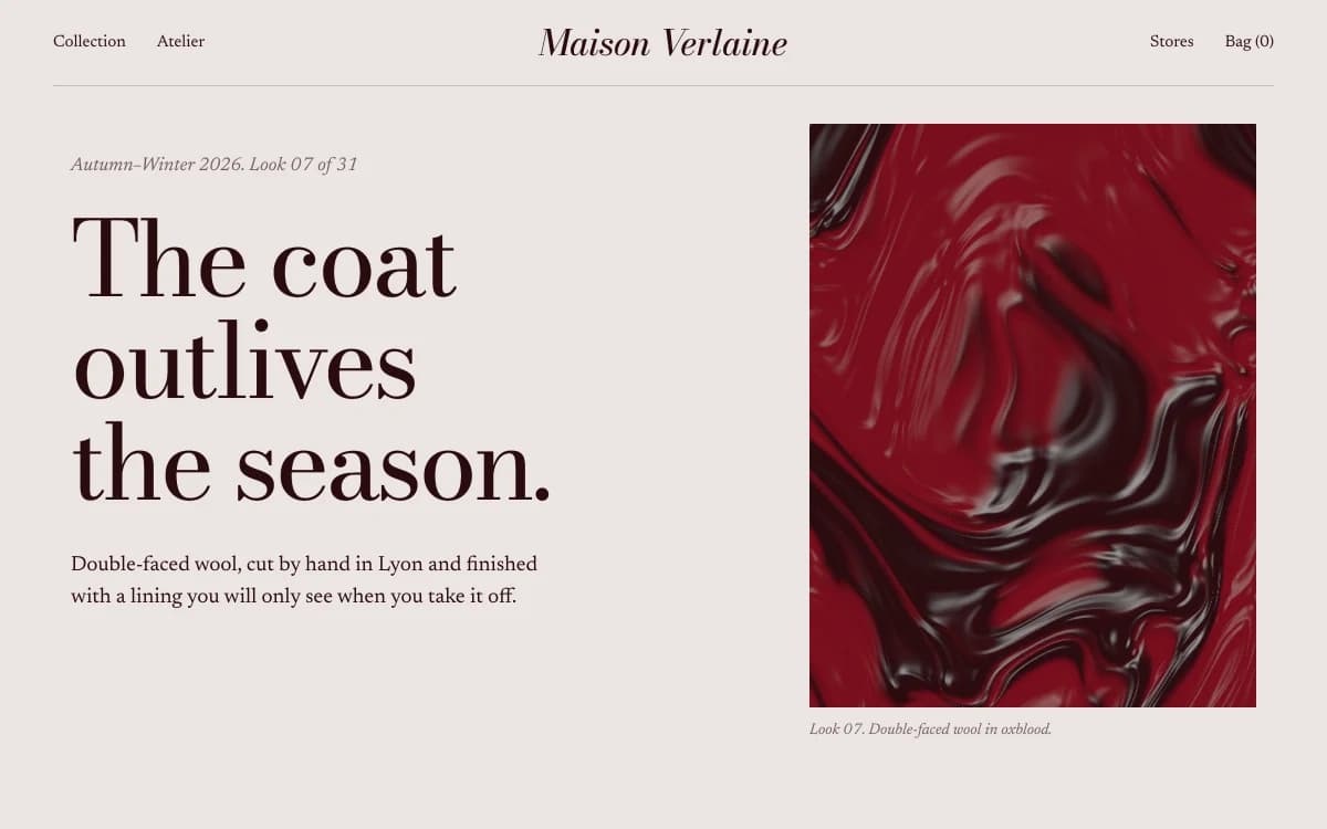
A magazine-spread look such as Editorial Luxe suits art directors and fashion designers: big type, tall images, captions set like print.
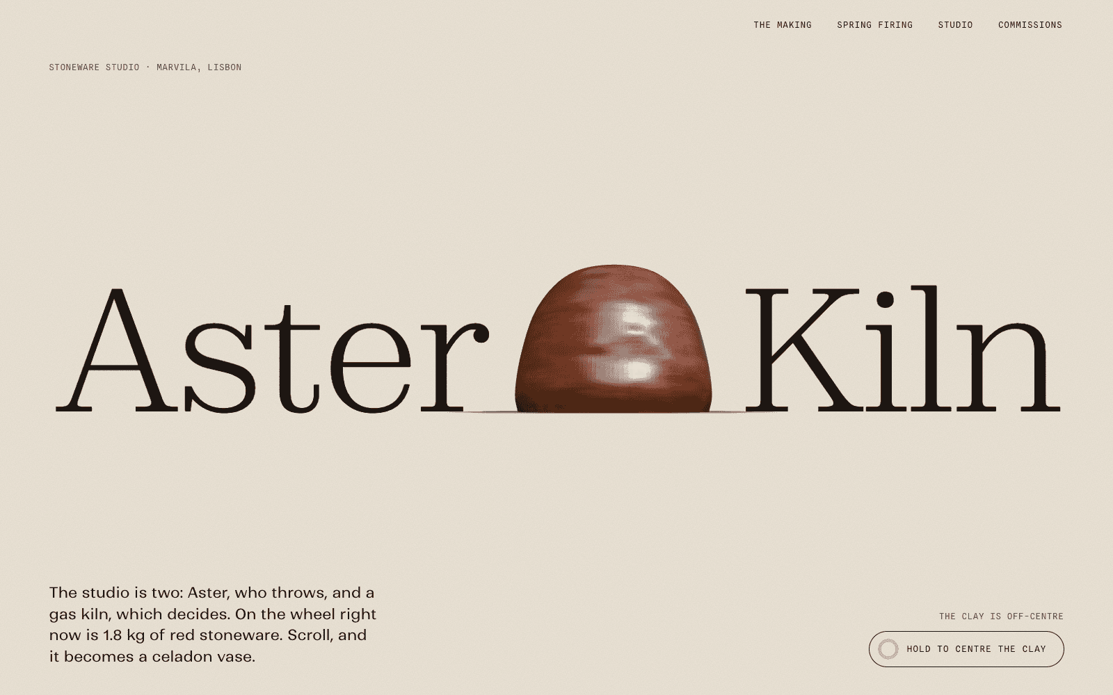
Aster & Kiln, a showcase site made by the Laarpi team with Laarpi's library and process for an imagined ceramics studio, shows another approach: the process is the portfolio. Scroll throws, trims, glazes and fires a vase, and then the finished pieces appear at their true relative sizes. For a maker, showing how the work is made can be the strongest case study of all.
The limit: the work must never wait for the effect. If a reviewer has to sit through an intro animation to find your projects, you've lost the skimmers. And anything that moves needs a calm version for visitors who ask their device for reduced motion; our guide to accessible motion shows how.
The first screen
Treat the first screen of your portfolio as the most important design problem in it. It needs:
- Your name, and a sentence about what you do, specific enough to be useful: "Product designer working on tools for scientists" beats "Designer & thinker".
- Work, visible. The first project, or a selection, without scrolling or with one scroll at most.
- A way in. Clear links to projects, and an obvious way to contact you.
The practical details that cost you the job
| Mistake | Fix |
|---|---|
| Slow loading images | Export at web sizes; load the first image straight away |
| Broken on a phone | Many reviewers first open your link from an email on a phone; compose for it |
| Password-protected everything | Protect only what you must; show the rest |
| No email address | Put a plain email address on every page |
| Out-of-date "currently at" | Check your about page every time you apply |
| Motion that can't be turned off | Respect reduced motion with a composed, still version |
| Generic domain | Use your own domain once you send the link out widely |
Link to the right project
When you apply, don't just send your home page. Link straight to the project most relevant to the role, and mention why in one line. It does the reviewer's first step for them. A portfolio with a page per project makes this easy.
Keep it current, lightly
You don't need to update your portfolio every month. You need to update it when you're about to look for work, and when you finish something that should replace a weaker project. A good habit: after each significant project, write the case study while you still remember the decisions, even if you don't publish it yet.
Building it with Laarpi
Laarpi is a coding agent that builds portfolio sites from a description. You describe your practice and the work you want to be hired for; it asks the questions that change the result, such as whether the site is for studios hiring or clients commissioning; it writes a plan you can edit, then builds the site in real code, checks it at six widths, and has a separate art director score it on eight criteria before revising it at least twice on a Finish. It never invents projects, clients or results; where your words are missing, it leaves clearly marked copy for you to replace. You direct changes by pointing at anything on the page, and you can publish to your own domain on a paid plan. Start with the portfolio website page to see how it works.