Botanical Archive: a natural history drawer you can open
A style for gardens, museums, perfumers and anyone with a collection to show. How the logic of plate, label and ledger becomes a website, the type and palettes behind it, and what to prepare.
Palette and type
Palette
- Ground#E3E6D8
- Surface#D5D9CB
- Ink#1E2B1F
- Muted#5B6558
- Accent#7B2E52
- Accent 2#B07A12
- Line#BCC1B3
Herbarium
Pressed-specimen paper, mulberry for labels and links, ochre for annotations. A natural-history drawer, not a wellness brand.
- Ground#DCE7D2
- Surface#CED9C5
- Ink#10261A
- Muted#536657
- Accent#1F6B3A
- Accent 2#E8553D
- Line#B3C0AD
Chlorophyll
Pale leaf ground with a forest ink; the green accent stays inside the family, and a single tomato red marks the thing to click.
- Ground#ECEFEB
- Surface#DDE1DD
- Ink#1C2321
- Muted#636866
- Accent#2F5D62
- Accent 2#B23A48
- Line#C2C6C3
Ink wash
Cool rice-paper ground, sumi ink, a slate-teal wash and a seal-stamp red used once per page.
Type
Botanical Archive
Cormorant Garamond
A natural-history drawer: specimen captions, calligraphic serif, herbarium paper and contour maps.
Instrument Sans
Cormorant Garamond / Instrument Sans / 0123456789
IBM Plex Mono
- Layout
- Catalogue logic: specimen plates, ledgers of names and dates, captions with provenance, wide margins.
- Motion
- Mask reveals on plates, topo-line fields, slow chapters; nothing bouncy.
Try it with a prompt
“A Victorian fern collection, newly digitised. Each sheet with its label, and a map of where it was found.”
Start building in Botanical ArchiveBotanical Archive opens a natural-history drawer. Specimen plates with captions that record where each thing was found. Ledgers of names and dates. A calligraphic serif on paper the colour of an old herbarium sheet. A contour map drifting slowly in the background.
It is calm, scholarly and quietly beautiful, the way a good museum is.
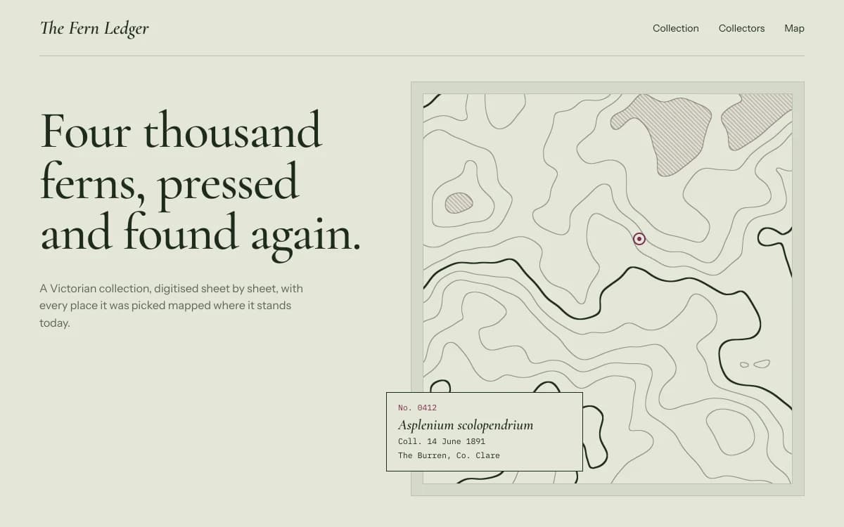
The specimen, for a fictional collection of digitised Victorian fern sheets, sets "Four thousand ferns, pressed and found again." in light Cormorant Garamond beside a topographic map with a single marked find, and pins a catalogue label in the corner: number, Latin name, date, place.
Where it comes from
Since the sixteenth century, botanists have pressed plants flat, mounted them on paper and labelled them: species, locality, date, collector. Herbaria hold millions of these sheets, and their visual language, the mounted specimen, the handwritten label, the accession number, is one of the most beautiful in science.
Natural-history plates, survey maps and library catalogues share the same logic: show the thing, say exactly what it is and where it came from, and file it in order.
What defines it
| Element | The Botanical Archive choice | Why |
|---|---|---|
| Images | Specimen plates with wide margins | Each item gets its own sheet |
| Captions | Provenance: name, date, place, number | Precision is the romance |
| Lists | Ledgers of names and dates | Catalogue logic makes a collection browsable |
| Type | A calligraphic serif, a restrained sans and a mono for numbers | Scholar's hand, printer's text, archivist's numbers |
| Background | Contour lines and paper texture | Field survey and herbarium sheet |
| Pace | Slow chapters, nothing bouncy | Time to look |
Palettes
| Palette | Ground | Ink | Accent | Character |
|---|---|---|---|---|
| Herbarium | #E3E6D8 | #1E2B1F | #7B2E52 | Pressed-specimen paper, mulberry for labels, ochre for annotations |
| Chlorophyll | #DCE7D2 | #10261A | #1F6B3A | Pale leaf and forest ink, one tomato red to click |
| Ink wash | #ECEFEB | #1C2321 | #2F5D62 | Rice paper, sumi ink and a seal-stamp red |
The herbarium palette's rationale says it best: a natural-history drawer, not a wellness brand.
Type
- Display: Cormorant Garamond. A calligraphic Garamond whose light weights at display sizes feel couture.
- Text: Instrument Sans. A crisp neo-grotesk with a width axis, restrained enough to let the plates speak.
- Mono: IBM Plex Mono. An engineered mono for accession numbers, coordinates and dates.
Motion and depth
Nothing bounces. Plates unmask as they enter. Images resolve from a coarse, palette-tinted mosaic into the full photograph, like a scan developing. Behind key statements, an animated topographic survey draws contour lines of slowly shifting terrain, with heavier index contours and summits hatched in the accent colour.
Story chapters unfold slowly beside a fixed plate, so the visitor reads the label while looking at the specimen.
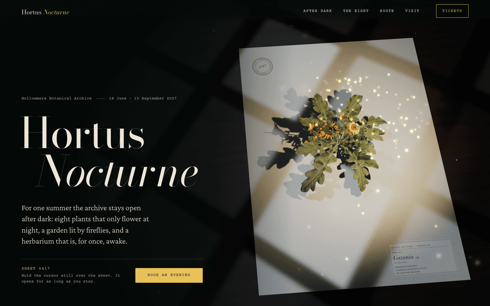
The night-garden exhibition in the community is the dramatic, after-dark relative of this style: a real photoscanned flower on a herbarium sheet that stands up and blooms only while the visitor holds still, an accession ledger of eight night-flowering species, and a garden plan whose route draws itself as you scroll.
A typical page, section by section
Every site is designed for its own idea, so treat this as a sketch, not a template. A page in this style often runs like this:
- The specimen plate. The opening statement beside one item mounted with its label.
- The introduction, a short paragraph on the collection and why it matters.
- The ledger: names, dates, places and numbers in rows, each opening its plate.
- Drifting plates, a selection of the most beautiful items at different heights.
- Chapters: the story of the collection, or the route through the garden, beside a contour map.
- Questions, split: visiting, access, research requests, in a two-column layout.
Who it suits
| A strong fit | A poor fit |
|---|---|
| Botanical gardens, museums, libraries | Fast-moving consumer launches |
| Nurseries, florists, seed companies | Nightlife and loud events |
| Perfumers and apothecaries | Brands that need to look futuristic |
| Field guides, research projects, exhibitions | Sites with no collection to show |
| Nature photographers with a catalogue of work | Portfolios that need to feel fast and commercial |
More on these in the use cases for event websites and photography portfolios.
How it goes wrong
- Wellness beige. Soft greens and a script font turn an archive into a spa. Keep the rigour: numbers, dates, provenance.
- Clip-art leaves. Decorative leaf illustrations scattered in corners. Use real specimens or none.
- Plants made of primitives. A 3D flower built from cylinders and ellipses is exactly what Laarpi refuses to ship. Use a real scan, or let contour lines and type carry the page.
- Light serif at text sizes. Cormorant's light weights are for display. Body text goes in the sans.
- Captions that say nothing. "Beautiful fern" is not a label. "Asplenium scolopendrium, collected 14 June 1891" is.
What to prepare
- The collection: images of each item, ideally consistent in light and background.
- The catalogue data: names, dates, places, numbers. Even a spreadsheet is enough. If you want visitors to search or save items, a website backend can hold the collection in a table.
- One sentence on why the collection matters. That becomes the opening statement.
Making it yours
- "A Victorian fern collection, newly digitised. Each sheet with its label, and a map of where it was found."
- "A small perfumer. Each scent as a specimen: its plants, where they grow, and when they were harvested."
- "A seed library. People browse varieties and reserve packets for spring."
For warmth instead of scholarship, see Analog Warmth. For the white-wall version of a collection, Gallery White Cube. For nature in motion, Organic Biomorph. On picking a serif with character, read choosing fonts that aren't Inter.