Gallery White Cube: the site is a wall, the work hangs on it
A style for painters, photographers and galleries who want the work to do all the talking. How the white-wall approach works on screen, the type and palettes behind it, and how to prepare the hang.
Palette and type
Palette
- Ground#F4F4F1
- Surface#E3E3E0
- Ink#000000
- Muted#6B6B6A
- Accent#D7261E
- Accent 2#5B6B7A
- Line#C3C3C1
Gallery white
White-cube walls, true black for type, and the red of a museum's sold dot. Nothing else competes with the work.
- Ground#E6F0F4
- Surface#D7E2E6
- Ink#0B2233
- Muted#586A77
- Accent#E8392B
- Accent 2#3F8FA6
- Line#BAC7CD
Arctic signal
Ice-white with a deep polar-navy ink. A signal-flare red is the only warm thing on the page.
- Ground#E5E3DC
- Surface#D7D5CE
- Ink#1A1A18
- Muted#61605D
- Accent#D80700
- Accent 2#00599C
- Line#BCBBB5
Newsprint red
Grey newsprint, press-black ink, masthead red and a wire-service blue. Reads like a paper with something to say.
Type
Gallery White Cube
Instrument Serif
The site is a white wall and the work hangs on it. Restraint everywhere except the images.
Switzer
- Layout
- Huge margins, small type, images at true proportions, wall-label captions, one red dot of accent per page.
- Motion
- Almost still: fades and mask reveals, draggable WebGL wall for the archive, pixel reveals on enter.
Try it with a prompt
“A painter's site. Nine rooms, one show. Each room is a series.”
Start building in Gallery White CubeGallery White Cube is built on one idea: the site is a white wall, and the work hangs on it. Margins are huge. Type is small and exact. Images keep their real proportions. Captions read like wall labels. There is one red dot on the page, the kind a gallery uses to mark a sold piece.
Everything is restrained, except the work.
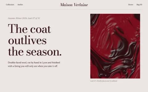
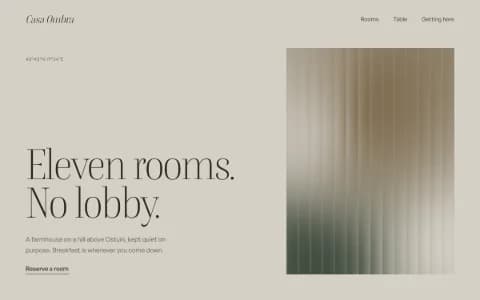
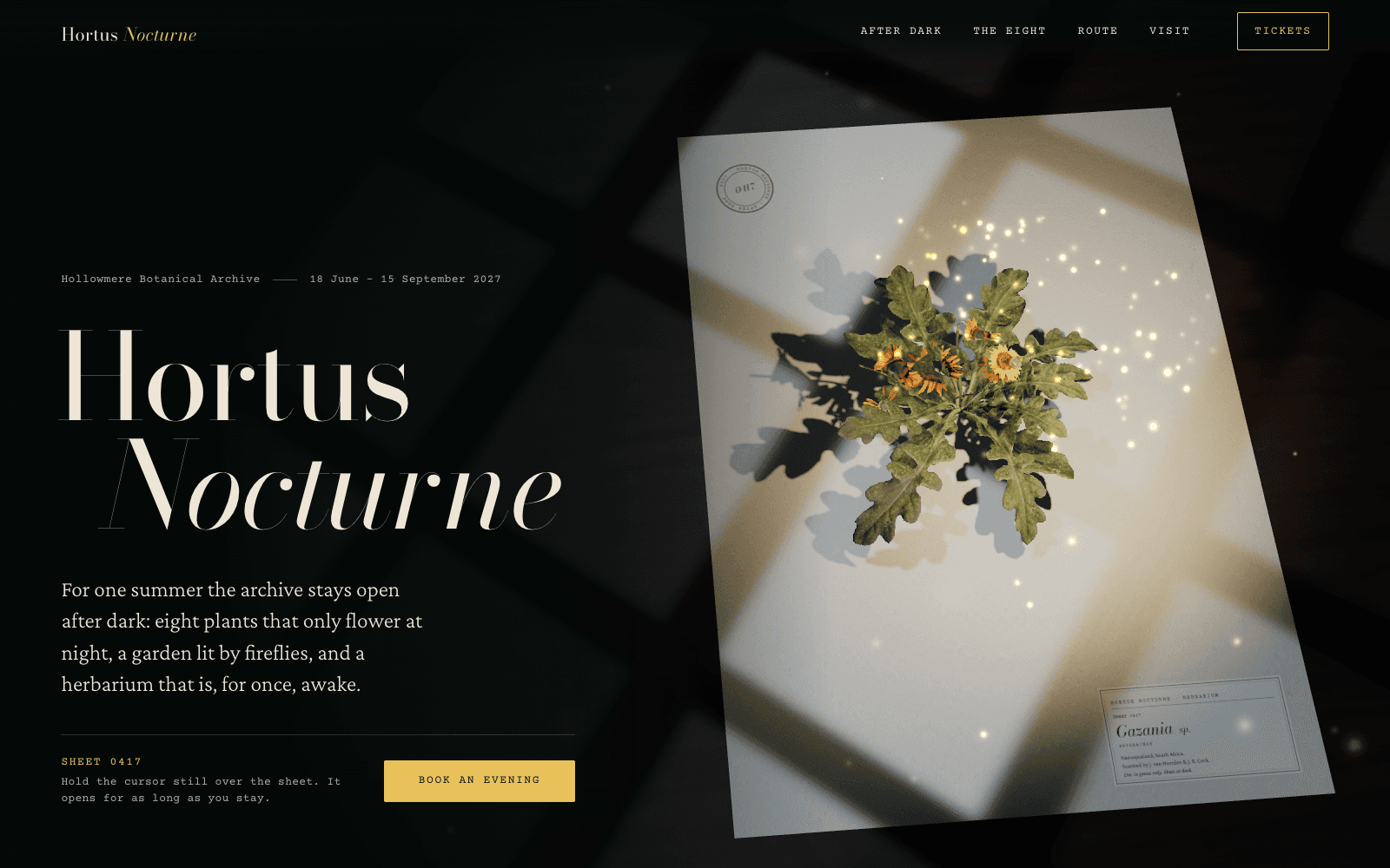
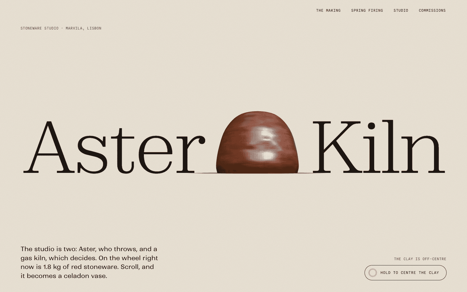
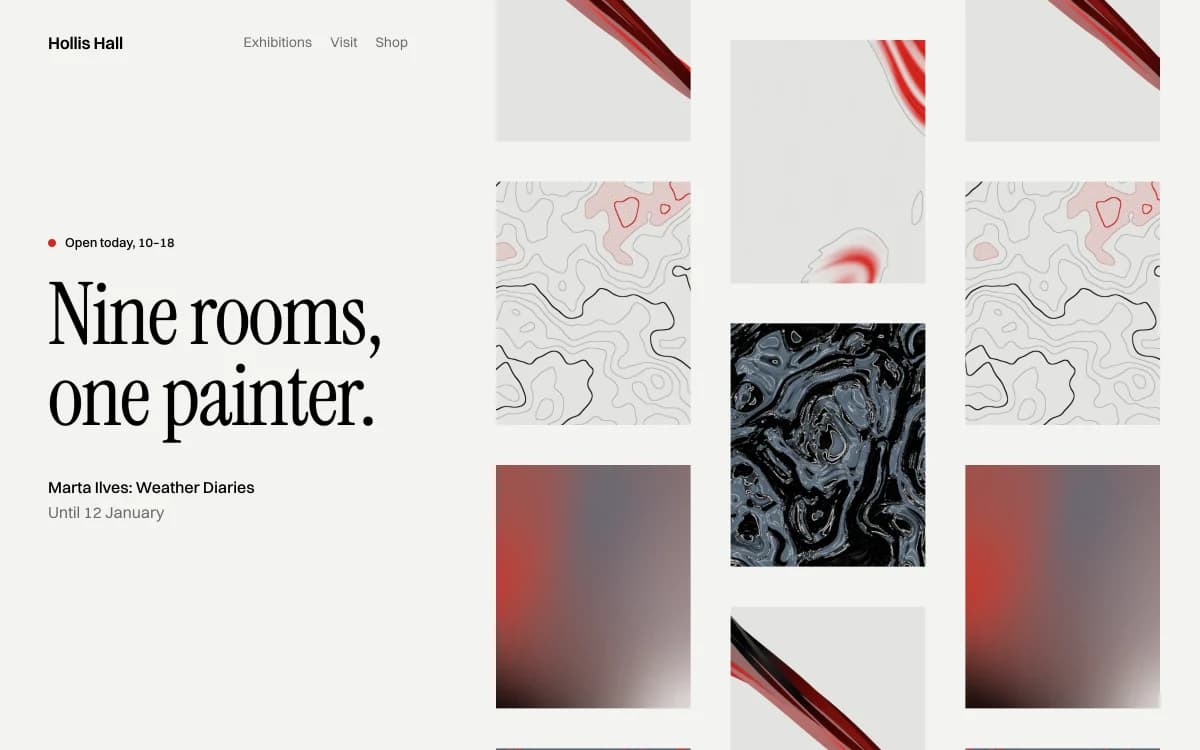
The specimen, for a fictional show of nine rooms by one painter, puts a small serif title and opening dates on the left and lets a staggered wall of images fill the rest of the screen.
Where it comes from
The "white cube" is the modern gallery: white walls, even light, nothing on display but the art. The critic Brian O'Doherty named and dissected it in his 1976 essays Inside the White Cube, arguing that the neutral room is itself a strong frame.
Websites for artists often fight the work with heavy navigation, uniform crops and decorative type. Gallery White Cube takes the gallery's lesson: a neutral, carefully proportioned frame makes the work look more important.
What defines it
| Element | The Gallery White Cube choice | Why |
|---|---|---|
| Ground | Gallery white, ice white or newsprint grey | A neutral wall |
| Images | True proportions, never cropped to a uniform grid | Cropping changes the work |
| Type | Small titles in a narrow serif; wall-label captions in a Swiss grotesk | Type supports, never competes |
| Space | Huge margins, a few images per screen | Air gives each piece its own room |
| Accent | One red dot, used once per page | The sold dot: one signal, nothing else |
| Archive | A draggable wall or a ledger of works | Browsing as walking through a show |
Palettes
| Palette | Ground | Ink | Accent | Character |
|---|---|---|---|---|
| Gallery white | #F4F4F1 | #000000 | #D7261E | White walls, true black, the red of a sold dot |
| Arctic signal | #E6F0F4 | #0B2233 | #E8392B | Ice white with polar navy; one flare of red |
| Newsprint red | #E5E3DC | #1A1A18 | #D80700 | Grey newsprint, press black and masthead red |
Type
- Display: Instrument Serif. Narrow and high-contrast, used small for titles. It looks like a wall title, not a headline.
- Text: Switzer. A Swiss-style grotesk from Fontshare that is neutral without being Helvetica. It sets captions, dates and media lines.
The pairing matters. Instrument Serif with the web's most common sans-serif is one of the most overused combinations of recent years, and Laarpi's lint flags it.
Motion and depth
Almost nothing moves. Images fade or unmask as they enter, and resolve from a coarse mosaic to the full picture, like a print developing.
The one moment of play is the archive: an endless wall of images you can throw in any direction, where the wall pulls back and bows as it moves and each picture slides inside its frame. It turns browsing into walking through a show. With reduced motion switched on, images simply appear and the wall renders as a single composed still, with every work also listed in the page as real text and links.
A typical page, section by section
Every site is designed for its own idea, so treat this as a sketch, not a template. A page in this style often runs like this:
- The poster frame. Name, current show or series and dates, set small, with one work hung large beside it.
- The statement, a short paragraph about the practice, in the text face.
- The wall. Works at true proportions with wall-label captions, a few per screen.
- The rail, a horizontal sequence for a series that should be seen in order.
- The ledger, exhibitions, editions or projects as rows: year, title, place.
- The footer: representation, contact and the name, quietly.
Who it suits
| A strong fit | A poor fit |
|---|---|
| Painters, sculptors and illustrators | Brands with no strong imagery |
| Photographers with a body of work | Events that need urgency |
| Galleries, curators, small museums | Stores with large catalogues |
| Architects with strong photography | Anyone who needs the site to shout |
More on these in the use cases for photography portfolios and architecture portfolios.
How it goes wrong
- Empty without a reason. Minimalism with weak work is just empty. The style depends on strong images, and lots of them.
- Uniform crops. A neat square grid looks tidy and destroys compositions. Keep proportions true.
- Tiny type that fails contrast. Small captions need full-strength ink. Light grey on white fails readability checks.
- Hidden navigation. Minimal does not mean mysterious. Visitors must always know how to reach the work, the info and the contact.
- Red everywhere. The sold dot works because it is rare. One per page.
What to prepare
A white-wall site is a hang, and a hang needs a checklist:
- Images at full resolution, uncropped, with colour you trust. They are shown at their true proportions.
- Wall-label details for each work: title, year, medium, dimensions, and whether it is available.
- Series or project texts, short, one per body of work.
- A plain information page: biography, exhibitions, representation and contact. Curators look for it first.
With these in hand, the agent can lay out the archive as a wall to drag through or a ledger to scan, and keep the captions exact.
Making it yours
- "A painter's site. Nine rooms, one show. Each room is a series."
- "A documentary photographer. Long projects, each with a short text. An archive I can drag through."
- "A small gallery with four shows a year. Current show first, then the archive."
For a portfolio that also wins work, read a portfolio that gets you hired and see the portfolio website use case. For more drama around the images, Editorial Luxe. For a harder grid, Swiss Brutal. For calm with warmth, Quiet Luxury.