Editorial Luxe: a magazine spread you can scroll
A style for fashion houses, photographers and publishers who would rather be read than skimmed. What makes a site feel like a magazine spread, the type and palettes behind it, and where it goes wrong.
Palette and type
Palette
- Ground#EBE5E2
- Surface#DDD6D3
- Ink#2A0C10
- Muted#735E60
- Accent#7A0E1D
- Accent 2#B8901E
- Line#C4BAB8
Oxblood and bone
Pinkish bone ground and a near-black that is secretly oxblood. The red accent stays dark and leathery; brass is for one detail, not decoration.
- Ground#D6D0C6
- Surface#CAC4BA
- Ink#2B2620
- Muted#59544D
- Accent#7E6A4C
- Accent 2#3E4A3D
- Line#B4AEA5
Stone and camel
Mid-tone stone instead of white, so the page feels like a material. Camel and loden are almost neutral: luxury that refuses to shout.
- Ground#ECEFEB
- Surface#DDE1DD
- Ink#1C2321
- Muted#636866
- Accent#2F5D62
- Accent 2#B23A48
- Line#C2C6C3
Ink wash
Cool rice-paper ground, sumi ink, a slate-teal wash and a seal-stamp red used once per page.
Type
Editorial Luxe
Bodoni Moda
A fashion-magazine spread: Didone display at extreme sizes, literate serif text, quiet colour and a lot of air.
Newsreader
- Layout
- Asymmetric spreads: big type overlapping images, captions set off-axis, deep first-line indents, wide margins; images in tall portrait crops.
- Motion
- Slow, confident line-mask reveals; mask reveals on images; subtle parallax on imagery only; smooth scroll on the heavy side.
Try it with a prompt
“A tailoring house in Lyon. Each coat gets a spread: a portrait photograph, its name in huge type, the cloth and the hours it takes.”
Start building in Editorial LuxeEditorial Luxe borrows the grammar of a fashion magazine. Headlines in a Didone at sizes that would embarrass most websites. A literate serif for the words people actually read. Tall portrait images, captions set off-axis, deep indents and a great deal of air.
It is the style for brands that would rather be read than skimmed.
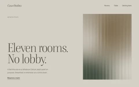
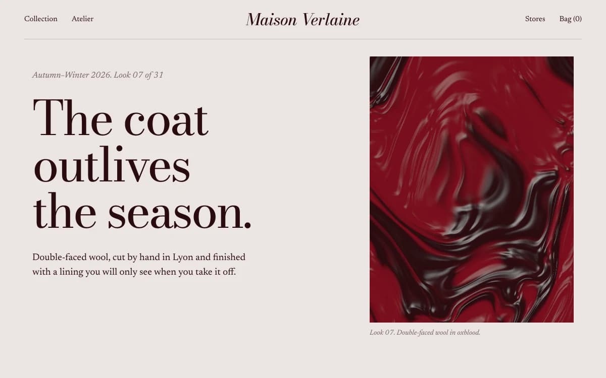
The specimen, for a fictional maison, shows the core move: one headline in Bodoni Moda broken over three lines, a short paragraph of text, and an image that holds its own column. Nothing else competes.
Where it comes from
Didone typefaces, the family of Bodoni and Didot, date from the late eighteenth century: extreme contrast between thick and thin strokes, vertical stress, hairline serifs. In the twentieth century they became the voice of fashion publishing, set at enormous sizes on magazine covers and mastheads.
The layouts come from the same magazines. Art directors such as Alexey Brodovitch, at Harper's Bazaar from the 1930s to the 1950s, used white space, scale and photography with a freedom that still looks modern. Every spread was composed on its own terms.
What defines it
| Element | The Editorial Luxe choice | Why |
|---|---|---|
| Display type | A Didone at extreme sizes, often with one italic word | Contrast between thick and thin is the luxury signal |
| Text type | A newspaper-born serif with generous leading | Long reading should be a pleasure |
| Layout | Asymmetric spreads: big type overlapping images, off-axis captions | Each screen is composed, not stacked |
| Images | Tall portrait crops, masked reveals, subtle parallax | Photography is the product |
| Colour | Quiet: oxblood, stone, sumi ink on paper | Colour never competes with the images |
| Space | Wide margins and deep first-line indents | Air is the most expensive material |
Palettes
| Palette | Ground | Ink | Accent | Character |
|---|---|---|---|---|
| Oxblood and bone | #EBE5E2 | #2A0C10 | #7A0E1D | Pinkish bone and a near-black that is secretly oxblood; brass for one detail |
| Stone and camel | #D6D0C6 | #2B2620 | #7E6A4C | Mid-tone stone that feels like a material |
| Ink wash | #ECEFEB | #1C2321 | #2F5D62 | Rice-paper ground, sumi ink and a seal-stamp red used once |
Type
- Display: Bodoni Moda. A Didone with optical sizes, so the hairlines are designed for display. Use it big. At small sizes those hairlines disappear, which is why it never sets body copy.
- Text: Newsreader. A text serif drawn for news reading, with a confident display cut for standfirsts and pull quotes.
Two serifs, one for drama and one for reading, is the classic magazine pairing. The overused alternative, a fashionable display serif with the web's most common sans-serif, is exactly what Laarpi's lint flags.
Motion and depth
Everything moves slowly and with confidence. Headlines arrive line by line behind a mask. Images unmask as they enter. Parallax applies to imagery only, never to text. Scrolling feels heavy and smooth, like turning thick paper.
Depth is subtle: a liquid lens that displaces a photograph under the cursor, or a slow, grainy gradient field behind a statement. A paper texture holds the page together.
A typical page, section by section
Every site is designed for its own idea, so treat this as a sketch, not a template. A page in this style often runs like this:
- A poster cover. A full-height portrait image framed with a headline overlapping its edge, like a cover line.
- The statement. One paragraph set large in the text serif, with a deep first-line indent.
- Drifting spreads. Images in tall crops at different heights, captions set beside them off-axis.
- A hung quote, with the quotation marks pushed into the margin, as a magazine would set it.
- Features, offset. Each product or collection gets its own composition rather than a repeated card.
- The people, credited by name and role, then a footer with the house name at full size.
Who it suits
| A strong fit | A poor fit |
|---|---|
| Fashion houses, ateliers and designers | Discount retail and anything urgent |
| Photographers with a strong body of work | Technical products sold on specifications |
| Small luxury stores with few products | Large catalogues that need filters and search |
| Publishers, writers, cultural magazines | Brands built on loud energy |
More on these in the use cases for photography portfolios and brand websites.
How it goes wrong
- Didone everywhere. At text sizes its hairlines vanish and paragraphs shimmer. Keep it for display.
- Every spread the same. A magazine never repeats one layout twenty times. The agent composes each section on its own grid moves.
- Stock fashion imagery. The style stands or falls on the photographs. Use your own, or let the type carry the page.
- Luxury as beige. Quiet colour is not the absence of colour. A single oxblood or brass accent gives the page a pulse.
- Text on images without contrast. Overlapping type on photographs only works when it stays legible. Every overlap is checked.
What to prepare
Editorial Luxe is only as strong as its material. Before you start, gather:
- Portrait photographs, high resolution and vertical, at least one for every section. Landscape images can work, but tall crops carry the style.
- A short text for each piece or collection, two or three sentences, written like a caption in a magazine rather than a product description.
- Credits: photographer, model, location, season. They become the off-axis captions that make a page feel edited.
- One word worth emphasising in each headline. The italic contrast word is where the voice lives.
If you have little photography, say so. The agent will lean on type and space instead of inventing imagery.
Making it yours
- "A tailoring house in Lyon. Each coat gets a spread: a portrait photograph, its name in huge type, the cloth and the hours it takes."
- "A literary magazine. Contents like a print issue, essays set for long reading."
- "A fine-jewellery maker with eight pieces. Every piece is a page."
If you want even less noise, see Quiet Luxury. For a white-wall gallery, Gallery White Cube. For the same drama after dark, Cinematic Noir. To learn how slow, intentional motion is built, read about animated websites.