An event website that sells the night before it happens
How an event website changes from announcement to the day itself, what people need at each stage, and how Laarpi builds festival, exhibition and conference sites with an idea of their own.
An event website lives a short, intense life. It has to make people want to come months before anything happens, and then, on the night, it has to tell a phone user standing outside the gate which entrance to use. Most event sites are built for only one of those moments.
They also tend to look identical: a hero photo of a crowd with hands in the air, a lineup grid of headshots, a countdown timer. The event itself is probably much more particular than that.
This page covers how an event website changes across its life, what people need at each stage, how to give it an idea of its own, and how Laarpi builds one.
An event website has a lifecycle
Plan the site for each stage, not just for launch day.
| Stage | What visitors need | What the site should lead with |
|---|---|---|
| Announcement | The idea, the dates, a reason to care | The concept and a mailing-list sign-up |
| Programme | Who, what, when | Lineup or programme, then tickets |
| On sale | Prices and availability | Tickets in the first screen |
| Final week | Practical details | Getting there, entry, what to bring, access |
| On the day | Times and places, on a phone | Schedule and map, fast |
| Afterwards | A record, and the next date | A recap and the sign-up for next time |
Because a Laarpi site is real code you direct in plain words, moving from one stage to the next is a short conversation: "Tickets go first now, and move the concept below the lineup."
Sell the feeling first
The first screen of an event site should make the idea of the event felt before anyone reads a word.
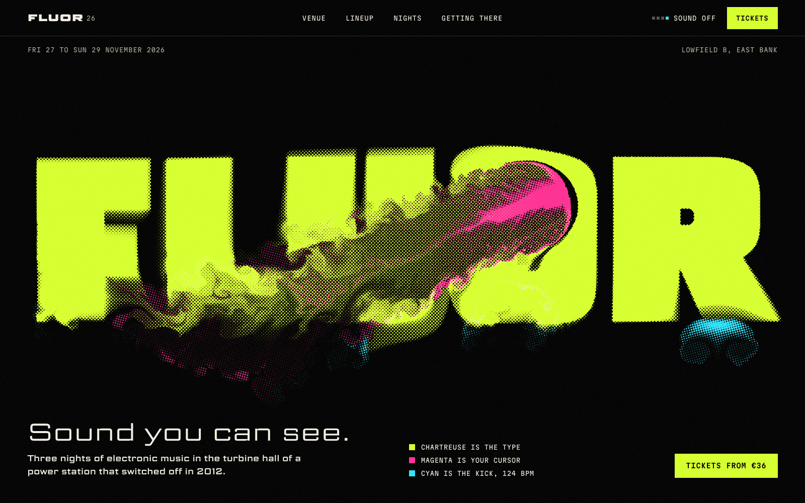
FLUOR 26 is a showcase site made by the Laarpi team with Laarpi's library and process for an imagined three-night electronic music event in a disused power station. Its idea is "sound you can see": the wordmark is printed in fluorescent ink you can stir with your cursor, and a cyan kick drum pushes the ink at 124 BPM. A scroll-driven chapter tips the flat page over into the floor of the hall and walks through the venue's three rooms. The lineup sets each artist at their tempo. Then come the timetable, four plain ticket rows and a drawing of the tram line, all calm and readable.
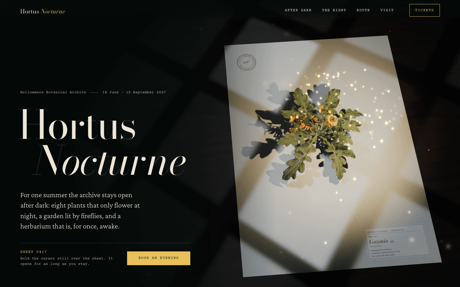
Hortus Nocturne is a showcase site for an imagined summer of night openings at a botanical archive. A pressed flower blooms only while you hold the cursor still, because the exhibition is about plants that open at night when nobody is watching. Below that: the eight night-flowering species, a garden route drawn as you scroll, and tickets for timed entry, full-moon lates and a season pass.
Both follow the same shape, and it's the one to copy: atmosphere at the top, practical clarity below. The idea earns attention; the plain sections earn the ticket sale.
Getting the practical sections right
The part of an event site that gets used the most is the least glamorous. Write it as if for someone tired and on a phone.
- Dates and times in a consistent format, with the time zone for anything online or international.
- The lineup or programme as real text, not an image of a poster, so it can be searched, read aloud and translated.
- Tickets: every type, its price, what it includes, and whether it's sold out. No hunting.
- Getting there: address as text, a map link, public transport, parking, the nearest entrance.
- Access: step-free routes, seating, quiet spaces, assistance tickets. People need this before they buy.
- Policies: age limits, re-entry, bags, refunds. A short FAQ beats a long terms page.
On the day, these sections should load before anything else. Laarpi builds every site to load text first and fade heavy visuals in afterwards, and to pause animation when it's off screen. See website performance with 3D.
Choosing a look for the event
Some directions that suit different kinds of event, as starting points:
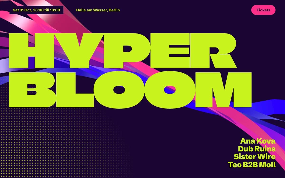
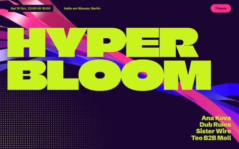
Acid Rave is flyer energy: lime grounds, violet ink, melting type. Clubs, raves, festivals.
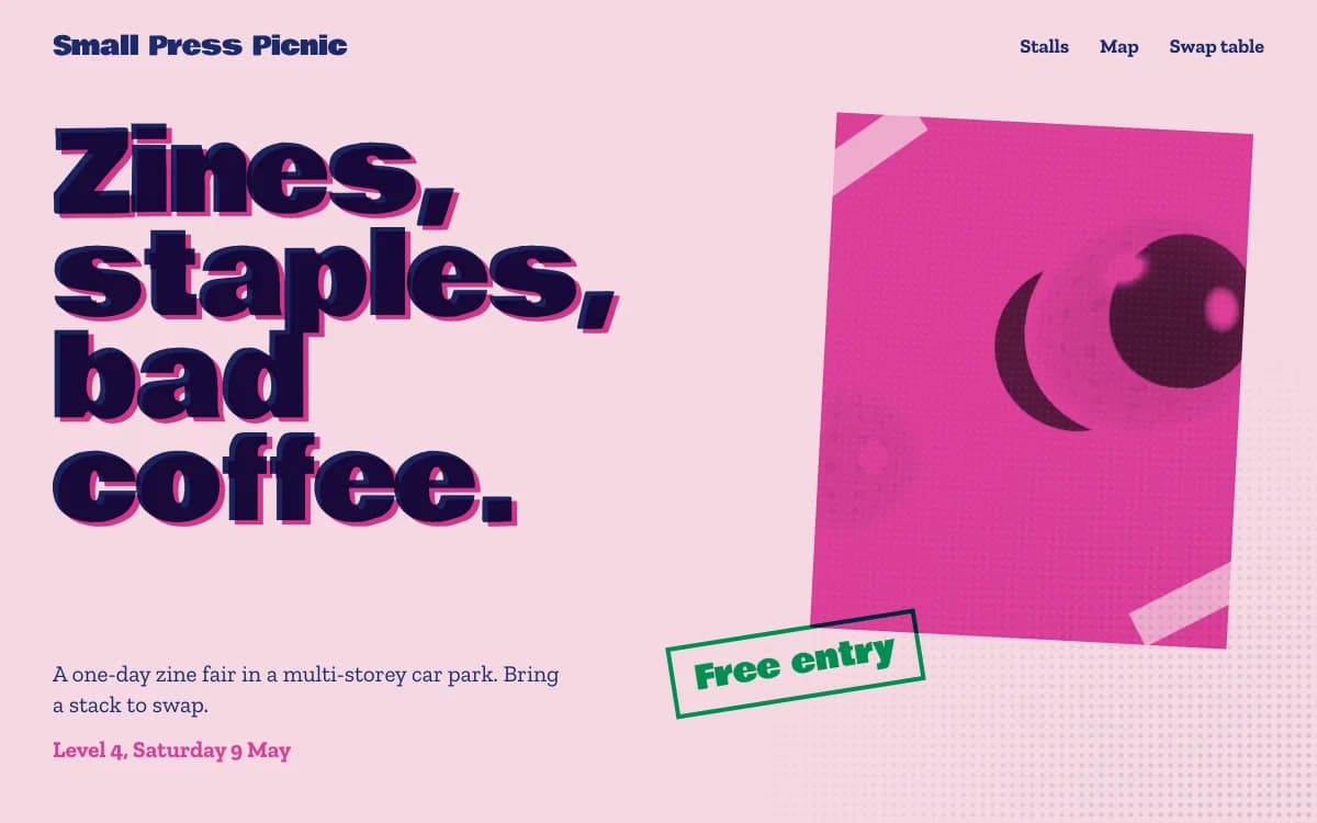
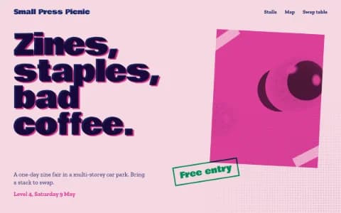
Riso Zine is risograph colours and slightly off registration. Fairs, markets, independent festivals, anything with a photocopier in its past. The specimen above was composed for a zine fair in a car park.
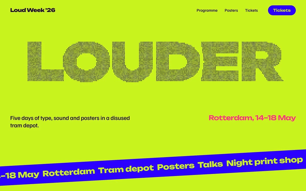
Kinetic Type lets the letters move. Design weeks, conferences about type and image, anything loud.
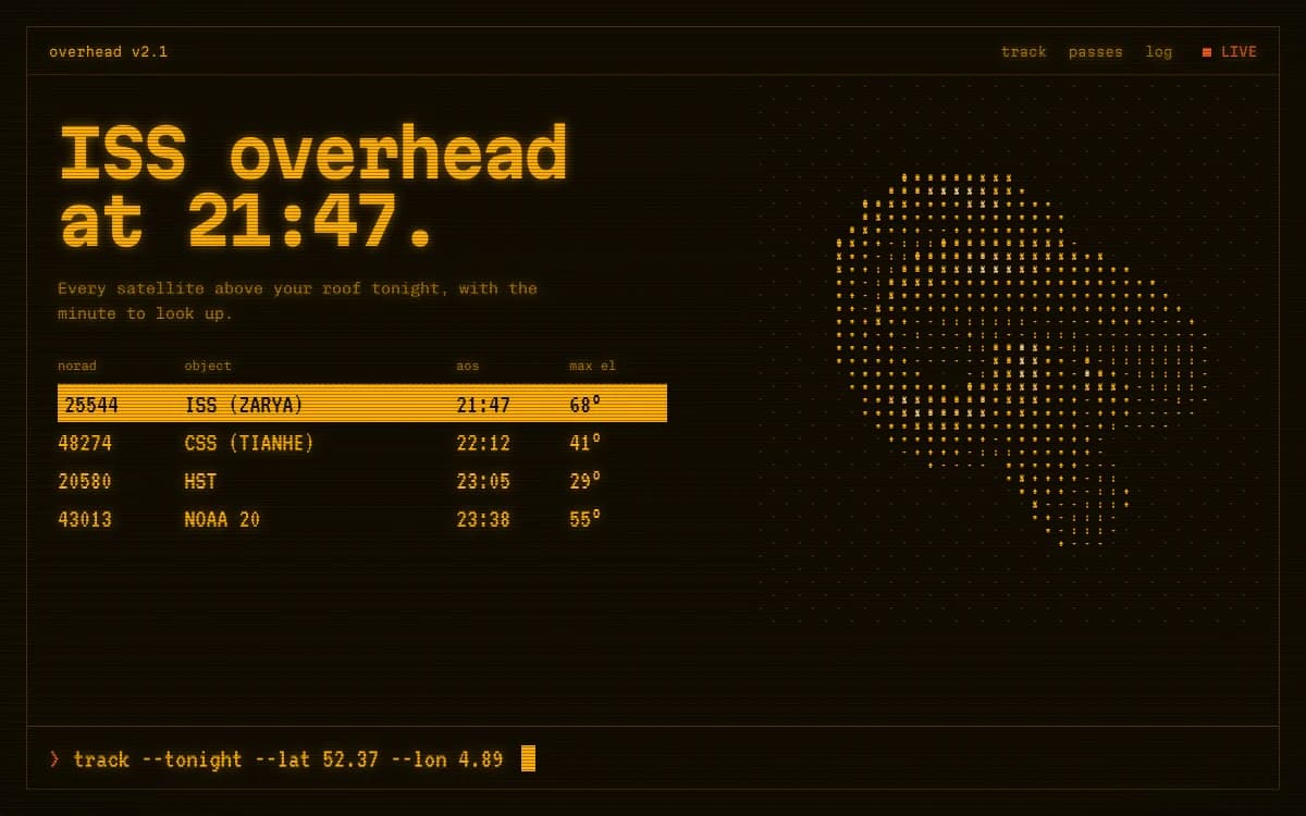
Retro-Futurist Terminal is a mission-control console where the data is real. Tech conferences, hackathons, astronomy nights.
Tickets, sign-ups and the backend
What Laarpi wires up, and what it links to:
- Mailing list and waitlist. A form that saves sign-ups to a table in your own Supabase project, with spam protection built in. You own the list.
- Ticketing. Link to or embed the platform you already use, styled to sit inside the page. Polar, which powers Laarpi's built-in checkout, reviews ticket sales case by case, so a dedicated ticketing platform is the safer choice for most events.
- Enquiries. Separate forms for press, traders, volunteers or speakers, each saving to its own table. More on the website backend page.
Motion, flashing and accessibility
Event visuals are where accessibility is most often forgotten. Strobing visuals that suit a club are dangerous on a screen: nothing on a page should flash more than three times a second. Animation should have a reduced-motion version that is still composed and still beautiful. Laarpi applies both rules to every site, and our guide to accessible motion explains why and how.
Event website checklist
- What, when and where in the first screen, in plain text
- A mailing-list sign-up from the day you announce
- Lineup or programme as real text, with times and stages or rooms
- Every ticket type with its price and what it includes, and sold-out states shown
- Getting there: address, map link, transport, entrances
- Access information before purchase, not after
- Policies as a short FAQ: age, re-entry, bags, refunds
- A phone layout where the schedule loads first on the day
- Nothing that flashes more than three times a second
How Laarpi builds an event website
Describe the event, its dates and place, what it should feel like and who it's for, and press Start building. Attach a poster, a venue photo or a reference if you have them.
It asks only what matters. For an event: "Is this site mainly for announcing and building a list, or for selling tickets now?" or "Should it feel like the poster or like being inside the venue?" The questions arrive as cards with palettes and type to choose from.
It writes a plan you can edit: the big idea, the sections in order, the type with reasons, the palette, what moves and why.
It builds real code and checks its own work. Screenshots at several scroll positions, layout checks at six widths from 1920 to 390 pixels, and a separate art director scoring eight criteria including concept clarity, motion, mobile and reduced motion. On a Finish, at least two rounds of revision before it finishes. For events, the checks that matter most are the timetable on a phone and the ticket buttons clearing the navigation.
You direct it. "Add Sunday." "Move the headliner up." "The doors are now at 21:00." Point at what you mean and only that part changes.
It ships. Publish to a laarpi.site address straight away, or your event's own domain on a paid plan.
What stays with your ticketing platform
Laarpi builds the event's public site: the idea, the programme, the practical information and the sign-ups, in real code, with your own accounts behind the forms. It isn't a ticketing system, a scanner app or an attendee CRM, and it links to those rather than pretending to be them. If your event deserves a site as particular as the event itself, start here. For artist and label sites, see musician websites; for a product launch event, see product launch pages.