Dimensional Pop: a product launch that behaves like a toy
A style for consumer product launches with one hero object and a sense of fun. How faux-3D type and a glossy real-time object share the page, the hot palettes behind it, and how to keep it focused.
Palette and type
Palette
- Ground#FF5B14
- Surface#FF7433
- Ink#1A0A00
- Muted#461904
- Accent#1B12E0
- Accent 2#FFF0D6
- Line#D14B10
Solar flare
The whole page is the accent: blazing orange ground, near-black ink, a cobalt that vibrates against it, and cream for the rare highlight.
- Ground#FFE14D
- Surface#FFD21F
- Ink#1D1A5E
- Muted#6A5E58
- Accent#E04460
- Accent 2#14A39A
- Line#D2B950
Toybox
Primary yellow ground with a deep indigo ink so the brightness stays legible; pink and teal as building-block accents.
- Ground#2A1D3E
- Surface#3D2F4C
- Ink#FFE6D5
- Muted#9D8A90
- Accent#FF7E67
- Accent 2#6FD6FF
- Line#5D4D62
Vapor dusk
Dusk-violet ground with a peach-light ink; coral sun and cyan sky — a sunset that doesn't need a gradient.
Type
Dimensional Pop
Tilt Warp
Faux-3D type and glossy objects on hot grounds — a product launch that behaves like a toy.
Rethink Sans
- Layout
- Split stages with one object, giant figures, horizontal rails, a single round call to action.
- Motion
- Chrome and glass objects reacting to scroll, counters, magnetic buttons, theme flow into an accent section.
Try it with a prompt
“A lamp made from a ring of aluminium. Five colours. People should want to bite it.”
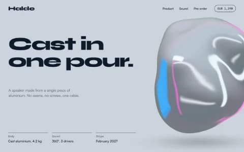
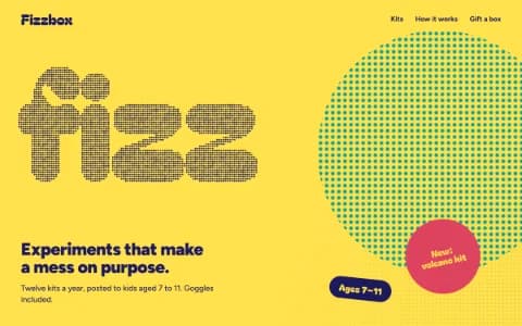
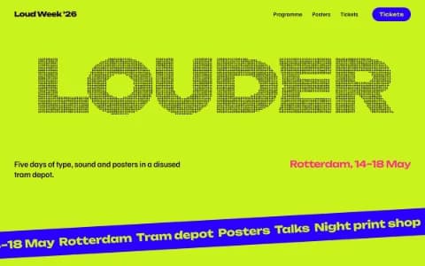
Start building in Dimensional PopDimensional Pop is a launch page that behaves like a toy. Hot flat colour fills the screen. Type leans out of the page in faux-3D. One glossy object sits on a split stage, catching the light and reacting when you scroll or reach for it. There is one round button, and you know exactly what it does.
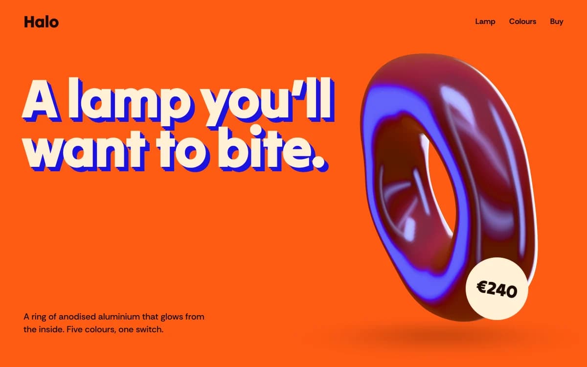
The specimen, for a fictional lamp made from a ring of anodised aluminium, puts "A lamp you'll want to bite." in faux-3D type on blazing orange, the glossy ring on the right, and a round price sticker on its edge: €240. A single line tells you it glows from inside and comes in five colours.
Where it comes from
Dimensional Pop borrows from pop art's flat, saturated colour, from product advertising's love of one hero object on a plain studio backdrop, and from the inflated, glossy 3D renders that took over album covers and brand campaigns in recent years.
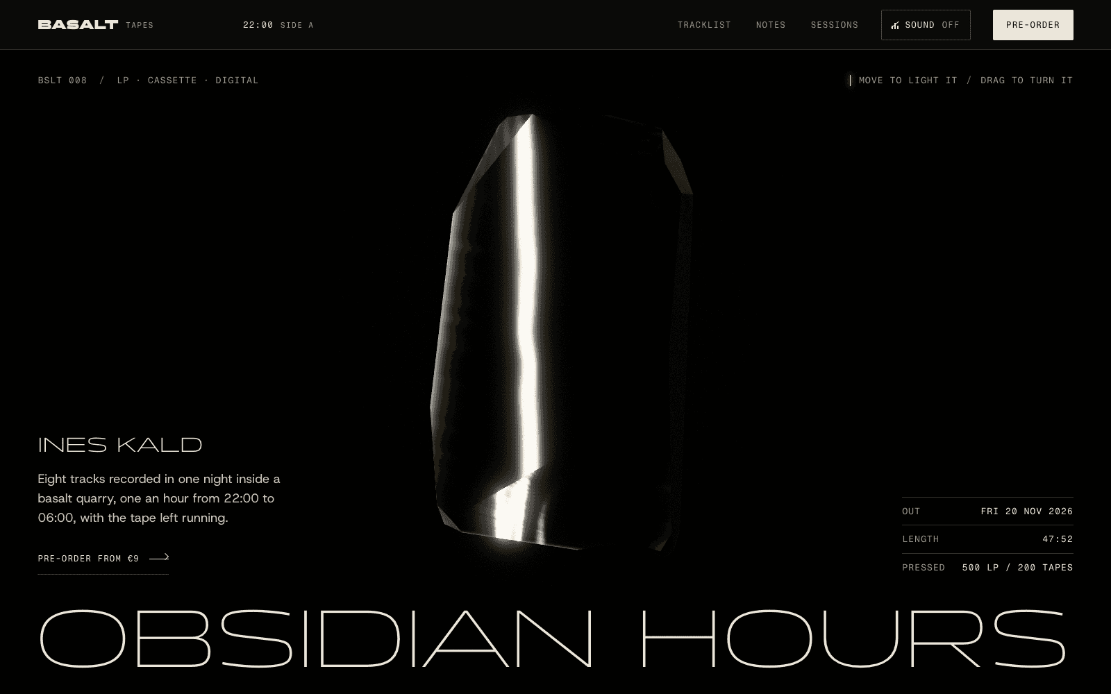
What makes it work on the web is that the object is no longer a picture. It is a real-time render that can catch light, turn and respond to the visitor, sitting next to type that has its own sense of depth.
What defines it
| Element | The Dimensional Pop choice | Why |
|---|---|---|
| Ground | One hot, flat colour per section | The page is the backdrop |
| Type | Faux-3D display that leans and warps | Depth in the letters, not just the object |
| Hero | A split stage with one glossy object | One thing to look at, and want |
| Figures | Giant numbers: price, colours, hours of battery | The facts as graphics |
| Action | A single round call to action | Pressing it should feel like fun |
| Transitions | Theme flow into an accent section | Colour changes like a new box opened |
Palettes
| Palette | Ground | Ink | Accent | Character |
|---|---|---|---|---|
| Solar flare | #FF5B14 | #1A0A00 | #1B12E0 | Blazing orange, near-black ink, cobalt that vibrates, cream for rare highlights |
| Toybox | #FFE14D | #1D1A5E | #E04460 | Primary yellow with indigo ink; pink and teal accents |
| Vapor dusk | #2A1D3E | #FFE6D5 | #FF7E67 | Dusk violet with peach ink; coral sun and cyan sky, without a gradient |
Type
- Display: Tilt Warp. A rare face with a variable warp axis that leans the letters into depth.
- Text: Rethink Sans. A contemporary sans with sharp counters that holds up at heavy weights and stays clear in small print.
Motion and depth
- Chrome objects: a liquid-metal form with an iridescent skin that breathes, floats over a soft shadow and leans toward the pointer.
- Glass blobs: refractive drops that melt together and bend the flat colour behind them.
- Scroll reactions: the object turns, tilts or changes colour as sections pass.
- Counters on the giant figures, and magnetic buttons that pull toward the cursor.
- Theme flow: the whole page changes colour as you reach the accent section.
When a real product model exists, the agent lights and stages it properly. When it does not, it abstracts the product into a glossy form rather than building a crude stand-in from primitive shapes. More on this on the 3D website builder page.
One object, three moments
Dimensional Pop pages work best when the object has a short story of its own, told across the scroll:
- The reveal. The object arrives on its flat colour field and catches the light. The headline says what it is in one breath.
- The turn. As you scroll, it rotates or opens to show the detail that matters: the glow inside the lamp, the sole of the sneaker, the can's colour.
- The choice. The page changes colour into the accent section, the object takes the colour you pick, and the round button sits right beside it.
Three moments, one object, one button. Anything more becomes a catalogue.
A typical page, section by section
Every site is designed for its own idea, so treat this as a sketch, not a template. A page in this style often runs like this:
- The split stage. Faux-3D headline on a hot ground, the glossy object beside it, a round price sticker.
- Giant figures: price, colours, hours, counted up as they arrive.
- The rail, the object in each colour or the product's details, moving sideways as you scroll.
- The accent section, where the page changes colour and the round button waits beside the object.
- A footer with the name, set to fill the width.
Who it suits
| A strong fit | A poor fit |
|---|---|
| Consumer product launches with one hero | Professional services |
| Small stores with a few colourful products | Archives and content-heavy sites |
| Drinks, snacks, sneakers and gadgets | Quiet, heritage or luxury brands |
| Apps launching something fun | Serious B2B buyers comparing specs |
More on these in the use cases for product launch pages and startup websites.
How it goes wrong
- The object as wallpaper. A glossy blob that has nothing to do with the product. Tie the form to the thing you sell.
- Gradient creep. Hot palettes slide easily into the purple-to-blue gradient. Dimensional Pop uses flat fields and lets the object carry the shading.
- Faux-3D on everything. Warped type for the headline, plain type for the rest. Otherwise nothing reads.
- More than one primary action. One round button per screen. Two and the toy becomes a dashboard.
- Heavy first load. The object fades in after the words, never before.
What to prepare
- The product's colours and materials. They drive the object and the section grounds.
- The three numbers that matter: price, size, battery, colours, whatever your buyer asks first.
- A product model, if you have one. If not, the agent abstracts it.
Making it yours
- "A lamp made from a ring of aluminium. Five colours. People should want to bite it."
- "A sparkling tea in three flavours. Each flavour takes over the page."
- "A pocket synth. Orange, loud, and the price obvious."
The guide to a product launch page that converts covers structure and selling. For a cooler, more precise version, see Liquid Chrome. For pure play, Playful Toybox. For type that moves, Kinetic Type.