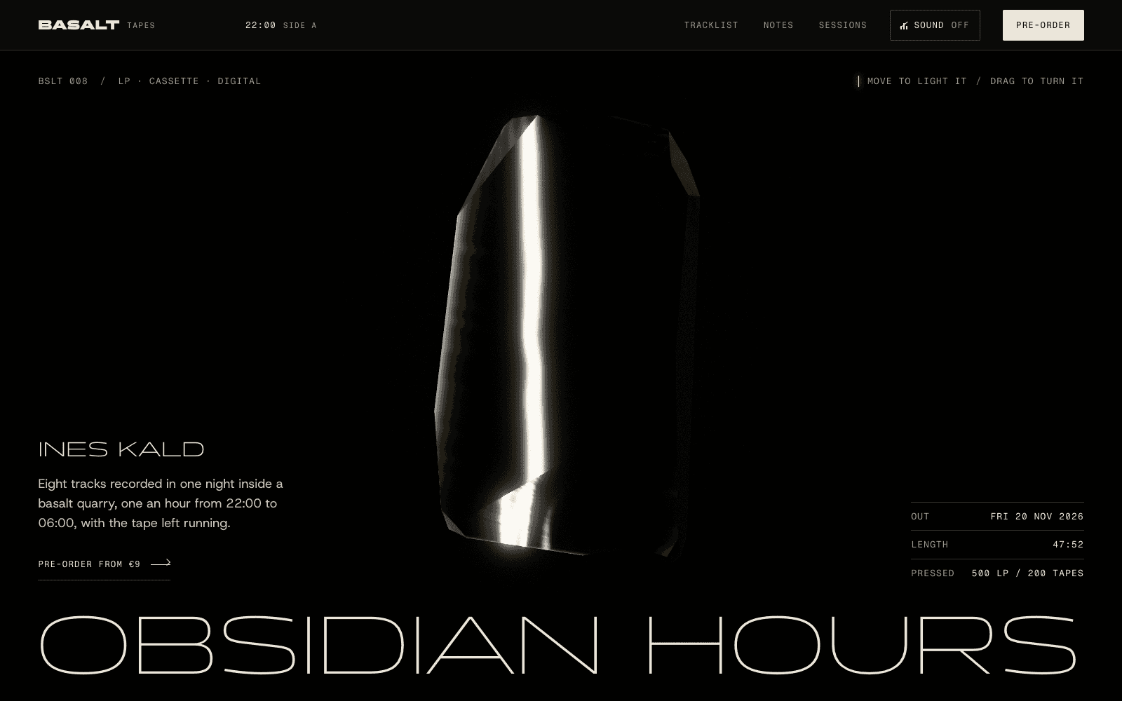
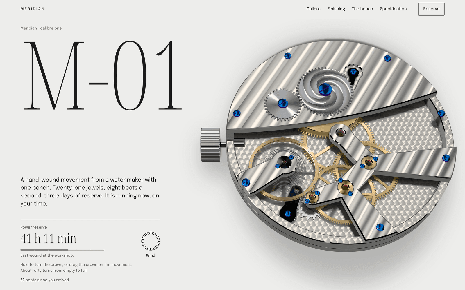
Cinematic Noir: a website graded like a film still
A style for cinemas, late-night places, releases and stories that happen after dark. How to make a site feel like a film, the grade and type behind it, and how to keep dark pages readable.
Palette and type
Palette
- Ground#0C1F22
- Surface#203132
- Ink#ECE4D0
- Muted#858980
- Accent#FF8A3D
- Accent 2#3FC1C9
- Line#424E4C
Cinema teal
A teal-black ground like a graded film still, warm projector-light ink, and an orange/teal pair borrowed straight from colour grading.
- Ground#111B29
- Surface#252D39
- Ink#EDE6D6
- Muted#868785
- Accent#E0405A
- Accent 2#8FA9C7
- Line#464C53
Midnight crimson
Midnight navy, never pure black, with a parchment ink; crimson for the moment of tension and a cold steel blue for everything else.
- Ground#062A3A
- Surface#193C4A
- Ink#D9F0F0
- Muted#7A979E
- Accent#FF6F59
- Accent 2#2DE1C2
- Line#395A66
Deep sea
Abyssal teal with bioluminescent ink; coral and cyan glow like things that live down there.
Type
Cinematic Noir
Gloock
Graded like a film still: deep teal or midnight grounds, a single warm light, sharp serif titles, scenes that unfold as you scroll.
Erode
- Layout
- Full-height scenes, centred statements over moving fields, pinned story chapters, credits-style lists.
- Motion
- Slow liquid fields, word reveals timed like subtitles, pinned chapters, ink-trail on the closing call.
Try it with a prompt
“A cinema that only opens after midnight. Ninety seats, no trailers, coffee until four.”
Start building in Cinematic NoirCinematic Noir treats a website as a film. Each screen is a scene. The palette is graded: deep teal or midnight, with a single warm light. Titles are sharp serifs, set like opening credits. Words arrive in time, like subtitles, as you scroll.
It is the style for stories that happen after dark.
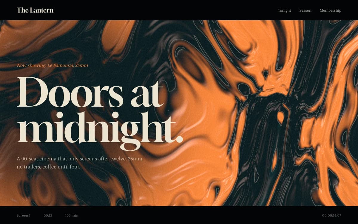
The specimen, for a fictional ninety-seat cinema that only screens after midnight, shows the essentials: "Doors at midnight." in a heavy serif over a slow field of marbled orange and black, two lines of plain information, and a strip of screening times along the bottom like a film's edge.
Where it comes from
Film noir is the name French critics gave to the dark American crime films of the 1940s and 1950s: hard shadows, single light sources, rain on streets, cigarette smoke in projector beams. Its lighting, chiaroscuro, comes from painting.
The palette comes from modern colour grading. Many contemporary films push shadows toward teal and skin tones toward orange, because the two sit on opposite sides of the colour wheel and make each other glow. Cinematic Noir borrows that pairing on purpose.
What defines it
| Element | The Cinematic Noir choice | Why |
|---|---|---|
| Structure | Full-height scenes, one focal point each | Each scroll is a cut |
| Light | One warm source on a cold ground | Light gives the eye somewhere to go |
| Titles | Sharp, heavy serifs, set large and centred over moving fields | Like a title card |
| Pacing | Words revealed like subtitles; pinned chapters | The visitor feels time pass |
| Lists | Credits-style: names, roles, times | Cinema's own typography |
| Texture | Film grain | Analogue depth on a digital ground |
Palettes
| Palette | Ground | Ink | Accent | Character |
|---|---|---|---|---|
| Cinema teal | #0C1F22 | #ECE4D0 | #FF8A3D | Teal-black like a graded still, projector-light ink, orange and teal |
| Midnight crimson | #111B29 | #EDE6D6 | #E0405A | Midnight navy with parchment ink and crimson for tension |
| Deep sea | #062A3A | #D9F0F0 | #FF6F59 | Abyssal teal with coral and cyan glowing like things that live down there |
None of these grounds is pure black, and none of the inks is pure white. Off-black and off-white feel like film; pure black and white feel like a screen.
Type
- Display: Gloock. Sharp wedge serifs and heavy contrast, in one weight. It looks best big, which is how it should be used.
- Text: Erode. A contemporary serif from Fontshare with soft wedges, set at generous sizes for reading on dark grounds.
Two serifs keep the voice literary. On a dark ground, slightly larger text and looser leading help long passages read comfortably.
Motion and depth
Motion is slow and timed, like editing:
- Liquid fields: marbled pigment rivers with a satin sheen move slowly behind titles and react to the cursor.
- Grain gradients: soft fields of colour drifting under film grain.
- Word reveals timed like subtitles, so statements arrive at reading pace.
- Pinned chapters that hold a scene while its story plays out, then release.
- An ink trail on the closing call to action, the cursor leaving smoke behind it.
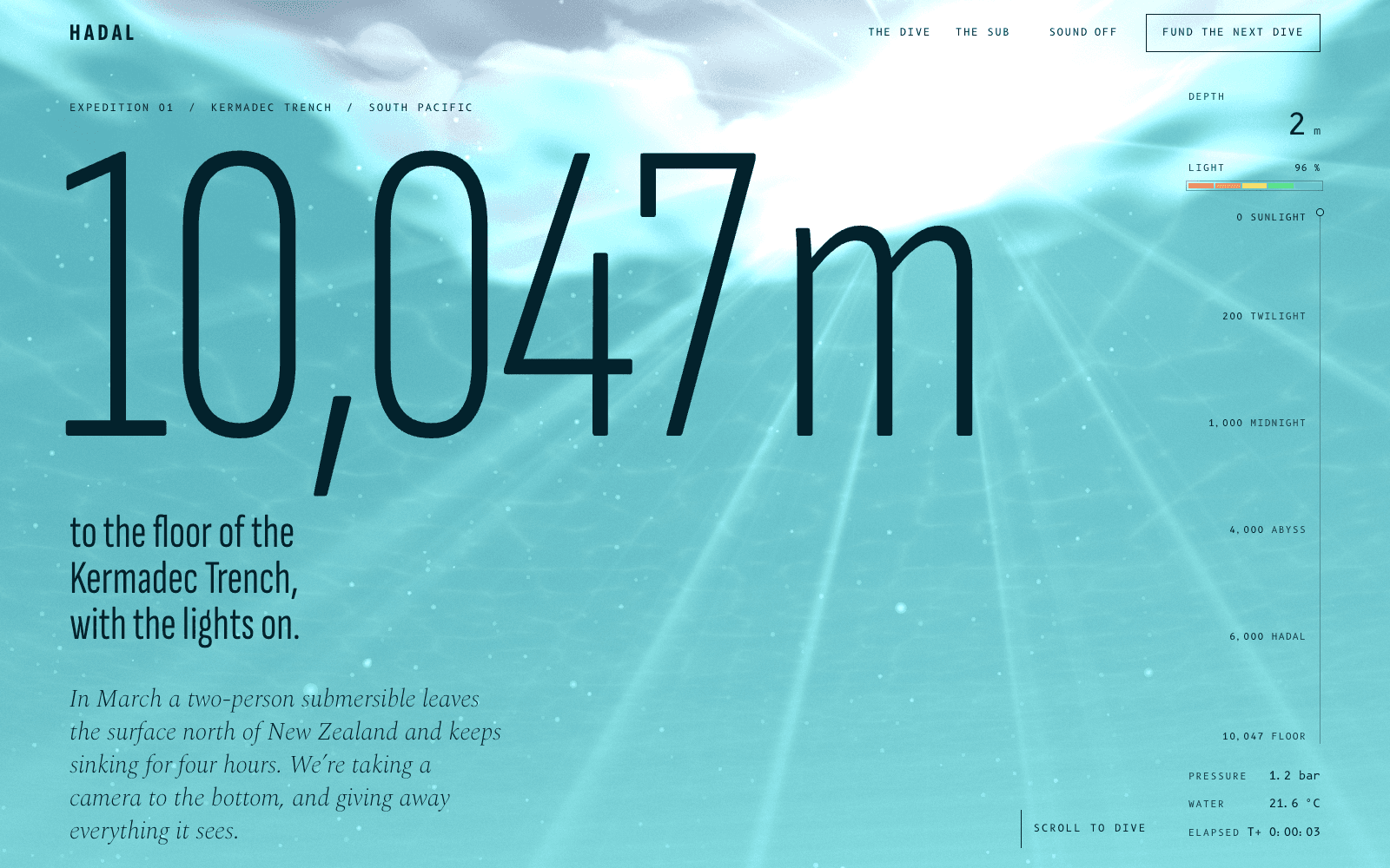
The ocean expedition in the community takes the idea further: the page is the water column, the light fails as you descend, and below 1,000 metres your cursor is the only lamp.
A typical page, section by section
Every site is designed for its own idea, so treat this as a sketch, not a template. A page in this style often runs like this:
- The opening shot. A full-height scene: one title over a slow field of light, and the essential facts in small type.
- The story in chapters, pinned, each revealing its lines at reading pace.
- The rail, a horizontal sequence of stills, works or nights.
- A line held on screen, like a subtitle in silence: one quote, one sentence.
- The credits: names, roles and times set like the end of a film.
- The closing call, with the cursor leaving an ink trail, then the name, small, like a last frame.
Who it suits
| A strong fit | A poor fit |
|---|---|
| Cinemas, film releases, documentaries | Children's products |
| Late-night bars and restaurants | Brands that should feel bright and open |
| Musicians and record releases | Sites people visit for quick facts in daylight |
| Theatre, mystery fiction, true-crime podcasts | Healthcare and public services |
More on these in the use cases for event websites and music artist websites.
How it goes wrong
- Dark for the sake of dark. A black page with white text is not cinematic. It needs a grade, a light source and a story.
- Video backgrounds as a shortcut. Autoplaying stock footage is heavy, generic and hard to read over. Real-time fields are lighter and belong to the site.
- Pinning forever. A scene that holds the screen too long makes visitors feel trapped. Chapters end.
- Grey text on navy. Muted text on dark grounds is the most common contrast failure. Every ink is checked.
- Motion that never rests. Slow is the point. With reduced motion switched on, every scene becomes a composed still.
What to prepare
- The story in beats. Five to eight moments, from the opening shot to the closing call. The agent will propose them, but your own instinct for the arc is the best starting point.
- The practical facts: dates, times, places, prices.
- Any stills you own, from a film, a venue or a performance. Graded to the palette, real images make the scenes specific.
Making it yours
- "A cinema that only opens after midnight. Ninety seats, no trailers, coffee until four."
- "A documentary release. The site should feel like the first five minutes of the film."
- "A cocktail bar behind an unmarked door. People should feel let in on a secret."
For the scroll mechanics behind this style, read animated websites and the guide to accessible motion. For the daylight version of the same drama, Editorial Luxe. For living forms in deep colour, Organic Biomorph. For titles that move, Kinetic Type.