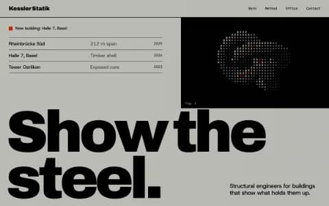
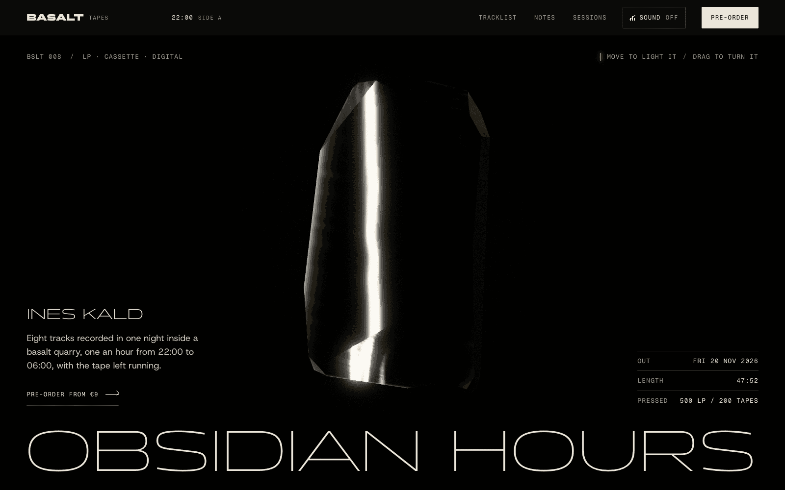
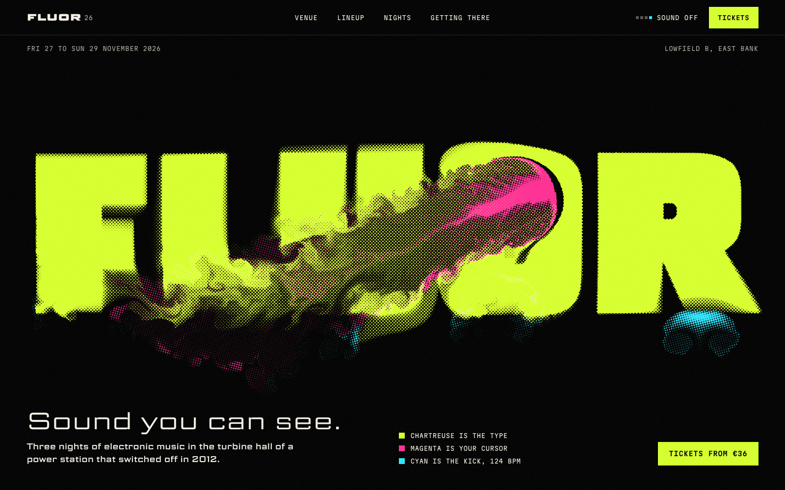
Product launch page
Launch pages that make the product the hero: something visitors can turn, open or play, then a price, a date and one action, with waitlists wired in.
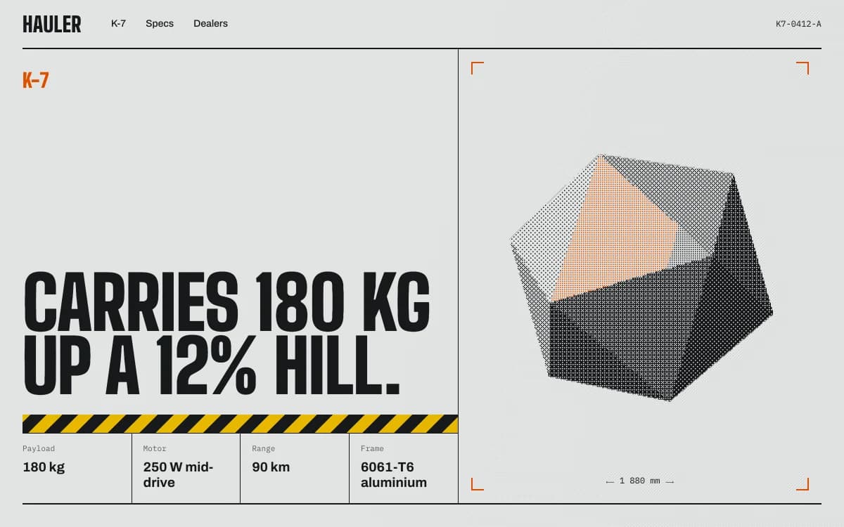
A product launch page has one job in its first screen: show people what the product is, show them the product, and give them one thing to do. Everything after that is proof. For a device, an instrument or a watch, the strongest proof is letting visitors handle it: turn it, open it, hear it.
This page covers what a launch page for a physical or visual product has to do, two launch pages we built where the product is the interface, the sections and the action, launch day, and what to bring. For copy and objections in depth, read a product launch page that converts. For the wider company site around a launch, see a startup website that shows the product.
What the first screen has to do
Three things, in this order:
- Name the product in one plain sentence. "A 16 HP Eurorack voice" tells a buyer more than any slogan about the future of sound.
- Show the product, large. Not a lifestyle scene, not an abstract gradient. The thing, lit well, from the angle that matters most.
- Offer one action. Join the waitlist, pre-order or buy. One primary button. If there are two buttons, one of them is the wrong one.
A visitor who leaves after the first screen should still know what you make and how to get it. A visitor who stays should be learning something about the product with every scroll.
Make the product the hero
Photographs show a product. Real-time 3D can let people check it the way they would in a shop: from the back, from underneath, from the inside. The test for every interaction is simple: what does it prove to a buyer? If an animation doesn't teach something about the product, cut it.
Here are two launch pages we built that way. Both are concept sites made by the Laarpi team with Laarpi's library and process; the brands are invented.
PATCH-01: play the module in the page
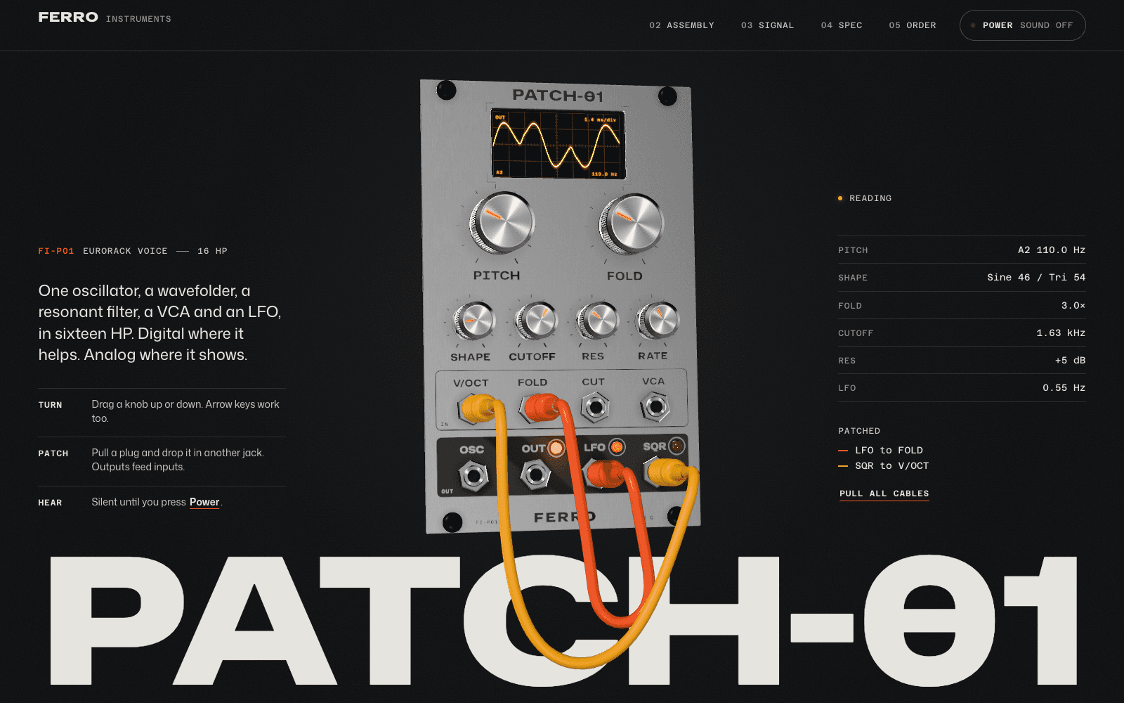
PATCH-01 launches an invented 16 HP Eurorack voice from an invented maker, Ferro Instruments. People who buy modular synths judge a module by its panel, its knobs and its sound before they read a spec sheet, so the page leads with those. The brief set four goals in order: play it, show how it's built, prove the numbers, take pre-orders.
| Beat | What the visitor does | What it proves |
|---|---|---|
| Play | Turns knobs, moves patch cables, presses Power and hears the voice | It's an instrument, and it sounds like this |
| Take it apart | Scrolls; the module separates into six numbered layers, from screws to main board | How it's built, and that it's built properly |
| Follow the signal | The camera enters the module's screen and steps through oscillator, wavefolder, filter, VCA and LFO | What each stage does to the sound |
| See your patch | The scope trace becomes a 3D figure drawn from the visitor's own patch | It responds to them, not to a demo loop |
| Check the numbers | A datasheet slides over: elevations and a spec table | The dimensions are real; the drawing is generated from the same layout file as the 3D panel, so they can't disagree |
| Pick a finish | Raw or Carbon re-anodises the panel next to the pre-order button | What they're ordering, exactly |
Notice what isn't there: no feature-card grid, no invented artist quotes, no logo wall. A product that hasn't shipped has no honest reviews yet, so the specifics carry the proof.
Meridian M-01: wind the calibre, take it apart under a loupe
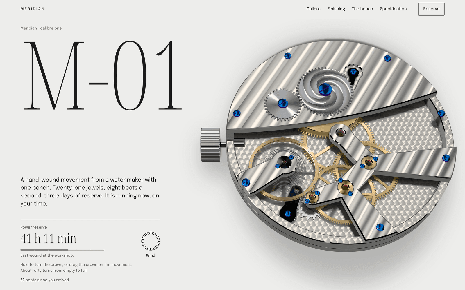
Meridian M-01 is a reservation page for an invented one-bench watchmaker making eighteen watches. Its audience reads movements before dials, so the page is the bench:
- Wind it. The movement runs at the visitor's local time. Press Wind or drag the crown and the power reserve fills, then runs down in real time.
- Take it apart. Scrolling lays the calibre flat on a parts sheet in service order, each part with its count, finish and magnification.
- Look closer. Five macro lenses cross perlage, Côtes de Genève, an inward bevel, black polish and blued screws, and the polished surfaces turn from black to white the way they do under a real loupe.
- Reserve one. The running movement sits beside the specification table, then a ledger of the eighteen numbers and a deposit button.
Each interaction answers a collector's real question: is this a coherent machine, and is the finishing as good as they say? That's why it works for a small run. Scarcity is shown by the ledger of numbers, not claimed in a banner.
More pages like these, ours and other companies', are collected in product website examples.
The sections a launch page needs
A launch page is read in scroll order, so plan it as a sequence, not a stack.
| Section | Job | Common mistake |
|---|---|---|
| Hero | Name it, show it, one action | A slogan instead of a sentence |
| The one proof | The interaction or image that shows why it's different | Five proofs at once |
| Specs as story | Numbers in the order a buyer checks them, each with what it means | A spec dump with no reading order |
| Social proof | Real quotes, real press, real pre-order counts, if you have them | Invented testimonials or "trusted by" logos you don't have |
| Price and availability | Price, ship date, batch size, regions | Hiding the price behind a button |
| The action | Waitlist, pre-order, buy or book a demo | Competing buttons |
| FAQ | The objections you actually hear | Questions nobody asks |
Social proof is optional. Before launch, most products have none, and that's fine. SI is built not to invent it: a quote, a number or an award on the page has to come from your messages or your material, or it is left as a visible placeholder you fill in or remove before publishing.
The action: waitlist, pre-order or demo
Launch pages usually pass through three states. Plan the page so it can move between them without a rebuild.
- Before launch: a waitlist. A form saves sign-ups to a table in your own Supabase project. Ask for an email and at most one question that helps you plan, such as which finish. See website backend.
- Launch: sell, pre-order or book. For software and digital products, checkout runs through your own Polar account; see website payments. Polar's policy (effective 25 March 2026) excludes physical products, so a hardware launch keeps the waitlist and links its order button to the store, distributor or crowdfunding page you already use. For B2B devices, a demo request form into Supabase often fits better than a buy button.
- After launch: the product page. Ship dates become stock status and real customer quotes can appear. Tell SI what changed and it edits those sections.
Whatever the state, write the action as what happens next: "Join the waitlist: one email when the first batch ships" beats "Sign up".
Launch day
Most launch traffic arrives in a burst, from a post, a newsletter or a press piece, and much of it is on phones. A few things decide whether it converts:
- Text first, 3D second. The name, sentence and button should be readable before the 3D finishes loading. On our phone profile (slow 4G, CPU slowed four times), PATCH-01 shows its loader at 0.9 s and the fully drawn module at 7.8 s; Meridian draws its movement at 11.5 s. The loaders show real progress, and the copy never waits for the scene. Fast websites with 3D covers how.
- Share cards. Check the title, description and image people see when the link is pasted into a message or a post. Ask for them in the brief if they matter to your launch.
- A press page. A short page with the fact sheet, approved images and a contact makes coverage easier. It is one more page in the same site.
- A reduced-motion version. Every interaction above has a still, readable equivalent.
What to bring
The more of your own material you bring, the less SI has to ask and the less it leaves open. Placing your own files on the site is in development in the private beta; today, attached images guide the design as references. This is how each kind is built to be used:
| Material | What it's used for |
|---|---|
| A GLB model from CAD or a 3D tool (up to 50 MB, textures embedded) | The 3D centrepiece, placed as it is and loaded after the first paint |
| Product photographs | Placed faithfully: no crop unless you ask, no colour change, no generative edits |
| A spec sheet (PDF, DOCX or XLSX) | The spec table, with your numbers |
| Price, ship date, batch size | The price and availability block |
| Logo, fonts, brand guide | The rules the page must follow. See a website from your brand guidelines |
Export the model web-ready: simplified, compressed and with textures no larger than they need to be. A 3D view of a 400 MB CAD assembly helps nobody on a phone. Read the 3D website builder page for what real-time 3D can and can't do.
How SI works on a launch page
Laarpi is in private beta, and this is the process SI is built to follow. SI is Laarpi's website agent: automated software running on AI models from third-party providers. Describe the product and who it's for, attach your material and press Start building. SI asks only what changes the page, such as "Should visitors use the product on the page, or is this about how it's made?" or "Waitlist now, or a sale on day one?" It writes a brief you can edit, with the beats, the centrepiece and why it serves the product, then builds the site in real code while you watch. A Draft gives you a fast first version; a Finish, on paid plans, runs the layout, accessibility, phone-weight, reduced-motion and facts checks until they pass. You then direct it in plain words or by pointing at a section: "add weight and power draw to the spec table". Publishing puts it on a laarpi.site address, or on your own domain on a paid plan. Pro is $25 a month; Free is $0.
When to use something else
If you sell hundreds of products with inventory and shipping, use a commerce platform for the store and build the launch page to send people to it. If your launch is software with no physical form, the SaaS landing page page is closer to what you need.