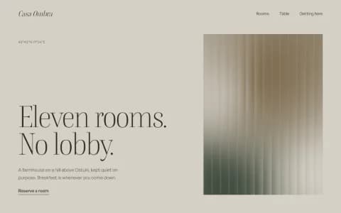
A startup website that shows the product
Startup sites for teams launching something visual: the four readers, the sections, what this year's startup homepages are built with, and how to build one.
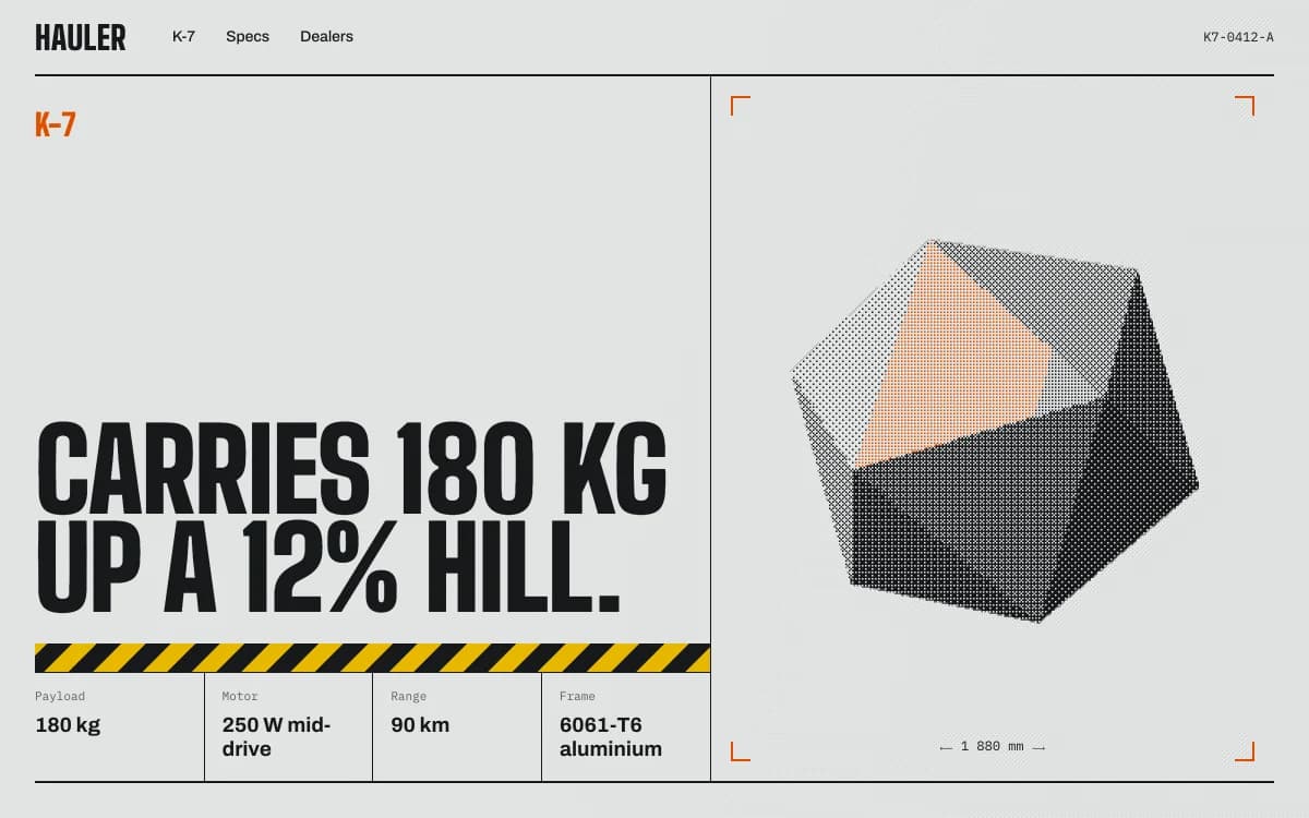
A startup website is read by four different people in the same week: a customer deciding whether to try the product, an investor checking whether the company is real, a candidate deciding whether to apply, and a journalist looking for a fact and an image. Most startup sites serve none of them well, because they describe the category instead of showing the product.
This page is for teams launching something you can see: robots, devices, instruments, games, AI products with a real demo, software with a brand. It covers what the site has to do, what this year's startup homepages are actually built with, the sections to plan, and how to build one with Laarpi. If the launch itself is the priority, start with the product launch page use case.
What a startup website has to do
| Reader | What they need in 30 seconds | What loses them |
|---|---|---|
| Customer | What it is, what it does for them, how to try or buy it | A slogan they could read on any competitor's site |
| Investor | That the product exists and the team can ship | Vague claims, no product shown, stale news |
| Candidate | What working there is like, open roles, who they'd work with | A careers link to an empty job board |
| Press | One sentence, a fact sheet, approved images, a contact | No press page, images only inside a carousel |
The homepage is for the customer. The others need one click to a page built for them. A site that tries to talk to all four in the hero talks to none.
What 2026 startup homepages are built with
We wanted to know what funded startups actually use, so we counted. On 5 October 2026 the Laarpi team took every company in Y Combinator's Summer 2025 and Summer 2026 batches from the public YC directory mirror (yc-oss.github.io), fetched each homepage once and classified the builder from its HTML.
| Batch | Reachable homepages | Framer | Webflow | Code frameworks or custom | Next.js (part of code) | Lovable, Bolt or v0 |
|---|---|---|---|---|---|---|
| Summer 2025 | 163 of 166 | 20 (12.3%) | 13 (8.0%) | 122 (74.8%) | 76 (46.6%) | 3 |
| Summer 2026 | 230 of 231 | 10 (4.3%) | 3 (1.3%) | 206 (89.6%) | 111 (48.3%) | 1 |
What it means, and what it doesn't:
- Most teams in this slice keep their site in code. That fits teams with engineers on staff, and often coding agents, who would rather own the site in their repo than learn another tool.
- It doesn't say who wrote the code, or how good the sites are. A homepage classified as Next.js could be hand-written, agency-built or generated.
- YC is one slice. Visual builders remain popular with startups outside it, and the right tool depends on who maintains the site.
- It's a snapshot. Sites get rebuilt; a homepage's builder today may not be the one it launched on.
The practical point: a startup website in code is normal, not exotic. What's rare is one that looks like the product rather than like the template it started from. The design styles are one way to start from a point of view instead of a default.
Show the product instead of a layout
The common startup homepage is a centred headline, two buttons, a screenshot in a browser frame, a logo strip and three feature cards. It's quick to make and impossible to remember. A team building something physical or visual has a better asset than any layout: the product.
- Robotics and devices: the machine itself, from the angles that explain it. A 3D model visitors can turn, or a sequence of renders that walks through what it does.
- Instruments and hardware: let people use it. Our PATCH-01 concept is a synth module you can play in the page before you read a word.
- AI products: the real output on real input. A recorded demo or a live example beats an illustration of a brain.
- Software with a brand: the product's own interface, type and colour, carried through the site, so the site feels like the product.
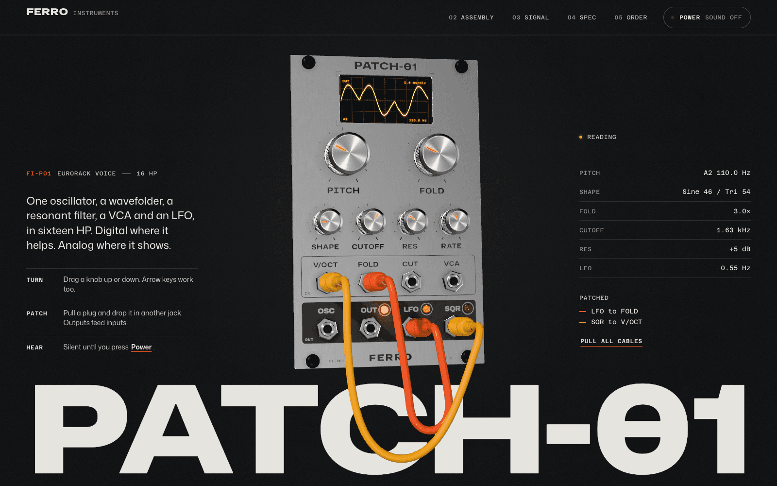
Both of our examples here are concept sites made by the Laarpi team with Laarpi's library and process, with invented brands. They show the approach; they aren't client work.
The sections to plan
| Section | What goes in it | Only if |
|---|---|---|
| Product proof | The product shown properly, in one sentence and one image or interaction | Always |
| Demo or interaction | A way to try, see or hear it | You can show it truthfully |
| How it works | The mechanism in three to five steps, with real numbers | Always, for technical products |
| Traction | Customers, pilots, waitlist size, revenue milestones | They're real and you're allowed to name them |
| Team | Founders and key people, with what they've built before | You want hires and investors to see it |
| Investors | Names of funds and angels | They've agreed to be listed |
| Careers | Open roles, how you work, the hiring process | You're hiring |
| Press kit | Fact sheet, logos, approved images, founder photos, contact | You expect coverage |
| Contact | One clear route per reader: sales, press, jobs | Always |
The "only if" column matters. A traction section with invented logos or rounded-up numbers does more harm than no section. SI won't write one: numbers, quotes, logos and awards on the page must match something in your messages or your material, or they stay as visible placeholders that block publishing until you fill or remove them.
Visual products: show the thing
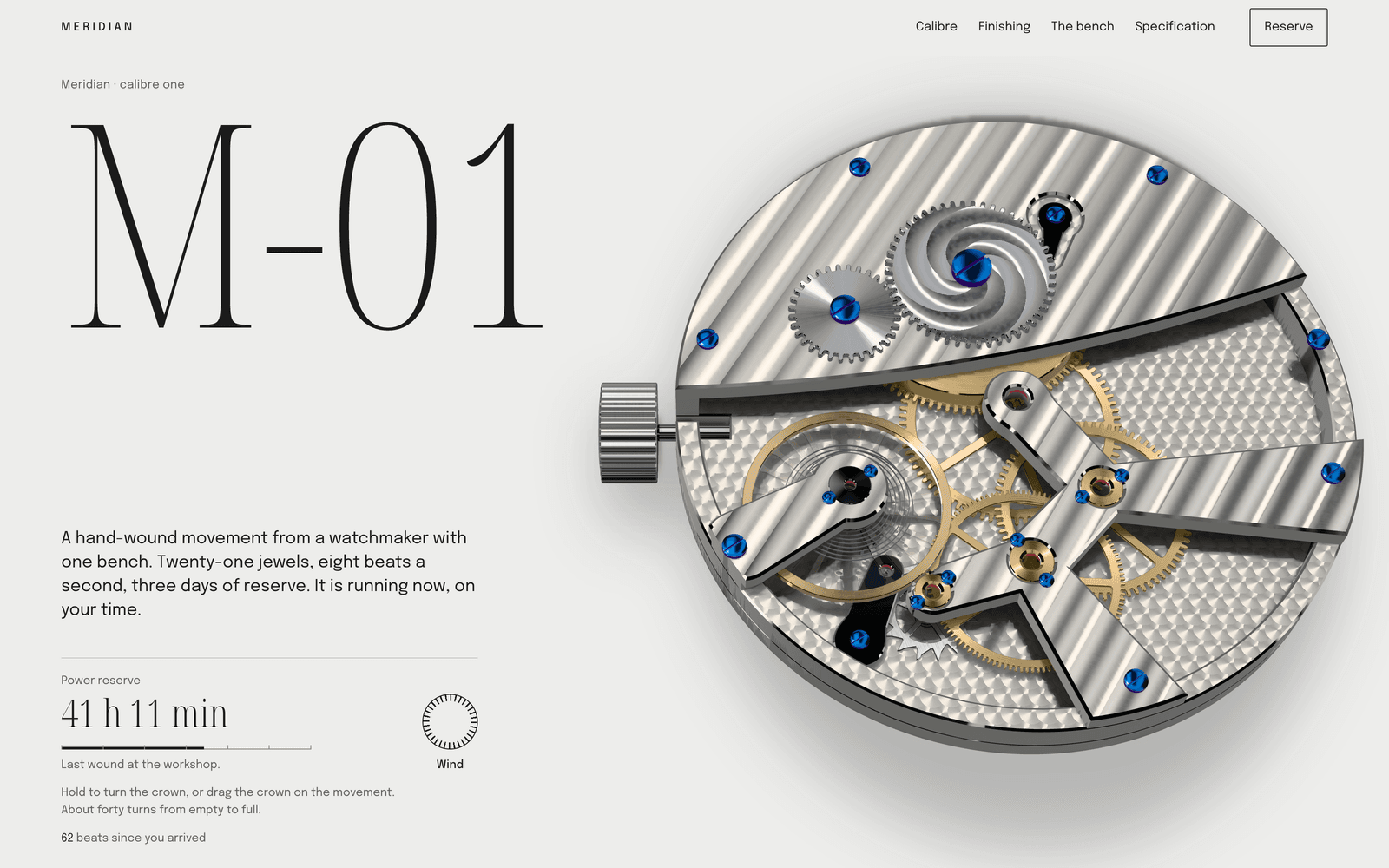
Meridian M-01, another concept site, is a reservation page for an invented watchmaker. Visitors wind the movement, take it apart on a parts sheet and inspect the finishing under moving loupes. For a hardware startup the lesson transfers directly: decide which question a buyer or investor really has (is it real, is it well made, how does it work) and design the one interaction that answers it.
More pages built this way, ours and others', are in product website examples.
Start from your own material
Most startups already have the raw material for a good site, scattered across a deck, a brand guide and a folder of renders. Placing your own files on the site is in development in the private beta; today, attached images guide the design as references. SI is Laarpi's website agent: automated software running on AI models from third-party providers. It is built to read your material before it writes the brief:
- The deck (PPTX or PDF): the one-line description, the problem, the product, the team and the numbers you've already approved for investors.
- The brand guide, logos and fonts: treated as rules. Logos are placed as supplied, never redrawn.
- Renders, CAD exports (GLB) and photos: placed faithfully, with no cropping or colour changes unless you ask.
- Your current site, if you have one: confirm it's yours and SI reads its pages and images as content.
Where the material is silent or contradicts itself, SI asks. A website from your brand guidelines covers this in detail.
Sign-ups, waitlists and payments
- Waitlists and contact forms save to a table in your own Supabase project. See website backend.
- Checkout for software and digital products runs through your own Polar account, with Polar as the merchant of record. See website payments.
- Physical products: Polar's policy (effective 25 March 2026) excludes them, so hardware teams collect a waitlist and link the order button to their own store or pre-order partner.
- Your own domain on paid plans, with the DNS records shown in the studio.
The data, the customers and the revenue stay in your accounts.
Choosing a tool honestly
| Your team | A good fit |
|---|---|
| Engineers who'll maintain the site in your own repo | Code, written by your team or a coding agent |
| A marketing team that edits pages visually every week | Framer or Webflow |
| A visual product, no designer, and a launch soon | Laarpi, or a studio if the budget allows |
| A content-heavy site with hundreds of pages | A CMS-first tool |
Laarpi is in private beta. Code download is planned, so today the site lives in Laarpi's studio and on your domain. If owning the files on day one matters most, that's a real reason to choose otherwise for now. The Laarpi vs Framer and Laarpi vs Webflow comparisons go into detail, with sources.
What it costs
Laarpi's Free plan is $0 a month and includes Drafts and a laarpi.site address. Pro is $25 a month and adds the Finish, with every quality check, and custom domains. Each run shows an estimated range of minutes and credits before it starts, with a cap you're never charged above. A studio quote is a different kind of purchase: a team's time, taste and accountability over weeks. Ask two or three studios whose work you admire for a quote on the same brief; that's the only reliable price comparison.
How to start
Describe the company in a sentence, say who the site is for and what should happen when they arrive, attach your deck, brand files and renders, and press Start building. In the private beta, SI is built to ask the few questions that change the result, write a brief you can edit and build the site while you watch, and then you direct it in plain words or by pointing at what to change. Who we are and what ships today is on the about page.