Playful Toybox: a website you want to poke
A style for toy makers, kids' brands, snacks and anything that should make people grin. How to be playful without being childish, the type and palettes behind it, and how to serve both the player and the payer.
Palette and type
Palette
- Ground#FFE14D
- Surface#FFD21F
- Ink#1D1A5E
- Muted#6A5E58
- Accent#E04460
- Accent 2#14A39A
- Line#D2B950
Toybox
Primary yellow ground with a deep indigo ink so the brightness stays legible; pink and teal as building-block accents.
- Ground#F6D8E2
- Surface#E7CCDA
- Ink#1C2A6B
- Muted#595B8C
- Accent#DB3E97
- Accent 2#00A95C
- Line#CAB5CA
Riso pink
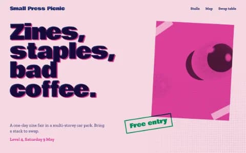
Built from real risograph drum colours: fluorescent pink paper, Federal Blue as ink, green as the second drum. Looks printed, not rendered.
- Ground#1D3EBF
- Surface#2A4BD0
- Ink#F3F0E6
- Muted#BBC2DC
- Accent#FFC93C
- Accent 2#FF7AA2
- Line#5069C8
Cobalt tile
Painted-tile cobalt as the ground, whitewash ink, and the yellow and pink of a market stall.
Type
Playful Toybox
Bagel Fat One
Bubbly type, primary grounds and things you want to poke. For kids' brands, games and anything that should make people grin.
Figtree
- Layout
- Chunky blocks, tilted marquees, uneven rosters, big round buttons; generous radius allowed.
- Motion
- Elastic magnetic buttons, particle wordmark, glass-blob toys, marquees; reveals with a little overshoot.
Try it with a prompt
“A monthly science kit for 7 to 11 year olds. Experiments that make a mess on purpose.”
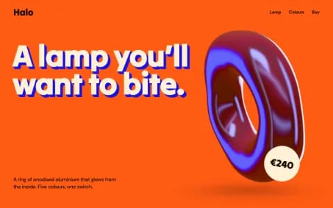
Start building in Playful ToyboxPlayful Toybox is a website you want to poke. Inflated bubble letters on primary-yellow grounds. Chunky blocks, tilted marquees, uneven rosters. Big round buttons that stretch toward your cursor and spring back. Glassy toys that wobble when you touch them.
It should make people grin, including the grown-ups paying for it.
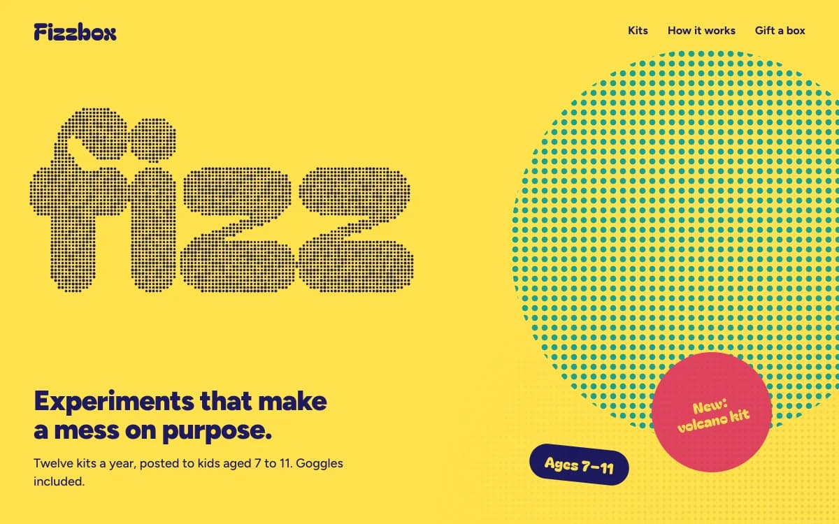
The specimen, for a fictional subscription of science kits for children, sets "fizz" in a giant halftone bubble face on yellow, a dot-screen circle bleeding off the right edge, a round sticker that tilts in the corner, and a plain line underneath: twelve kits a year, posted to kids aged 7 to 11, goggles included.
Where it comes from
Toy packaging, cereal boxes and children's television have always used bold primaries, fat letters and bouncing motion to get attention from small people across a crowded shelf. Product design took the same ideas into rounded, tactile objects you want to pick up.
On the web, playfulness used to mean cartoons and clip art. Playful Toybox takes the better lesson from toys: the delight is in how things respond. A button that squashes when pressed is more fun than a mascot waving.
What defines it
| Element | The Playful Toybox choice | Why |
|---|---|---|
| Type | Inflated bubble letters for display, a friendly sans for text | Fat letters feel squeezable |
| Colour | Primary grounds: yellow, cobalt, riso pink | Bright enough to read across a room |
| Blocks | Chunky, slightly uneven, generously rounded | Building blocks, not cards |
| Buttons | Big, round, elastic and magnetic | Pressing is the fun part |
| Motion | Reveals with a little overshoot, wobbly objects | Toys bounce |
| Texture | Halftone dots | Comic-book print |
Palettes
| Palette | Ground | Ink | Accent | Character |
|---|---|---|---|---|
| Toybox | #FFE14D | #1D1A5E | #E04460 | Primary yellow with deep indigo ink; pink and teal as building blocks |
| Riso pink | #F6D8E2 | #1C2A6B | #DB3E97 | Fluorescent pink paper and blue ink, like a riso print |
| Cobalt tile | #1D3EBF | #F3F0E6 | #FFC93C | Cobalt ground, whitewash ink, market-stall yellow |
Type
- Display: Bagel Fat One. Inflated bubble letters with enough weight to fill a hero on their own.
- Text: Figtree. A friendly geometric sans with clear text sizes, so parents can read the details.
Motion and depth
- Elastic magnetic buttons that lean toward the cursor and spring back with overshoot.
- Particle wordmarks that burst apart when the cursor passes and settle back.
- Glass blob toys: refractive drops that melt together and wobble, like something you could squeeze.
- Tilted marquees that run faster when you scroll faster.
- Reveals with a little overshoot, so things land like they were dropped.
All of it calms down for visitors with reduced motion switched on: the toys hold still, and the page is just as clear.
A typical page, section by section
Every site is designed for its own idea, so treat this as a sketch, not a template. A page in this style often runs like this:
- The kinetic hero. The name in bubble letters that burst and settle, with one round button.
- A tilted marquee of what is inside: flavours, kits, games.
- Offset features, each one beside a toy that wobbles when touched.
- The roster, the characters, the team or the range, in uneven, colourful blocks.
- Prices as chunky columns, plain and easy to compare.
- Questions, split, answering what parents ask: ages, safety, delivery, returns.
Who it suits
| A strong fit | A poor fit |
|---|---|
| Toy and game makers, kids' kits and online stores | Law, finance and healthcare |
| Family attractions and play spaces | Luxury and quiet brands |
| Snack, drink and sweet brands | Anything solemn |
| Creative classes, apps and launches that want delight | Technical buyers comparing specs |
More on these in the use cases for brand websites and product launch pages.
Designing for two audiences
A playful site usually has two visitors: the person who will play, and the person who will pay. Each looks for different things, and the page should serve both without either feeling ignored.
| The player looks for | The payer looks for |
|---|---|
| Colour, characters, something to touch | Age range and safety information |
| What they get to make or do | Price, delivery and what is in the box |
| Things that move when poked | How to cancel or return |
| A reason to say "I want that" | A reason to trust the brand |
The fun lives in the hero, the buttons and the toys. The trust lives in clear rows of plain information further down.
How it goes wrong
- Childish, not playful. Cartoon mascots and comic fonts talk down to everyone. Playful Toybox is bold, not babyish.
- Emoji as icons. The fastest way to look generated. Shapes, stickers and type do the job better.
- Bounce on everything. Overshoot on every element makes a page feel seasick. Save it for buttons and key moments.
- Contrast failures on bright grounds. White text on yellow fails. Deep inks only.
- Hiding the grown-up information. Ages, prices, safety notes and delivery details must be easy to find, because a parent is the one paying.
What to prepare
- The product in one sentence a child would understand, and one a parent would trust.
- Ages, prices and what is in the box. These go in clear rows, not in the fun.
- Photographs of the product being used, if you have them. Real mess beats staged perfection.
Making it yours
- "A monthly science kit for 7 to 11 year olds. Experiments that make a mess on purpose."
- "A board-game café. The menu and the games library should be easy to browse."
- "A fizzy drink with three flavours. Each flavour gets its own colour and its own toy."
For the motion behind the bounce, see animated websites. For bright and dimensional, Dimensional Pop. For print-shop play, Riso Zine. For type that moves, Kinetic Type.