Industrial Spec Sheet: the datasheet as desire
A style for hardware, tools, gear and manufacturers whose numbers are part of the pleasure. How to make a datasheet desirable, the type and palettes behind it, and how to write specs people read.
Palette and type
Palette
- Ground#E2E4E3
- Surface#D4D6D5
- Ink#16191B
- Muted#5F6263
- Accent#E04F00
- Accent 2#E8B800
- Line#B9BBBB
Hazard spec
Machine-grey ground and graphite ink, with safety orange and hazard yellow used the way an engineer would: to mark what matters.
- Ground#123A7A
- Surface#1A4690
- Ink#E8F0FF
- Muted#99ADCE
- Accent#FFD23F
- Accent 2#7FB2FF
- Line#45669A
Blueprint
Blueprint cyanotype blue as the ground with drafting-white ink; yellow pencil for annotations.
- Ground#BBBBB5
- Surface#AEAEA8
- Ink#000000
- Muted#474745
- Accent#C22300
- Accent 2#0033FF
- Line#969691
Brutal concrete
Raw concrete mid-grey, true black, and a primary red/blue pair. No softness anywhere.
Type
Industrial Spec Sheet
Big Shoulders Display
Tolerances, part numbers and safety orange. The site reads like an engineering datasheet for something you want.
Archivo
Big Shoulders Display / Archivo / 0123456789
IBM Plex Mono
- Layout
- Spec tables, condensed headline stacks, registration marks, numbered procedures, figures with units.
- Motion
- Counters, scramble labels, ascii-object hero; hard pins for the process.
Try it with a prompt
“An electric cargo bike. Payload, range and hill grade are the selling points.”
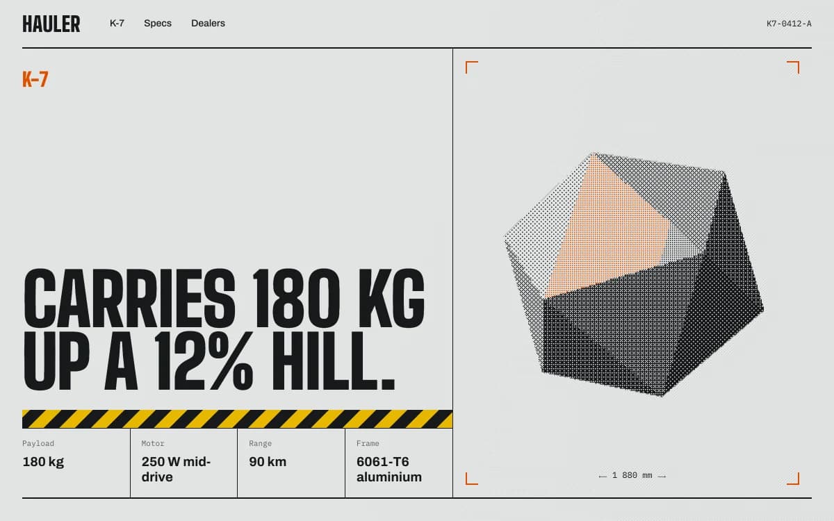
Start building in Industrial Spec SheetIndustrial Spec Sheet is for products whose numbers are part of the pleasure. The site reads like an engineering datasheet for something you want: condensed headlines stacked tall, figures with their units, part numbers, registration marks in the corners, and safety orange used exactly where an engineer would use it.
The specimen, for a fictional electric cargo hauler, leads with "Carries 180 kg up a 12% hill." in condensed capitals, a band of hazard stripes, and a spec row underneath: payload, motor, range, frame. On the right, a polyhedron rendered in dithered dots sits inside crop marks.
Where it comes from
Industrial design has always had two faces: the product and its documentation. Datasheets, assembly drawings, safety labels and catalogue pages are designed for clarity under pressure, and their typography, condensed capitals, tabular figures, numbered steps, has a beauty of its own.
Safety colours come from industrial standards, where orange marks the parts of a machine that can hurt you and yellow marks caution. Used on a website, they carry the same instant meaning: look here.
What defines it
| Element | The Industrial Spec Sheet choice | Why |
|---|---|---|
| Headlines | Condensed stacks, often in capitals | They fit tall in narrow columns, like signage |
| Figures | Big numbers with units, in tables | The specs are the story |
| Marks | Registration and crop marks, part numbers | The page feels like a document |
| Process | Numbered procedures, pinned while you read | Assembly instructions as narrative |
| Colour | Machine grey, graphite, safety orange, hazard yellow | Colour marks what matters, nothing else |
| Texture | Dither | Printed, technical, a little rough |
Palettes
| Palette | Ground | Ink | Accent | Character |
|---|---|---|---|---|
| Hazard spec | #E2E4E3 | #16191B | #E04F00 | Machine grey and graphite with safety orange and hazard yellow |
| Blueprint | #123A7A | #E8F0FF | #FFD23F | Cyanotype blue with drafting-white ink |
| Brutal concrete | #BBBBB5 | #000000 | #C22300 | Raw concrete, true black, primary red |
Type
- Display: Big Shoulders Display. A condensed face rooted in Chicago signage that stacks tall in narrow columns.
- Text: Archivo. A workhorse grotesque with a wide width axis.
- Mono: IBM Plex Mono. Engineered, with clear figures for spec tables and part numbers.
Motion and depth
Motion is mechanical. Figures count up to their values. Labels scramble into place. The process section pins hard while each numbered step takes its turn.
The hero object can be a lit form rendered into characters, or a field of topographic contour lines for products that meet terrain. When a real product model exists, the agent lights and stages it properly, and can take it apart along its real axes.

The synth module in the community is this style at full strength: the module separates into six numbered layers along its screw axes, the camera dives into its screen to follow the signal, and a paper datasheet slides over with front and side drawings and a spec table drawn from the same data.
A typical page, section by section
Every site is designed for its own idea, so treat this as a sketch, not a template. A page in this style often runs like this:
- The split stage. A condensed headline that states the key spec, and the product or a character-rendered form in crop marks.
- The spec ledger: every figure with its unit, in rows with hairline rules.
- Figures at scale: the three numbers that sell it, counted up.
- The procedure, pinned: how it is made, assembled or used, step by numbered step.
- Versions as aligned columns, with prices and ship dates.
- A footer with the part number, the maker and the name in condensed capitals.
Who it suits
| A strong fit | A poor fit |
|---|---|
| Hardware and gear launches | Fashion, beauty and fragrance |
| E-bikes, tools, outdoor equipment | Restaurants and cafés |
| Audio and music gear | Wellness and care |
| Manufacturers and engineering firms | Brands built on feeling rather than function |
More on these in the use cases for product launch pages.
How it goes wrong
- Fake precision. Invented figures to fill a table. Every number on a spec sheet must be true, or the whole style becomes a costume.
- Hazard stripes everywhere. Warning colour works because it is rare. One band, one meaning.
- Condensed capitals for body text. Unreadable at length. Paragraphs go in the grotesque.
- A spinning render with no reason. If the 3D does not explain assembly, scale or function, it is decoration.
- Tables that break on phones. Wide spec tables need a phone layout of their own, not a sideways scroll. Laarpi checks every page at six widths.
Writing specs people actually read
A spec table is copy, and it can be written well:
-
Lead with the number the buyer asks first. For a cargo bike it is payload and range, not frame tubing.
-
Always give units, and keep them consistent: kilograms throughout, not kilograms then pounds.
-
Use tabular figures so columns of numbers line up digit by digit.
-
Say what the number means in use. "180 kg payload" is a fact; "carries 180 kg up a 12% hill" is a reason to buy.
-
Show tolerances and conditions where they matter. Range at what speed, in what temperature.
-
The real specifications, with units and tolerances. This style lives on them.
-
Drawings or a 3D model, if you have them. If not, the agent can build drawings from the dimensions.
-
The order details: variants, prices, ship dates. With website payments connected, pre-orders work from day one.
Making it yours
- "An electric cargo bike. Payload, range and hill grade are the selling points."
- "A Eurorack module. People should see where the signal goes before they buy."
- "A family firm that machines aluminium parts. Capabilities as a datasheet, quotes by form."
The guide to a product launch page that converts covers structure and the order flow, and the 3D website builder covers how product models are staged. For raw grids without the hazard tape, see Swiss Brutal. For the console version, Retro-Futurist Terminal. For a polished, consumer finish, Liquid Chrome.