Quiet Luxury: nothing shouts, everything is placed
A style for boutique hotels, small restaurants and makers of fine goods whose customers do not want to be shouted at. How restraint becomes a material, the details that signal quality, and what to avoid.
Palette and type
Palette
- Ground#D6D0C6
- Surface#CAC4BA
- Ink#2B2620
- Muted#59544D
- Accent#7E6A4C
- Accent 2#3E4A3D
- Line#B4AEA5
Stone and camel
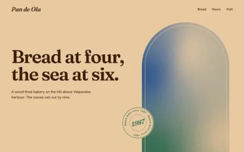
Mid-tone stone instead of white, so the page feels like a material. Camel and loden are almost neutral: luxury that refuses to shout.
- Ground#EBE5E2
- Surface#DDD6D3
- Ink#2A0C10
- Muted#735E60
- Accent#7A0E1D
- Accent 2#B8901E
- Line#C4BAB8
Oxblood and bone
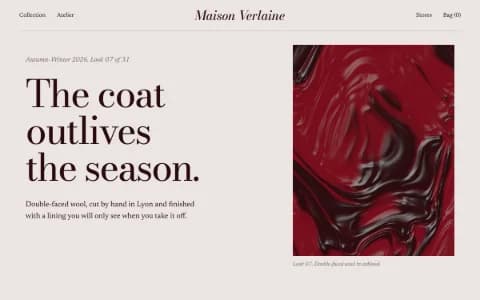
Pinkish bone ground and a near-black that is secretly oxblood. The red accent stays dark and leathery; brass is for one detail, not decoration.
- Ground#C8D3BF
- Surface#BCC7B5
- Ink#1F2A2E
- Muted#4D5855
- Accent#C9381F
- Accent 2#3E6672
- Line#A6B1A2
Matcha steel
Matcha-grey ground and a blue-steel ink; vermilion lacquer marks the one important thing.
Type
Quiet Luxury
Boska
Stone, camel and a sharp serif. Nothing shouts; everything is placed.
General Sans
- Layout
- Centred moments between asymmetric spreads, menus typeset with leaders, contact as a letter, wide margins.
- Motion
- Slow fades and line reveals only; grain-gradient fields at low speed; hover displacement on imagery.
Try it with a prompt
“A farmhouse hotel with eleven rooms and no lobby. Breakfast is whenever you come down.”
Start building in Quiet LuxuryQuiet Luxury is restraint used as a material. Stone and camel instead of white. A sharp serif set without fuss. Wide margins. Few words. A menu typeset with dotted leaders. A contact page written like a letter. Motion so slow you barely notice it, until you do.
Nothing shouts. Everything is placed.
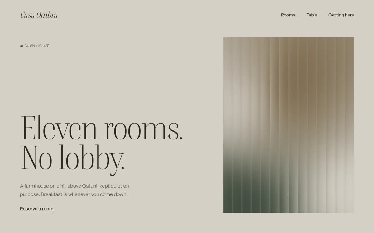
The specimen, for a fictional farmhouse hotel on a hill, says it in four words: "Eleven rooms. No lobby." A small location line in the corner, a short paragraph, a single "Reserve a room" link, and a tall image of reeded glass with light falling through it.
Where it comes from
The phrase "quiet luxury" became a fashion headline in the early 2020s, describing clothes without logos whose quality only shows up close. The idea is much older: the best hotels, tailors and restaurants have always let materials, service and detail speak.
For websites, it means removing everything that performs. No banners, no badges, no countdowns, no superlatives. What is left has to be very good.
What defines it
| Element | The Quiet Luxury choice | Why |
|---|---|---|
| Ground | Mid-tone stone, bone or matcha grey | The page feels like a surface, not a screen |
| Type | A sharp high-contrast serif and a warm neo-grotesk | Precision with a human touch |
| Layout | Centred moments between asymmetric spreads, wide margins | Pacing, like walking through rooms |
| Menus and lists | Typeset with leaders, like a printed carte | Care in the practical details |
| Contact | Written as a letter | A person, not a form |
| Motion | Slow fades and line reveals only | Nothing hurries |
Palettes
| Palette | Ground | Ink | Accent | Character |
|---|---|---|---|---|
| Stone and camel | #D6D0C6 | #2B2620 | #7E6A4C | Stone instead of white; camel and loden, almost neutral |
| Oxblood and bone | #EBE5E2 | #2A0C10 | #7A0E1D | Pinkish bone, oxblood ink, brass for one detail |
| Matcha steel | #C8D3BF | #1F2A2E | #C9381F | Matcha grey and steel ink; vermilion lacquer for the one important thing |
Type
- Display: Boska. A high-contrast serif with sharp edges that looks expensive at scale. Free from Fontshare.
- Text: General Sans. A neo-grotesk with a slightly humanist warmth, so the details feel considered, not cold.
Motion and depth
Almost nothing moves, and what does moves slowly: fades, line-by-line reveals, a grain gradient drifting behind a statement at low speed, a photograph that ripples gently under the cursor. Reeded-glass flutes over a soft field of colour suggest a window without showing one.
There are no hard 3D objects. The luxury is in the pace.
A typical page, section by section
Every site is designed for its own idea, so treat this as a sketch, not a template. A page in this style often runs like this:
- The poster frame. A short statement in the serif, one image, one quiet link to book.
- The introduction, a single paragraph in the voice of the place.
- Drifting images, rooms, tables or objects at different heights, with space between them.
- The carte: menu, rates or the collection typeset with dotted leaders.
- The letter: how to reach you, written by a person, with the details a guest needs.
- A footer with the name and the address, nothing else.
Who it suits
| A strong fit | A poor fit |
|---|---|
| Boutique hotels, guesthouses, retreats | Festivals and nightlife |
| Restaurants with a short menu and few tables | Discount retail and flash sales |
| Makers of fine goods, small online stores | Kids' brands |
| Ateliers, private clinics, architects | Products that need to feel fast and new |
More on these in the use cases for brand websites and architecture portfolios.
How it goes wrong
- Beige as the whole idea. Neutral colour without composition is just dull. The layout and the detail must carry it.
- Too quiet to use. Tiny grey text on stone fails contrast and frustrates guests looking for check-in times. Restraint never means unreadable.
- Hidden booking. Luxury guests still need to book. One clear action per screen, always findable.
- Stock serenity. Generic spa photography of stones and towels. Use your own rooms, tables and objects, or let type and texture carry the page.
- Fake exclusivity. "Only 2 rooms left" badges are the opposite of quiet. Real availability, plainly stated.
The details that signal quality
In a quiet site, small things carry the weight that big gestures carry elsewhere:
- Rates and prices set in tabular figures, aligned, with no "from" unless it is true.
- A menu typeset like a printed carte, with dotted leaders running to the price.
- Short declarative copy. "Eleven rooms. No lobby." does more than a paragraph about exclusivity.
- Consistent light in the photographs. One time of day, one temperature, one point of view.
- A contact page written by a person: a name, a direct line, how quickly you reply.
- Focus states and keyboard access as considered as the visuals. Quality is in what people do not notice.
What to prepare
- A few excellent photographs of the rooms, the table, the object. Fewer and better beats many.
- The essential facts: rates or prices, how to book, getting there, what is included.
- The voice of the place, in a sentence or two. "Breakfast is whenever you come down" tells a guest more than a paragraph about hospitality.
If guests should be able to request a booking or join a list for the next season, a website backend stores the requests in your own database.
Making it yours
- "A farmhouse hotel with eleven rooms and no lobby. Breakfast is whenever you come down."
- "A tasting-menu restaurant with sixteen seats. One menu, changed each season."
- "A leather goods maker with five products. Each one shown like a museum object."
For the magazine version of luxury, see Editorial Luxe. For pure white-wall restraint, Gallery White Cube. For warmth with more character, Analog Warmth.