An agency website that proves the taste it sells
How a creative or digital agency's own website should be positioned and structured, why case studies matter more than services lists, and how studios use Laarpi for their own site and for client work.
An agency website has an awkward job. It sells taste and judgement, and it's the first piece of the agency's work most prospects ever see. If it looks like a theme, the pitch is already weaker. Yet a surprising number of agency sites share one skeleton: a looping showreel behind a bold claim, a services grid, a client logo wall, and "Let's talk" in a giant footer.
This page covers how to position and structure an agency's own website, why case studies do the selling, and how studios use Laarpi both for their own site and for client work.
Position before you design
The most common problem with agency websites isn't visual. It's that they don't say who they're for. "We're a full-service creative agency" could describe thousands of studios.
A useful test: could a competitor paste your home page headline onto their site unchanged? If so, rewrite it. Specific beats broad, every time:
| Vague | Specific |
|---|---|
| "We build brands that matter" | "Identity and packaging for independent food and drink brands" |
| "Full-service digital agency" | "Websites and product design for climate-tech companies" |
| "Strategy, design, technology" | "We redesign B2B software so customers can use it without training" |
Specific positioning also makes the design easier, because now the site has an audience and a point of view to design for.
Case studies do the selling
Prospects hire agencies by imagining their own project in your past ones. Give them enough to imagine with.
A case study that works:
- The client and the brief, in two sentences.
- What made it hard. Constraints are where judgement shows.
- The idea, stated plainly before you show it.
- The work, at real size, in sequence, with captions.
- What changed, with real results only, approved by the client.
- Credits, including collaborators.
Three to six of these beat a grid of twenty thumbnails. Keep everything else in an index.
Let the site prove the taste
An agency site can demonstrate its craft directly, as long as the craft serves the message rather than burying it.
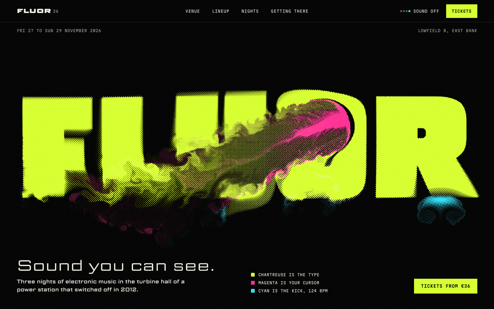
FLUOR 26 is a showcase site made by the Laarpi team with Laarpi's library and process for an imagined electronic music event. Its whole identity hangs on one idea, "sound you can see": the wordmark is fluorescent ink you can stir, the kick drum pushes it at 124 BPM, the lineup is set at each artist's tempo. Every section is a variation on that one idea. That's what agency clients are paying for, and an agency's own site can show the same discipline.
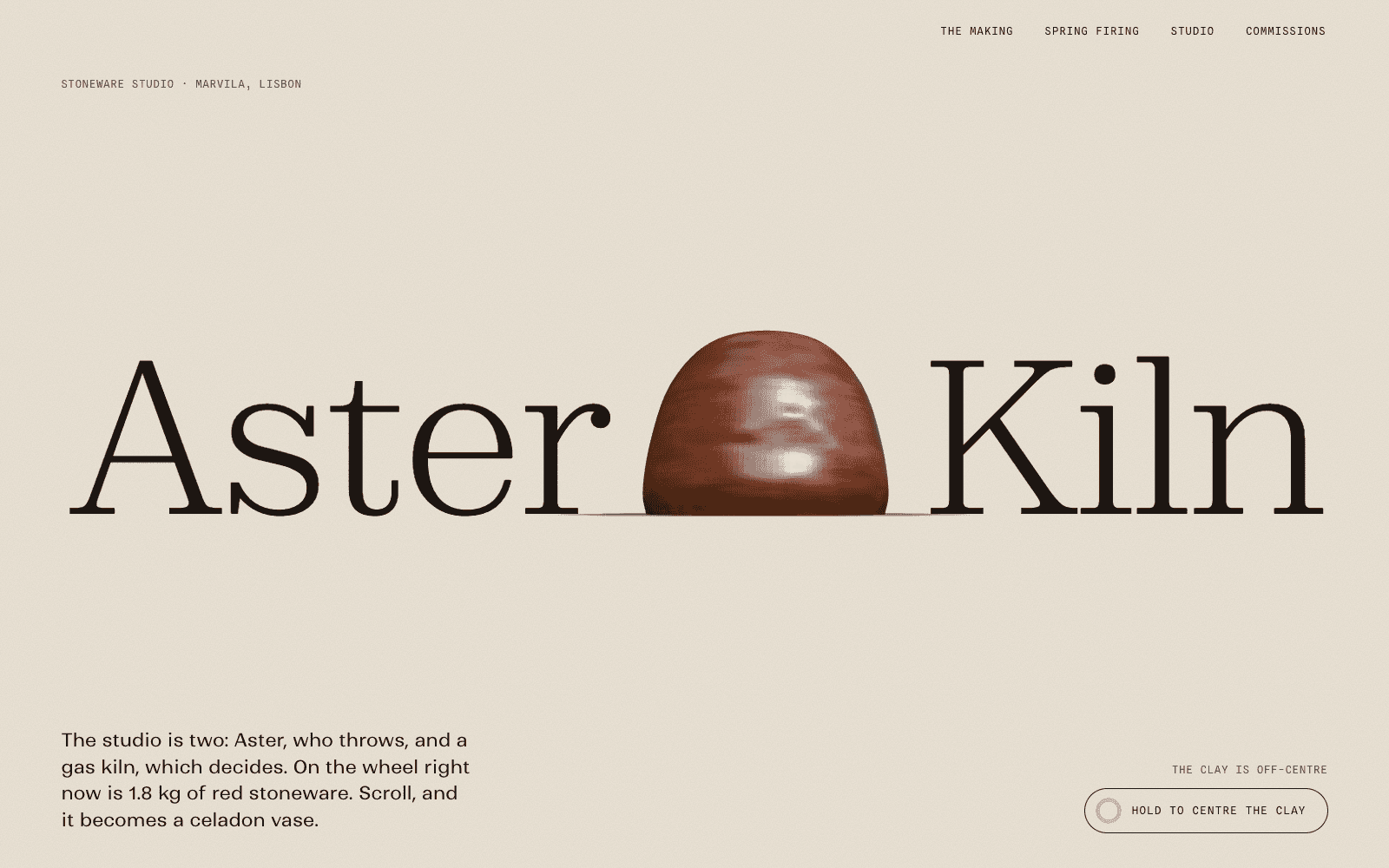
Aster & Kiln is a showcase site for an imagined Lisbon ceramics studio. Scroll throws, glazes and fires a vase, then the finished pieces sit at their true relative sizes on one shelf line with prices. It turns a process into the sales argument, which is exactly what a good agency case study does.
The rule we apply: one signature idea for the site, carried through, never a different effect in every section. And the work always loads before any spectacle.
Choosing a look for a studio
Some directions that suit different kinds of studio, as starting points:
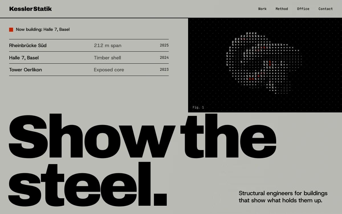
Swiss Brutal puts information first: a strict grid, heavy type, hairline rules. Right for design-led studios with a systematic practice.
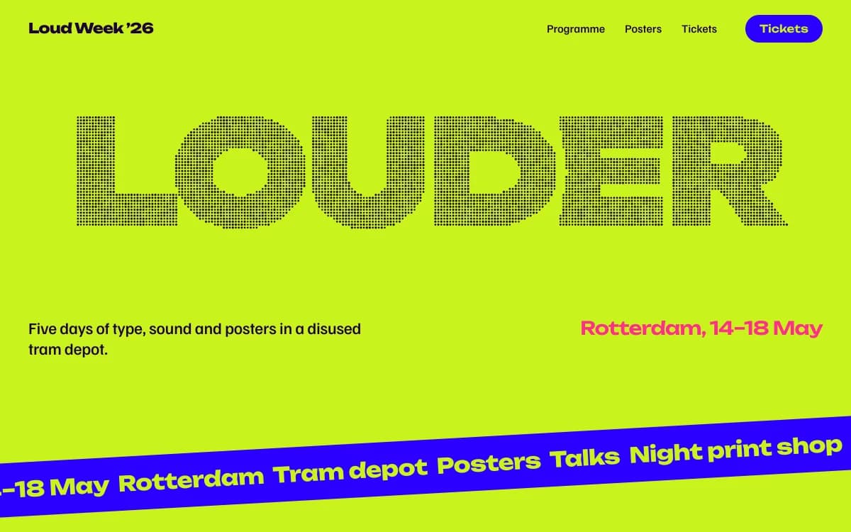
Kinetic Type lets the letters carry the identity. Right for motion, brand and typography studios.
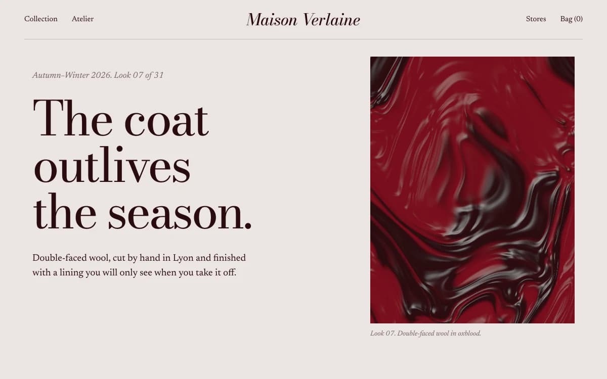
Editorial Luxe borrows the magazine spread. Right for fashion, beauty and culture agencies.
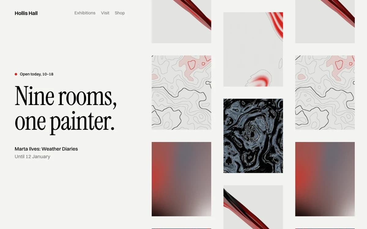
Gallery White Cube steps back and lets the work hang. Right for studios whose client work is strong enough to carry the site alone.
The studio, the people, the process
The about page is where a prospect decides whether they'd enjoy working with you. Treat it as seriously as the work.
- Real people, with real roles. Photographs of the actual team, names, what each person does. Prospects hire people, not logos.
- How you work, described as it really happens: how a project starts, who they'll talk to, how decisions are made, how long things take. Avoid the invented four-step diagram with icons; describe your actual process in plain sentences.
- What you won't do. A short list of the work you turn down tells a prospect more about your taste than any manifesto of what you love.
- Clients and recognition, only with permission, and only if they're real and relevant. An honest short list beats a padded logo wall.
New business, handled properly
An agency's contact page is a sales tool. A new-business form that asks the right questions (what you need, timeline, budget range, how you heard about us) saves a discovery call and filters out poor fits. With Laarpi, that form saves each enquiry to a table in your own Supabase project, with spam protection built in. Keep a plain email address beside it for people who'd rather write.
Using Laarpi for client work
Laarpi is built for client work as much as for your own site. How it fits an agency workflow:
- Every site designed from scratch. No templates to recognise across your portfolio. The agent asks the questions a creative director would ask for each client, writes a plan you can edit, and builds real code.
- Quality checks on every build. Screenshots, layout checks at six widths, and a separate art director scoring eight criteria. On a Finish, at least two rounds of revision before it calls a site done.
- Directable by anyone on the team. Click any part of the preview and say what to change. Every version is kept and can be restored.
- Client-owned backends. Sign-in, data and payments connect to the Supabase and Polar accounts you choose, so they can belong to the client from the start.
- Client domains. Publish to a laarpi.site address for review, then to the client's own domain. See custom domains.
- Code you can read. Every file is open in the Code tab; downloading the code is planned.
- Start from community work. Any published community site can be remixed into a new project. See Remix.
On plans: Max is sized for heavy builders and freelancers; Business pools credits across seats and adds more custom domains; a shared team workspace is planned. Pricing has the details. If you'd rather have our team build a site with Laarpi for you or a client, see Build with experts.
How Laarpi builds an agency website
Describe the studio: what you do, for whom, and what you believe about the work. Attach your best case study images. Press Start building.
It asks only what changes the site. For example: "Should the site lead with one flagship case study or an index of the work?" or "Is the studio's voice formal or irreverent?" Questions come as cards, with palettes and type you can see.
It writes a plan you can edit: the idea of the site, the order, the type with reasons, the palette, what moves and why.
It builds, reviews and revises, then you direct it by pointing at anything on the page.
Agency website checklist
- A first-screen statement that a competitor couldn't paste onto their own site
- Three to six case studies, each with brief, problem, idea, work, result and credits
- Real people on the about page, with real roles
- Your actual process, in plain sentences
- A new-business form that asks about scope, timeline and budget, plus an email address
- One signature idea for the site itself, carried through, never at the expense of the work
- A phone layout composed for phones, because many prospects first open the link from an email
- Your own domain and a fast, readable page before any spectacle
When a CMS suits an agency better
Laarpi builds designed sites in real code. That suits agencies that publish a few deep case studies a year. If your team publishes daily news and needs a shared content editor, a CMS-based tool will suit that rhythm better. For portfolio sites by individuals, see portfolio websites; for practices, architecture portfolios.