A SaaS landing page that doesn't look like every other one
Why most SaaS landing pages look identical, what to put in their place, and how Laarpi builds a software landing page with sign-in and subscription checkout on your own accounts.
Close your eyes and picture a SaaS landing page. A centred headline about doing more with less. Two buttons. A floating dashboard screenshot at an angle, with a purple-to-blue glow behind it. A strip of grey logos. Three cards with icons. A testimonial carousel. A pricing table with the middle plan highlighted.
You can see it because it's on half the internet. That's the problem: when every software product looks the same, visitors can't tell yours apart, and they stop reading. A SaaS landing page is the one place where looking like everyone else costs you directly.
This page is about building one that doesn't: what to put in place of the clichés, how to show a product honestly, and how Laarpi builds a SaaS landing page with sign-in and subscriptions wired in.
Replace each cliché with something true
Every cliché exists because it once answered a real question. Answer the question better.
| The cliché | The question it was answering | A better answer |
|---|---|---|
| "Do more with less" headline | What does it do? | One plain sentence: what it does, for whom |
| Floating fake dashboard | What does it look like? | The real product: a screenshot, a short recording or a live demo |
| Grey logo strip | Who uses it? | Real customers with permission, or nothing yet |
| Three cards with emoji icons | What are the features? | One idea explained properly, then a specific list |
| Testimonial carousel | Is it any good? | A working demo, specifics, an honest FAQ |
| Highlighted middle plan | Which plan do I need? | Plans described by who they're for |
Laarpi's own list of things it will never ship includes most of the left-hand column. The agent is built to avoid them, and a separate art director scores every site on originality before it's done.
Show the product working
The strongest proof a software company has is its product. The best SaaS landing pages let you use it before you sign up.

PATCH-01 is a showcase launch page made by the Laarpi team with Laarpi's library and process for an imagined synthesizer module. The page is the product: you turn the knobs, patch the cables and hear it, all before reading a word of marketing. Nobody needs to be told it's good; they've just used it.
A software product can do the same with its core interaction:
- A live, sandboxed demo of the one thing the product does best: format a query, render a chart, clean a CSV, schedule a meeting. Fake data, real behaviour.
- A short recording of a real task, with captions, if the product can't run in a page.
- Real screenshots, at real size, annotated. Not a tilted mock-up with invented numbers.
Then let the visitor see what happens next. If they liked the demo, the trial button should be right there.
Make the numbers the story
If your product is about data, let the page be about data too, honestly.
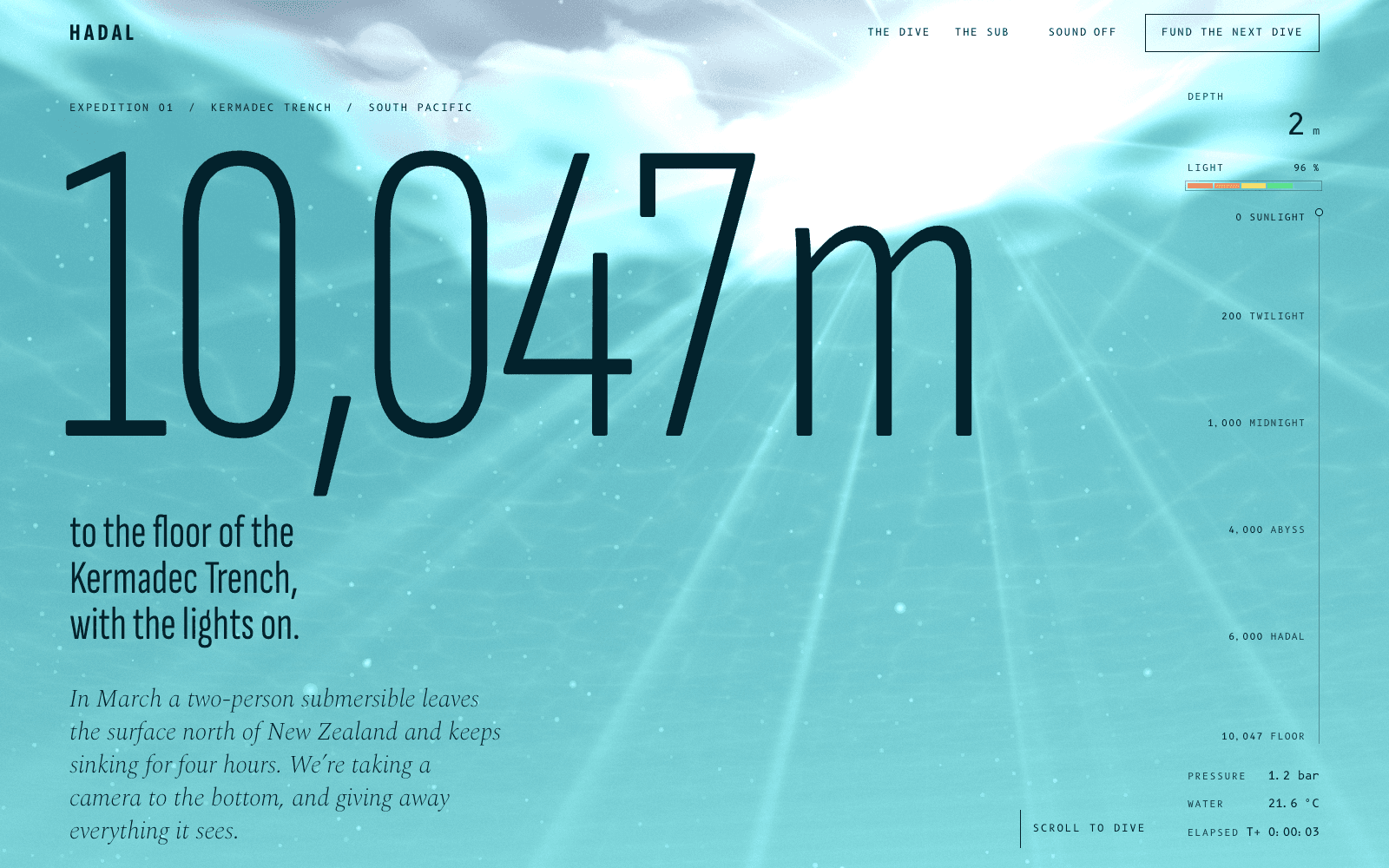
HADAL is a showcase site for an imagined deep-sea expedition. Scroll is the descent, and the depth gauge in the corner never lies: every number on the page is true to the dive. Even the support options are priced in the story's own units: a metre of the dive, a minute on the seabed. For a SaaS product, the lesson is to describe pricing in the units your customers think in, and to make every number on the page a real one.
A structure that works
Most SaaS landing pages need these parts, in roughly this order:
- What it does and for whom, in one sentence, with the primary action beside it.
- The product, shown working.
- The problem, in the customer's words, briefly.
- How it works, step by step, with the real interface.
- Specifics: integrations, security, limits, what's included. Lists are fine here.
- Proof: real customers, real numbers, or the demo again if you're new.
- Pricing: plans described by who they're for, with an FAQ beneath.
- The action again.
For developer products, add a code sample above the fold and a link to the docs. Developers trust a curl command more than any headline. For more on copy and order, see our guide to a product launch page that converts.
Choosing a look for software
Some directions that suit different kinds of software, as starting points:
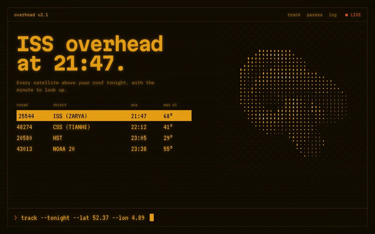
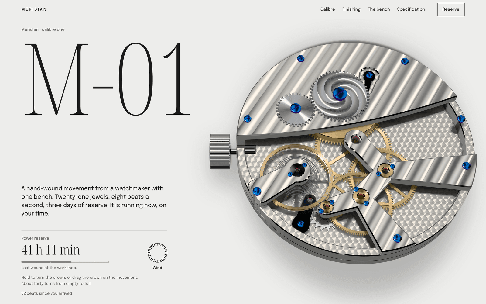
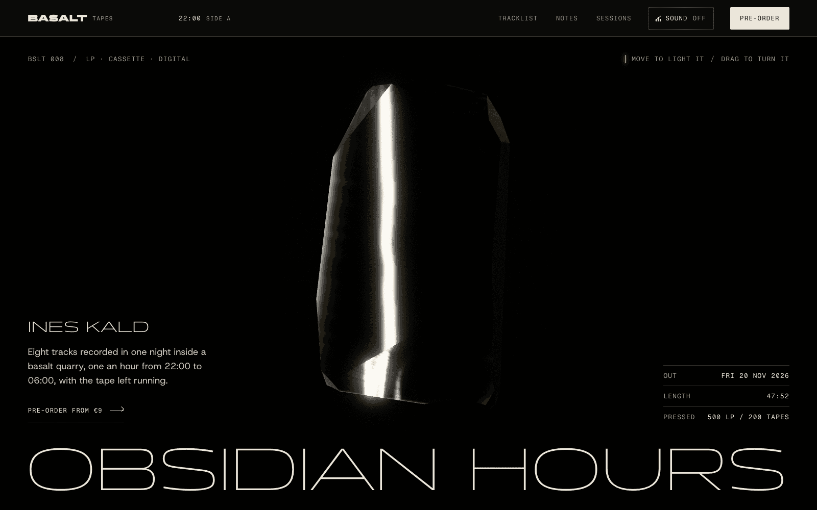
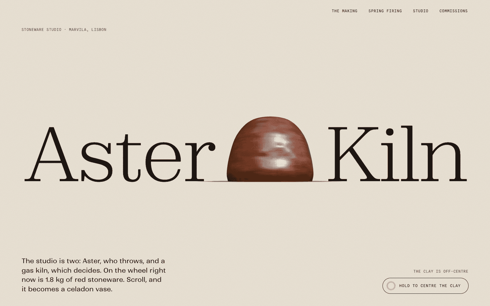
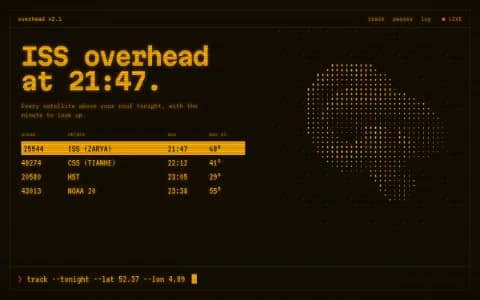
Retro-Futurist Terminal is a mission-control console where the data is real. Right for infrastructure, observability, developer tools and anything with a command line.
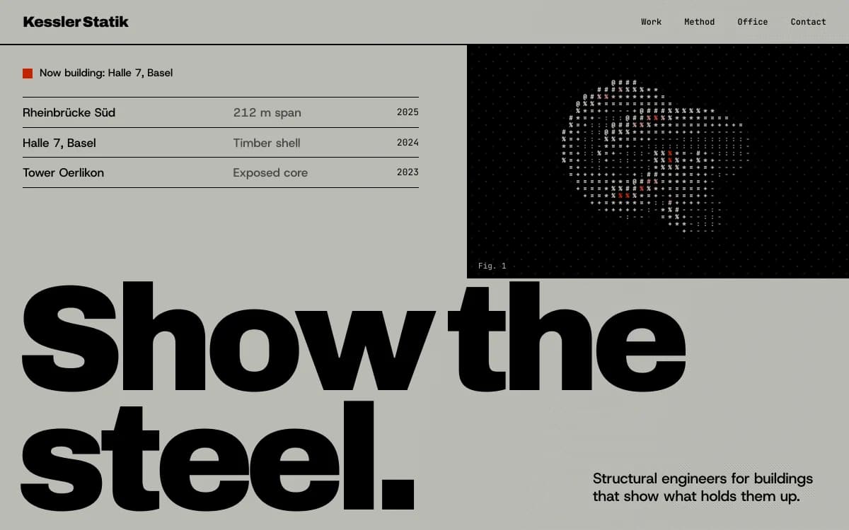
Swiss Brutal makes information the ornament: a strict grid, heavy type, hairline rules. Right for analytics, finance and products for people who distrust marketing.
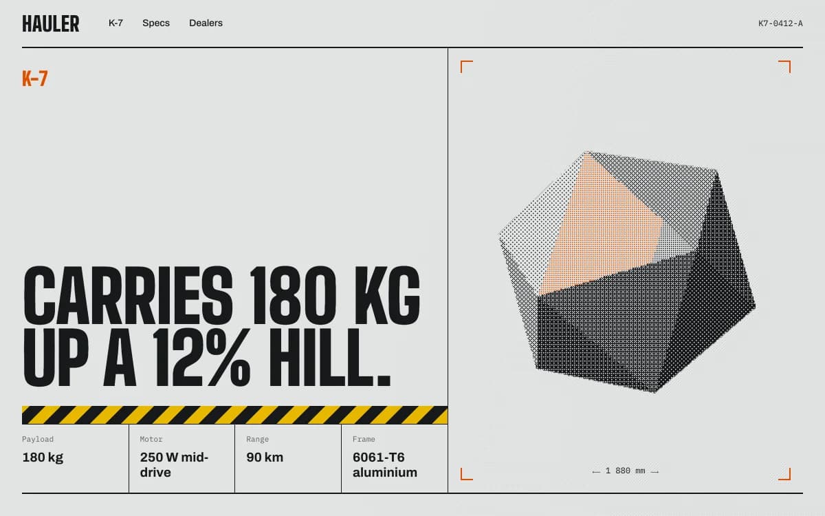
Industrial Spec Sheet reads like an engineering datasheet. Right for hardware-adjacent software, IoT and logistics.
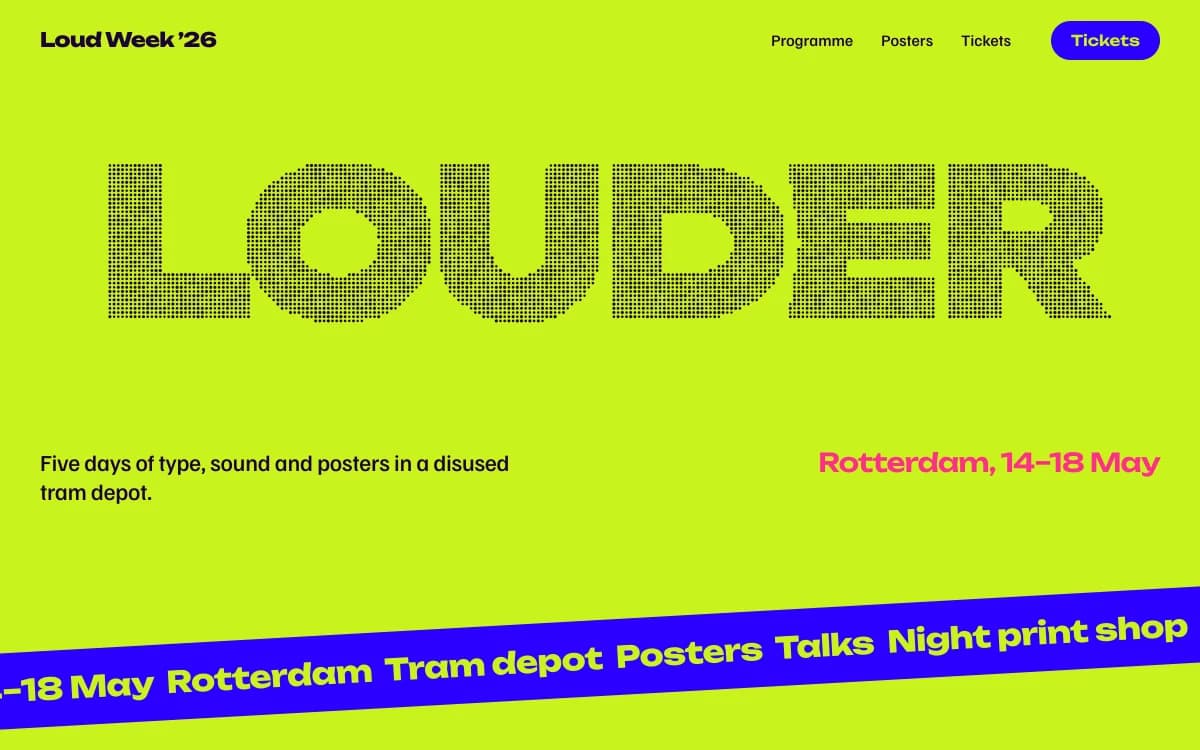
Kinetic Type lets the type move. Right for creative tools, where the landing page should prove the product's sense of play.
Sign-in and subscriptions, on your accounts
A SaaS landing page usually needs more than a page. Here's what Laarpi wires up:
- Sign-up and sign-in. Email and password or magic-link sign-in in your own Supabase project, with row-level security on. Parts of the page can show only to signed-in visitors. See website backend.
- Subscriptions. Laarpi connects your own Polar account, creates your plans as products and wires checkout links to the pricing buttons. Polar is built for software and acts as merchant of record, so it handles sales tax for you. See website payments.
- Waitlist. Before launch, a sign-up form that saves emails to your Supabase table.
- Your own domain. On paid plans, with the DNS records shown and checked for you.
None of it passes through Laarpi: your users, your customers and your revenue stay in your accounts.
How Laarpi builds a SaaS landing page
Describe the product, who it's for and what it does better than the alternatives. Attach screenshots. Press Start building.
It asks only what changes the page. For example: "Is the main action a free trial, a demo call or a waitlist?" or "Should the page feel like a developer tool or a consumer app?" Questions arrive as cards with real palettes and type specimens.
It writes a plan you can edit: the one idea, the order of sections, the type and palette with reasons, and what the demo or centrepiece is.
It builds real code and reviews it. The agent screenshots its own work, checks the layout at six widths, and has a separate art director score it on eight criteria, from concept clarity to originality. On a Finish, it revises at least twice, and checks for console errors, contrast and a reduced-motion version before it finishes.
You direct it. Point at the pricing table and say "make yearly the default". Only that part changes.
SaaS landing page checklist
- One sentence in the first screen: what it does, for whom
- The real product, shown working, not a mock-up with invented numbers
- One primary action, repeated at the top and the end
- How it works, step by step, with the real interface
- Only real customers, logos and numbers, with permission
- Plans described by who they're for, with the FAQ beneath the pricing
- For developer tools: a code sample and a docs link near the top
- A fast phone layout and a reduced-motion version
What Laarpi builds, and what it doesn't
Laarpi builds the website around your software, not the software. It won't build your dashboard, your API or your billing logic beyond checkout links and webhooks. It builds the page that makes someone want to try it, with sign-in and subscriptions on your own accounts. If you're comparing tools for this, our Laarpi vs Framer comparison covers the differences honestly, and pricing shows what each plan includes.