An architecture portfolio website that explains buildings
What an architect's or practice's website needs, how to present drawings, photographs and models on the web, and when real-time 3D helps a project rather than decorating it.
Architects are trained to communicate space through drawings, models and photographs, and then most practice websites throw that training away. Plans get shrunk into thumbnails. Sections disappear entirely. Built work is shown as a slideshow of exteriors, and the site itself looks like every other template with a logo in the corner.
An architecture portfolio website can do better, because the web can show things paper can't: a section that cuts as you scroll, a sun path moving across a facade, an exploded axonometric that comes apart in your hands. An architecture portfolio website can show a project the way you would explain it across a table. This page covers what the site needs, how to present each kind of material, when 3D earns its place, and how Laarpi builds one.
Who the site is for
The answer changes the site more than any style choice.
| Visitor | What they want first | What the site should lead with |
|---|---|---|
| A prospective client | Proof you've built something like their project | Built work by type, with photographs and a clear brief |
| A competition jury or partner | Your thinking and your range | Ideas, drawings and models, built or not |
| A practice hiring | Your skills and your process | Process work, drawings you made, your role on each project |
| Press and researchers | Facts and good images | Project data, credits, downloadable images |
A practice website usually serves the first and last. A student or graduate portfolio serves the third. Decide which, then let it shape the order of everything.
Presenting the material
Photographs
Lead each built project with one strong photograph, then sequence the rest the way you'd walk the building: approach, threshold, the main space, the details. Credit the photographer on the page.
Drawings
Drawings are where architects lose the most on the web. A few rules:
- Export vectors as SVG where you can, so line weights stay crisp at every size. Otherwise use high-resolution PNG, never compressed JPEG.
- Give drawings room. A plan shown 300 pixels wide is decoration. Let a visitor open it full screen.
- Label them like a drawing set: what it is, the scale or a scale bar, the north point.
- One drawing per idea. If the section is the project, show the section big and early.
Models and 3D
Physical model photographs are underrated: they show intention without the noise of a finished building. Digital models can go further, as long as they explain something. More on that below.
Project data
A short table per project helps clients and press: location, status, year, client (with permission), size, collaborators, photographer. Keep it factual and only list what's real.
Choosing a look for an architecture practice
Architecture sites fall into a few honest moods. Four directions that fit, and what each one says:
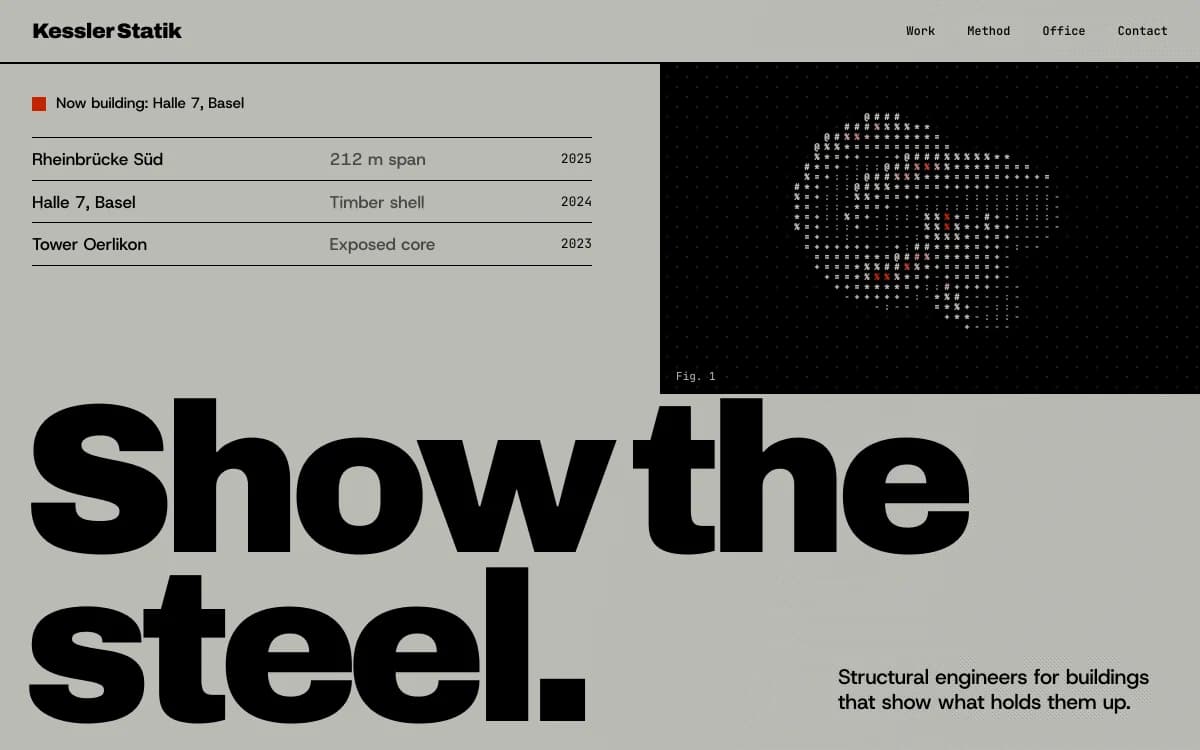
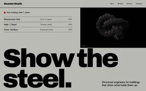
Swiss Brutal puts information first: a strict grid, heavy grotesque type, hairline rules carrying project data. It suits practices whose work is structural or rigorous. The specimen above was composed for a firm of structural engineers.
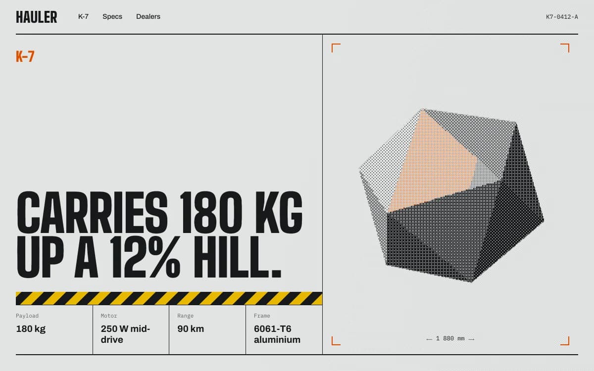
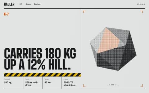
Industrial Spec Sheet reads like an engineering datasheet: part numbers, tolerances, one strong signal colour. Right for practices working in timber engineering, prefabrication or anything where the detail is the design.
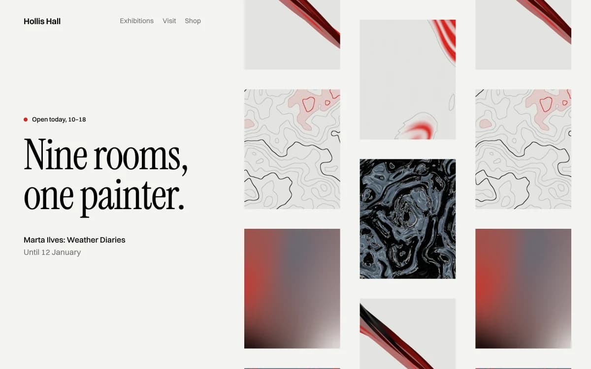
Gallery White Cube steps back and lets photographs and drawings hang on a white wall. Right for practices whose images are strong enough to carry the page.
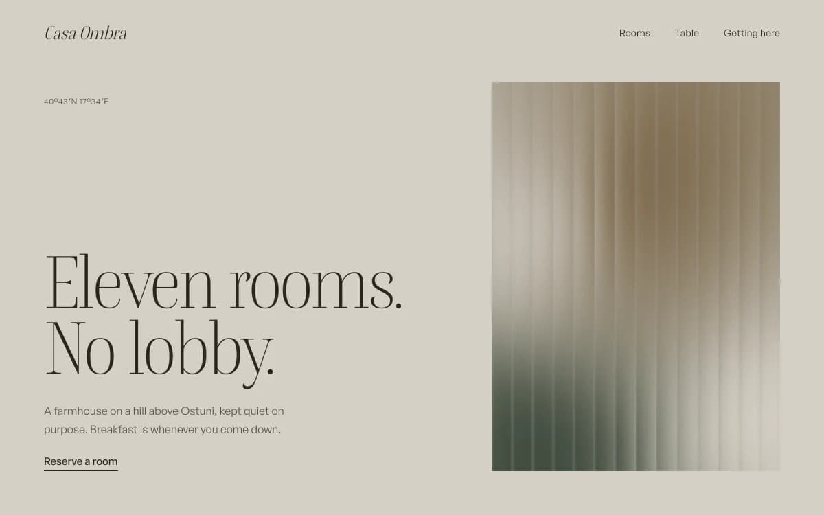
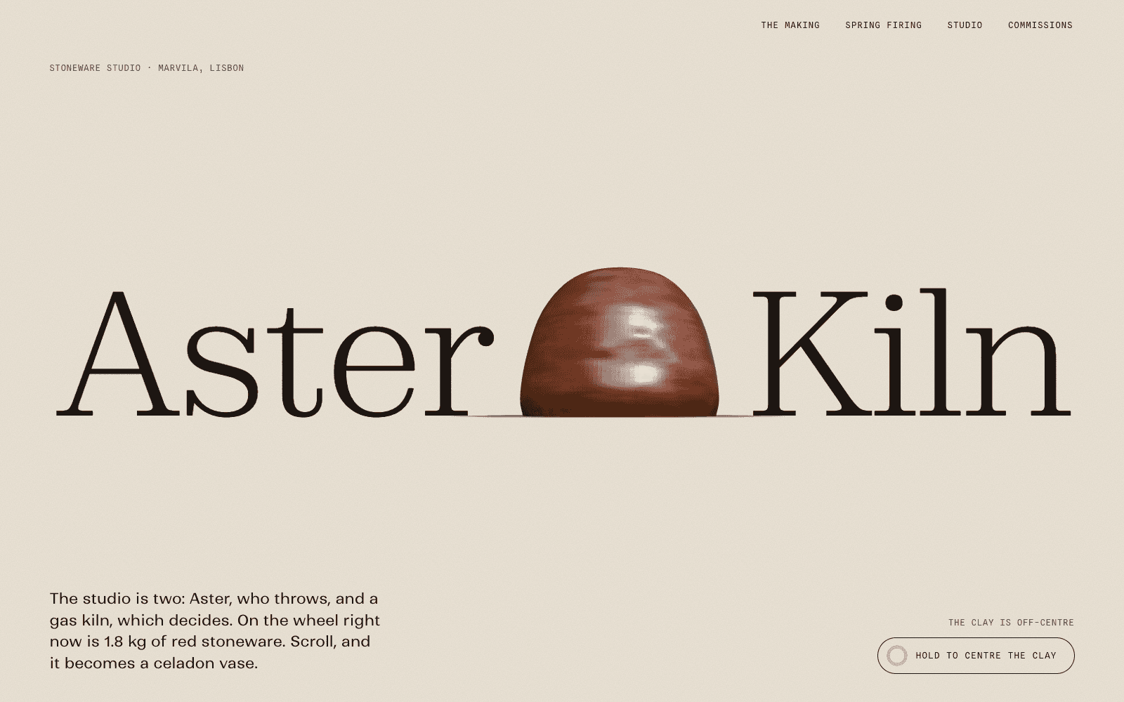
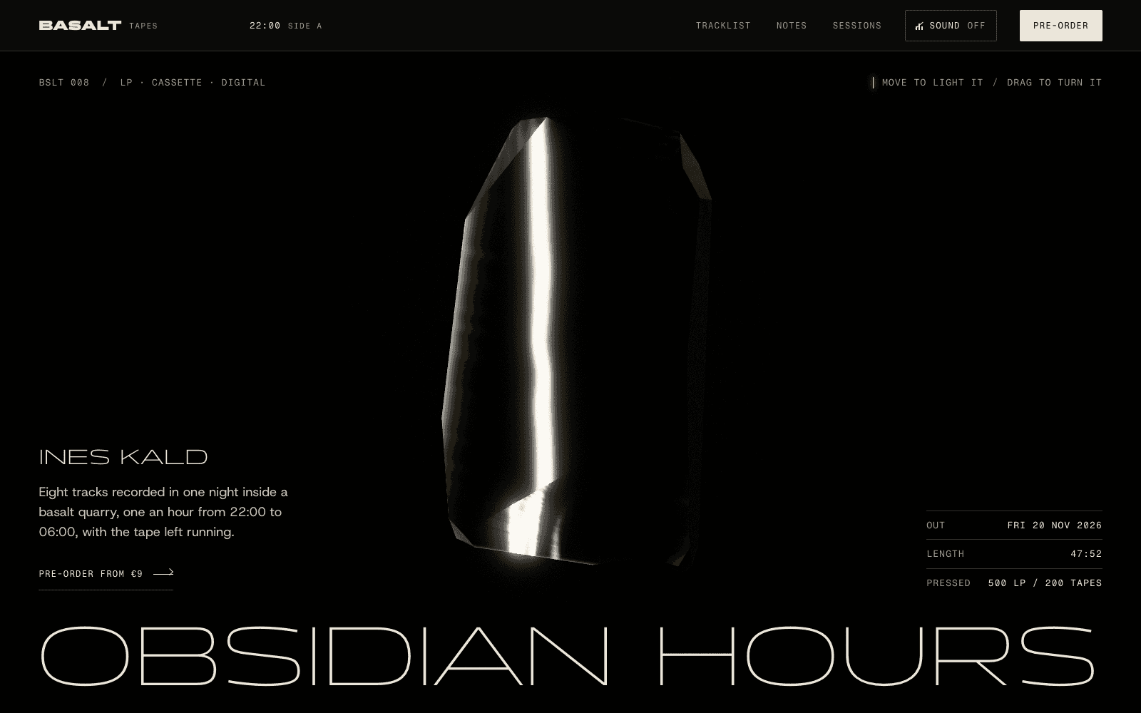
Quiet Luxury is stone, camel and a sharp serif. Right for residential and hospitality architects whose clients expect calm.
When 3D helps an architecture website
Real-time 3D should do what a drawing or photograph can't. Three techniques that genuinely explain buildings:
- The exploded view. A building or a detail separates along its construction layers as you scroll: structure, envelope, cladding, interiors. It shows how a thing is made.
- The moving section. A cutting plane travels through the model as you scroll, so the visitor sees the spatial sequence rather than reading it from a still drawing.
- The sun study. Light moves across the model through a day or a year, so you can show why the plan turns the way it does.
Two showcase sites made by the Laarpi team with Laarpi's library and process use the first technique on objects rather than buildings, and they show the level of craft involved:

PATCH-01 is a showcase product page for an imagined synthesizer module. As you scroll, the module turns three-quarters and separates along its screw axes into six numbered layers. Further down, a paper datasheet slides over with front and side elevations drawn from the same layout data as the 3D model, so the drawing and the object can never disagree. That last idea transfers directly to architecture.
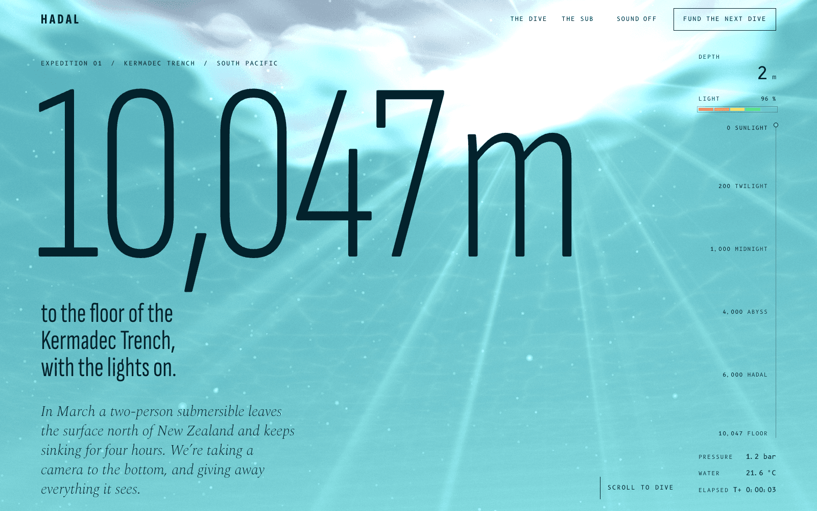
HADAL is a showcase site for an imagined deep-sea expedition. Scroll is the descent and the depth gauge never lies. Near the bottom, the submersible is explained as an engineering section of its titanium sphere rather than as a glossy render. It's a lesson in using 3D to explain, not to impress.
What doesn't work: a full building model you can orbit freely with no guidance. Visitors get lost, the file is huge, and it rarely says anything a good photograph doesn't. Our guide on how to build a 3D website covers the trade-offs, and website performance with 3D covers keeping models light.
Preparing a model
Placing your own model in the site is in development in the private beta. To be ready for it, export a GLB. Practical advice:
- Export a simplified version. Massing plus one detailed element usually tells the story better than a full BIM export, and loads in a fraction of the time.
- Bake or simplify materials. Real-time lighting does the rest, using studio or sky lighting from open-licensed HDRIs.
- Compress it. Free tools such as glTF-Transform can compress geometry and textures to a fraction of their size. Aim for a model of a few megabytes at most.
- Keep the whole site light. Laarpi's rules cap a site at 12 MB, enforced on a Finish, and load the text first, then fade the 3D in, so the page is readable before the model arrives.
How Laarpi builds an architecture website
Describe your practice or your portfolio, attach photographs or drawings as references, and press Start building. Placing your own photographs, drawings and models on the site is in development in the private beta.
It asks what matters for your practice. For example: "Should the site lead with built work for clients, or with ideas and competitions?" or "Is the drawing or the photograph the hero of each project?" The questions arrive as cards, with type specimens and palettes you can see.
It writes a plan you can edit: the idea of the site, the page structure, the type with reasons, the palette, what moves and why. Change any line and the next build follows your version.
It builds real code and reviews its own work. It takes screenshots, checks layouts at six widths for collisions and overflow, and asks a separate art director to score the site on eight criteria including concept clarity, 3D, composition and mobile. On a Finish, it revises at least twice. Drawings get checked at phone width too, where most architecture sites fall apart.
You direct it. Point at a drawing and say "this needs to open full screen" or "put the section before the photographs". Only that part changes.
It ships. Publish to a laarpi.site address or your practice's domain. An enquiry form can save straight to your own Supabase project.
Architecture portfolio website checklist
- Lead with the work that matches the visitor you most want: built work for clients, ideas for juries, process for practices hiring
- Every project: one strong photograph, at least one drawing shown large, a short text and a data table
- Drawings as SVG or high-resolution PNG, with scale and north point
- A clear status on every project: built, on site, competition, unbuilt
- Real names only for clients, collaborators and photographers, with permission
- 3D only where it explains something a drawing can't, and never before the text has loaded
- A phone layout where drawings can still be opened and read
- A direct contact, plus a press page with downloadable images if you're published
When another tool suits a practice better
Laarpi builds bespoke sites in real code, so every project page is designed, not filled into a template. That suits practices that publish a handful of projects a year and care how they're shown. If you need a large team to publish news weekly through a content editor, a CMS-based tool fits that workflow better. If you need the website to explain your buildings the way you would in person, this is a good place to start.
See also the general portfolio website page, and how real-time 3D works on the 3D website builder page.